Create responsive SVG image maps
Dudley Storey revitalises the traditional image map with scalable vector graphics (SVG) to create responsive image maps using transition effects.
Sign up to Creative Bloq's daily newsletter, which brings you the latest news and inspiration from the worlds of art, design and technology.
You are now subscribed
Your newsletter sign-up was successful
Want to add more newsletters?
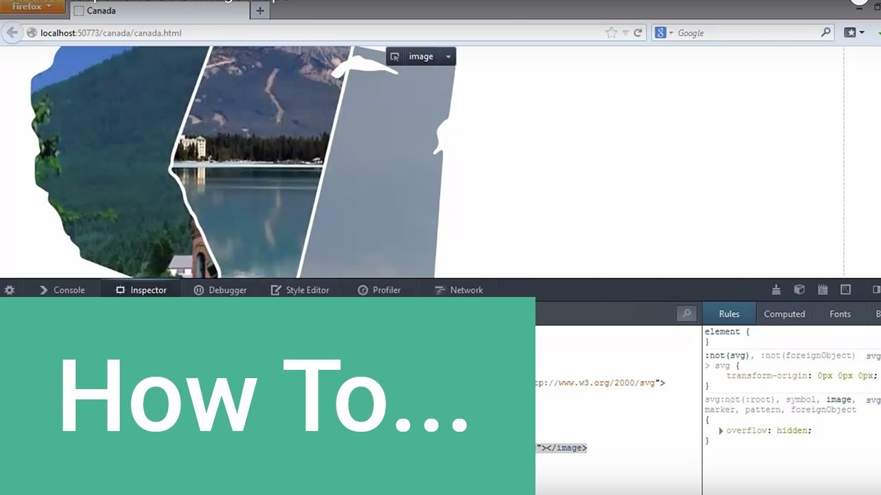
Screencast created by Tuts+Premium in association with net magazine and Creative Bloq.
Image maps have a very long history on the web, gaining immediate popularity after they were featured in early versions of HTML. The use of this particular kind of visual navigation has declined in recent years due, in part, to the fact that the 'hotspot' interface areas of image maps were defined in pixels.
This made them both difficult and tedious to build, while the result of this process was non-responsive: if the image in the image map is resized, the associated hyperlinks drift out of registration with the underlying visual elements, making navigation a case of hunting, clicking and luck. This makes traditional image maps inappropriate for modern mobile website design, yet they remain a valuable user interface pattern, especially for interactive diagrams and geographical locations.
Article continues belowWith a little cleverness, we can use the power of SVG to improve upon the image map, while eliminating the drawbacks of the traditional version.
- Download the support files for this tutorial
Advantages of SVG
SVG doesn't suffer from a registration issue because the format has its own internal viewport system. So long as the file is set up correctly, bitmap images and polygon points in an SVG document will scale and move relative to each other, preserving the integrity of navigational linked hotspots. At the same time, SVG is a vector format that will remain 'perfect' no matter what size it's scaled to. We can also combine the features of SVG and CSS3 to create powerful transition effects in the reborn image map, which is something that was impossible to do in the traditional version.
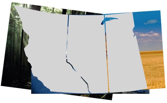
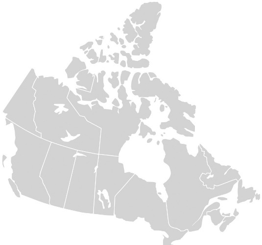
To illustrate this, we'll use a geographical map as the basis for our image map. Such images also have the advantage of being freely available: Wikipedia has maps of every country in SVG format as does Régis Freyd's MapsIcon project. For this example, I'll use a map of my adopted country of Canada, simplified down to the western provinces for the sake of clarity.
Generally speaking, complex modifications to an SVG file are best left to a vector illustration tool, which can manipulate the file graphically. Today, most such tools support the SVG format.
Sign up to Creative Bloq's daily newsletter, which brings you the latest news and inspiration from the worlds of art, design and technology.
Cleaning up the code
Exported from Illustrator, the code of the SVG file will look something like this:
<?xml version="1.0" encoding="utf-8"?>
<!-- Generator: Adobe Illustrator 15.0.0, SVG Export Plug-In
SVG Version: 6.00 Build 0) -->
<!DOCTYPE svg PUBLIC "-//W3C//DTD SVG 1.1//EN"
"http://www.w3.org/Graphics/SVG/1.1/DTD/svg11.dtd">
<svg version="1.1" id="Layer_1" xmlns="http://www.w3.org/2000/svg"
xmlns:xlink="http://www.w3.org/1999/xlink" x="0px" y="0px"
width="560.972px" height="400.48px"
viewBox="-4.872 578.6 560.972 400.48"
enable-background="new -4.872 578.6 560.972 400.48"
xml:space="preserve">
<g id="Canada" transform="translate(-959.79,0.708441)">
<path id="CA-AB" fill="#D3D3D3" d="M1321.652,944…
…
</g>
</svg>
It's straightforward to clean up the code: remove comments, prolog, doctype as well as any attributes we don't need. That turns the code into this:
<svg version="1.1" xmlns="http://www.w3.org/2000/svg"
xmlns:xlink=http://www.w3.org/1999/xlink
viewBox="-4.872 578.6 560.972 400.48">
<g id="Canada" transform="translate(-959.79,0.708441)">
<path id="CA-AB" d="M1321.652,944…
</g>
</svg>
It's then easier to add links and images to the code.

Linking the SVG shapes
Links in SVG are written in the same way in HTML, with the addition of an xlink prefix to href attribute:
<a xlink:href="http://travelalberta.com">
<path id="CA-AB" d="M1321.652,944…
</a>
After linking each path, look at the SVG file in a browser: the exact outline of the Alberta province becomes the hotspot area of the associated link, and scales with the document and viewport window.
Integrating SVG into a web page
There are several ways to integrate interactive SVG into a web page: as an object, an iframe, or with the code added directly into the page. We'll use the latter. Copy and paste the edited SVG code like so:
<body>
<h1>Imagemaps Redux</h1>
<svg version="1.1" xmlns="http://www.w3.org/2000/svg"
xmlns:xlink=http://www.w3.org/1999/xlink
viewBox="-4.872 578.6 560.972 400.48">
<g id="Canada" transform="translate(-959.79,0.708441)">
<path id="CA-AB" d="M1321.652,944…
</g>
</svg>
…
</body>
Currently, the SVG document takes up the entire space of the viewport, and the paths are filled with black. Let's change that while adding to the interactivity of the linked areas. In the host HTML document's embedded style, or in a stylesheet linked to the document, add the following:
svg { height: 50vw; }
path { fill: #d3d3d3; transition: .6s fill; }
path:hover { fill: #eee; }
If you have HTML content below the SVG file, you'll note that it's pushed down further than you may reasonably expect. We can cure that by making the SVG responsive. Right now, the SVG map works as a simple image map with hover effects. The vector points of the paths automatically create hotspots on the map, saving a great deal of development time, and they scale with the browser window, making the map responsive. SVG is automatically alpha-masked, so we can include any content behind the image map without interfering with the map's graphical quality.
We can enhance the visuals of the map by adding clipped photographs inside each map area that will fade in during mouseover. It's probably easiest to Place the images in Illustrator, although you can achieve the same result by hand coding: simply scale and position the photographs in front of the appropriate province, making sure that each image covers its province completely. After exporting the result, repeat the clean-up operation and:
- Surround paths with a clipPath element, each with a unique id value.
- It's a good idea to place the each bitmap image after its associated clipPath element.
- Use the clip-path attribute to reference the ID of the clipPath element (note the different spelling).
The code around the Alberta shape becomes:
<a xlink:href="http://travelalberta.com/">
<clipPath id="alberta-clipper">
<path id="CA-AB" d="M1932…"/>
</clipPath>
<image clip-path="url(#alberta-clipper)"
width="1024" height="768"
xlink:href="crowsnest-pass.jpg" x="1300" y="150">
</image>
</a>
Before applying the clip-path attribute on the images you may find it necessary to manually readjust the position of each image to get it in the right location by changing its x and y value together with its height and width , after removing the transform attribute that Illustrator applies.

Adding accessibility
The current SVG spec doesn't have strong support for accessibility, but we can improve things by adding appropriate title , accesskey and ARIA role attributes:
<a xlink:href="http://travelalberta.com/" title="Alberta"
accesskey="a">
<clipPath id="alberta-clipper">
<path id="CA-AB" d="M1932…
</clipPath>
<image clip-path="url(#alberta-clipper)" width="1024"
height="768"
xlink:href="crowsnest-pass.jpg"
x="1300" y="150" role="image" title="Crowsnest Pass">
</image>
</a>
Adding animation
The SVG image map can be improved by transitioning the clipped bitmap images on hover:
svg { height: 50vw; }
a image { opacity: 0.5; transition: 1s opacity; }
a:hover image { opacity: 1; }
SVG has very good support across all modern browsers and mobile platforms, and offers strong alternatives to traditional HTML and JavaScript solutions. Support does suffer a little when it comes to Internet Explorer: only version 9 and above display the vector format, although you could always use a conditional comment or JavaScript to write in code to support the older Microsoft browsers.
Making SVG responsive
For a format that is intended to be infinitely scalable, it's ironic that the task of making SVG responsive on a web page can be quite challenging. If you're adding an SVG image to a page as an inline image, it can be made responsive in exactly the same way as you would a bitmap:
<img src="monkey.svg" alt="Monkey face" style="width: 100%; height: auto;">However, we can't use this approach for the image map used in this tutorial as inline SVG images will not support interactivity. Instead, we must embed the SVG code directly on the page. With the cleaned-up code I suggest in the article, the embedded image map will be responsive, but at the cost of a large vertical gap appearing above and below the illustration. To remove this gap, do the following:
01. Add a preserveAspectRatio attribute to the SVG code and surround it with a div:
<div class="svg-wrapper">
<svg version="1.1" xmlns="http://www.w3.org/2000/svg"
viewBox="0 580 560 400" preserveAspectRatio="xMinYMin
meet">
..
</svg>
</div>
02. Add the following CSS to the page:
.svg-wrapper { display: inline-block; position: relative; width: 100%; padding-bottom: 100%; vertical-align: middle; }
.svg-wrapper svg { display: inline-block; position: absolute; top: 0; left: 0; }
This combination of absolute and relative positioning with padding-bottom constantly maintains the SVG drawing inside a responsive 'window'. The padding represents the aspect ratio of the SVG illustration: padding-bottom: 100% assumes that the SVG file is as wide as it is high. For taller or wider drawings, increase and decrease the padding-bottom value, respectively. Variations on the technique can used to force third-party content, such as embedded YouTube videos and Google maps, to also be responsive on your web pages.
Words: Dudley Storey
This article originally appeared in net magazine issue 249.

The Creative Bloq team is made up of a group of art and design enthusiasts, and has changed and evolved since Creative Bloq began back in 2012. The current website team consists of eight full-time members of staff: Editor Georgia Coggan, Deputy Editor Rosie Hilder, Ecommerce Editor Beren Neale, Senior News Editor Daniel Piper, Editor, Digital Art and 3D Ian Dean, Tech Reviews Editor Erlingur Einarsson, Ecommerce Writer Beth Nicholls and Staff Writer Natalie Fear, as well as a roster of freelancers from around the world. The ImagineFX magazine team also pitch in, ensuring that content from leading digital art publication ImagineFX is represented on Creative Bloq.

