Design the perfect footer in Photoshop
Just because it’s at the bottom of the screen doesn’t mean it isn’t vital for creating an informative and stylish homepage. Elliot Jay Stocks shows us how
Sign up to Creative Bloq's daily newsletter, which brings you the latest news and inspiration from the worlds of art, design and technology.
You are now subscribed
Your newsletter sign-up was successful
Want to add more newsletters?
This article originally appeared in issue 180 of .net magazine - the world's best-selling magazine for web designers and developers.
What you’ll learn: Footers may be at the bottom of the page, but they’re still important. So we need a clear, legible text but with some nice visual flourishes. We’ll handle image manipulation and most of the planning in Photoshop, but then we’ll move to the browser and render our footer with – as always – the simplest and neatest XHTML and CSS.
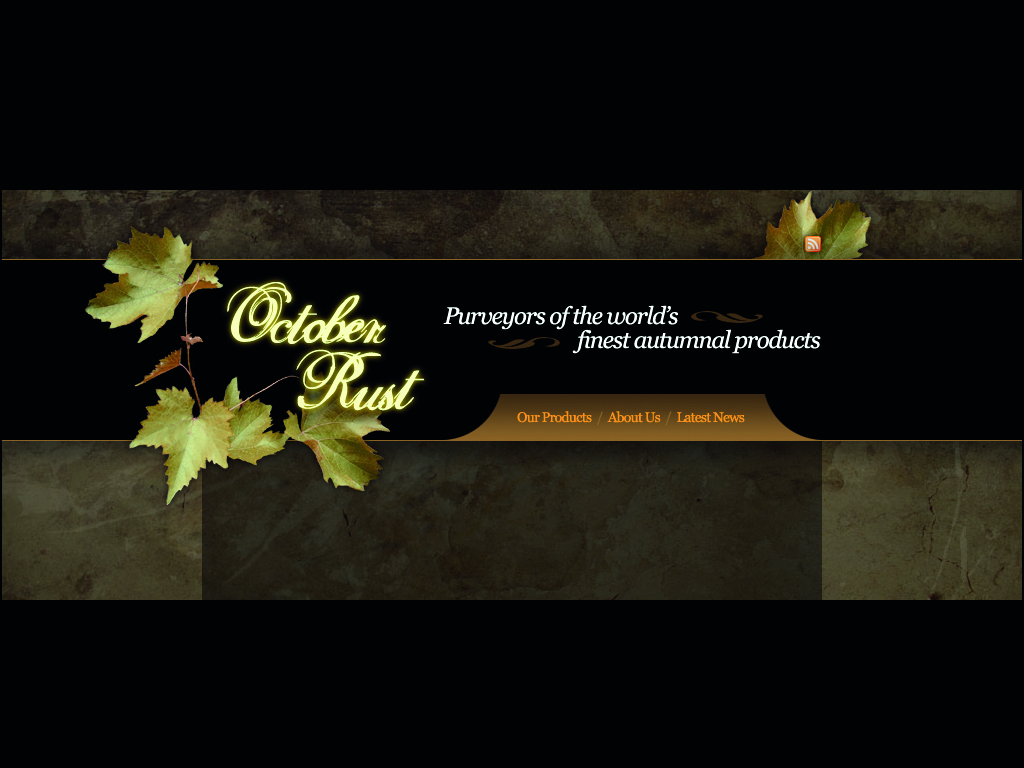
Last time, we created a great-looking header for our fictional small business website. It followed an autumnal colour palette, using some elegant typography and some basic photo manipulation to set the theme for the site. We’re going to follow that up now by creating the footer to complement it.
Article continues belowIf headers are the bold, striking elements that lead a user into a site’s content and give the first impressions, then footers might well be seen as the ‘parting thoughts’ of a website; a graphical bookend to all of the other elements on the page. They might not be very noticeable, but they’re there to do an important job.
1. Here's one we made earlier
Open header.psd in the demo file folder you can download above to see what we created last month. We want the footer to have a similar look to the header, but we also want it to be unique. So consider what should change and what should be retained.
2. Improvements
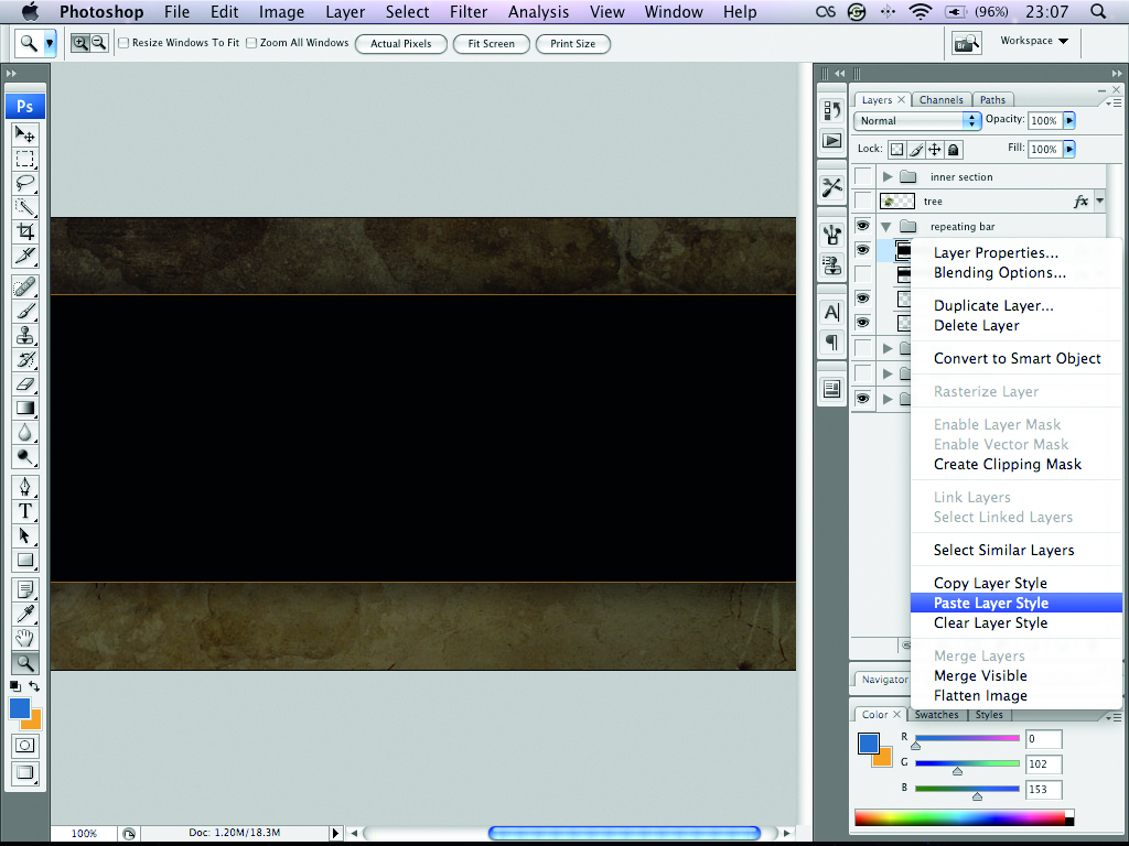
Hide the layer groups inner section, feed, and page content. We’ll make the larger repeating bar from scratch. To do this, create a new layer and fill a taller rectangle with black. Copy the Layer Effects from the bar layer and paste them into the new one.
3. Pick a tree
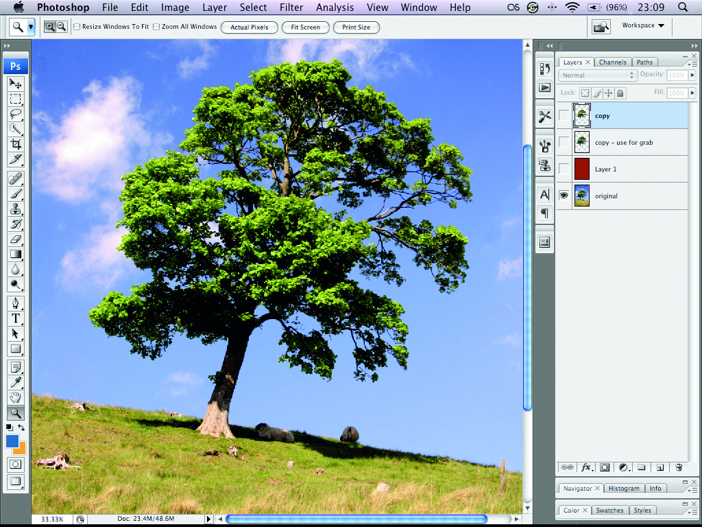
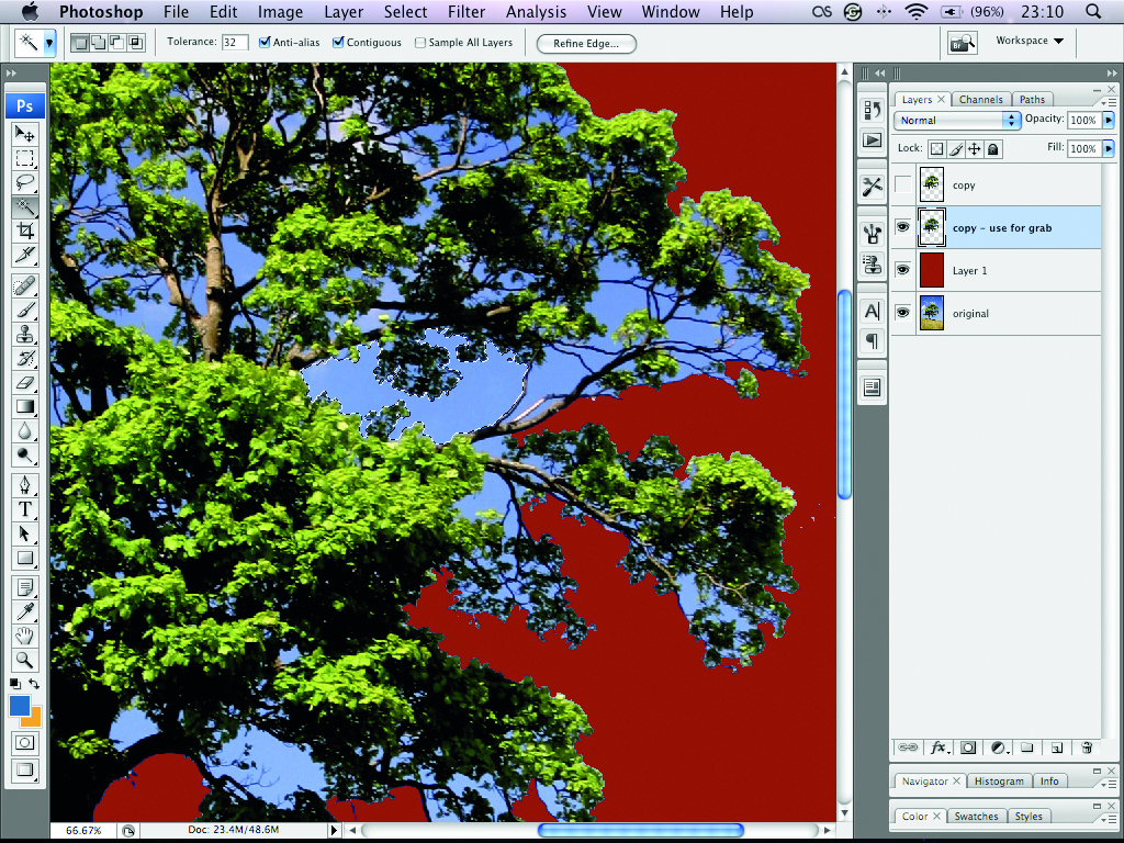
Move the glow bottom layer down to below your new bar layer. Now open tree.psd in the demo folder. This image was obtained from sxc.hu. There are three layers – the original, a copy and a layer of red in between. Start erasing from copy so that the red shows through.
Sign up to Creative Bloq's daily newsletter, which brings you the latest news and inspiration from the worlds of art, design and technology.
4. A touch of magic
Use the Magic Wand tool to erase around the tree’s leaves. The deductions will be pixellated, but this doesn’t matter, as we’ll be reducing the image’s size. Don’t worry too much about parts of the blue sky showing through – we’ll deal with this in the next step.
5. Resize
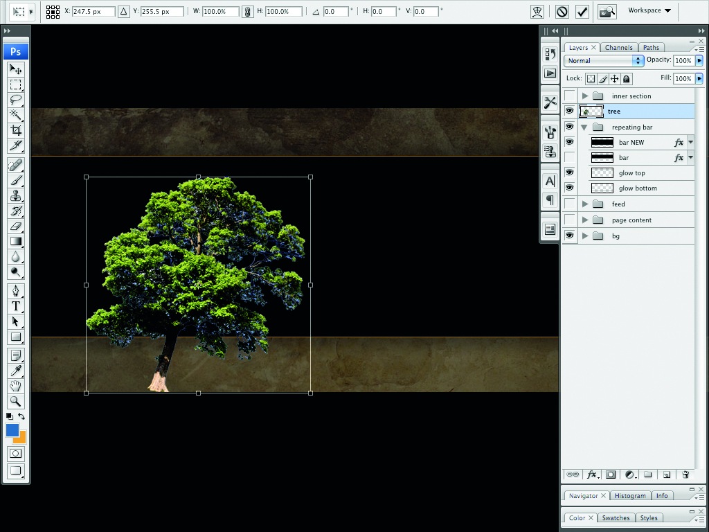
Drag the copy layer onto footer_final.psd and rename it tree. Using Free Transform (Cmd+T/Ctrl+T), reduce the size of the image so that it extends from the bottom of the canvas to just under the top of the footer bar, holding Shift so that you retain the correct ratios.
6. The right balance
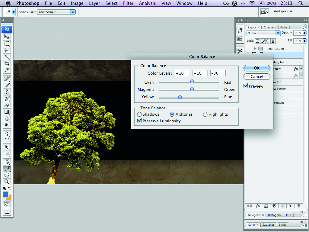
To delete the blue and get our ‘autumnal’ colours, use the Color Balance dialog (Image > Adjustments > Color Balance) – Shadows: +10 (R) +10 (G) -30 (B); Midtones: +100 (R) +50 (G) -60 (B); Highlights: +20 (R) +10 (G) -10 (B). Tick the Preserve Luminosity box.
7. Subtle glows
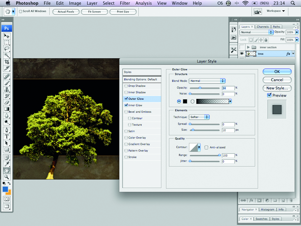
The tree’s edges are still a bit jagged. To soften them, double-click on the layer to invoke the Layer Effects and add a subtle black ‘inner glow’. Now add an even more subtle black ‘outer glow’. This should be just enough to make the tree stand out from the background.
8. Subtle changes
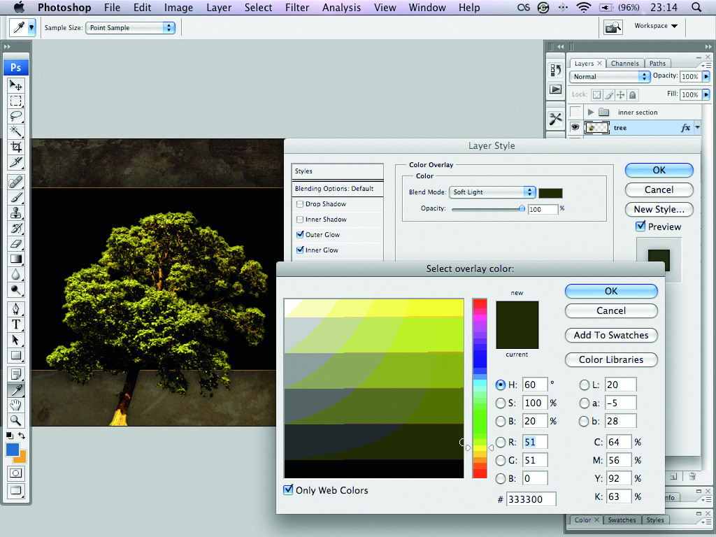
To make the tree appear more autumnal, invoke the Layer Effects panel once again and add a Colour Overlay. Choose the colour #333300 and set its blend mode to Soft Light. These subtle layer effects have significantly improved the appearance of our tree image.
9. Feed me!
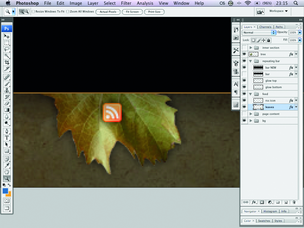
Unhide the feed layer group and select the leaves layer within. Flip using the Edit > Transform > Flip Vertical menu and drag the layer group underneath the footer bar. Reposition the elements so that the leaves and feed icon appear as a reversed version of the header.
10. Plan the structure
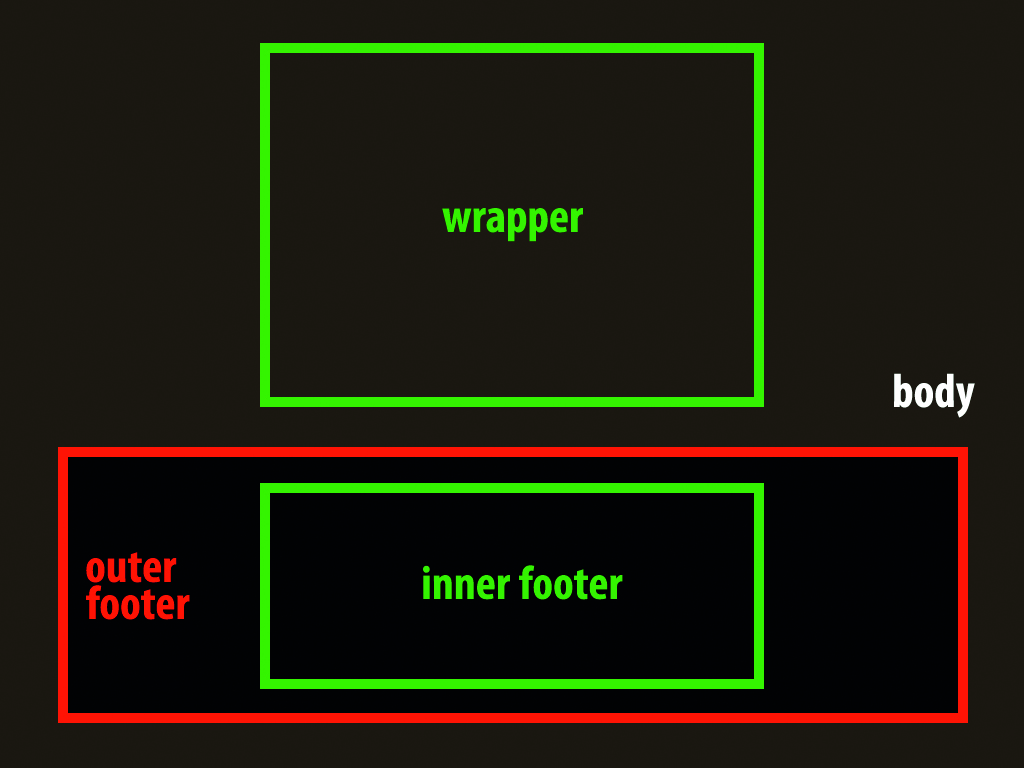
As with the header, our footer will actually be made up of two footers – one within the other. The outer footer will span the entire width of the page, and the inner footer (with a fixed width) will sit inside, containing all of our content.
11. Prepare the images for the web
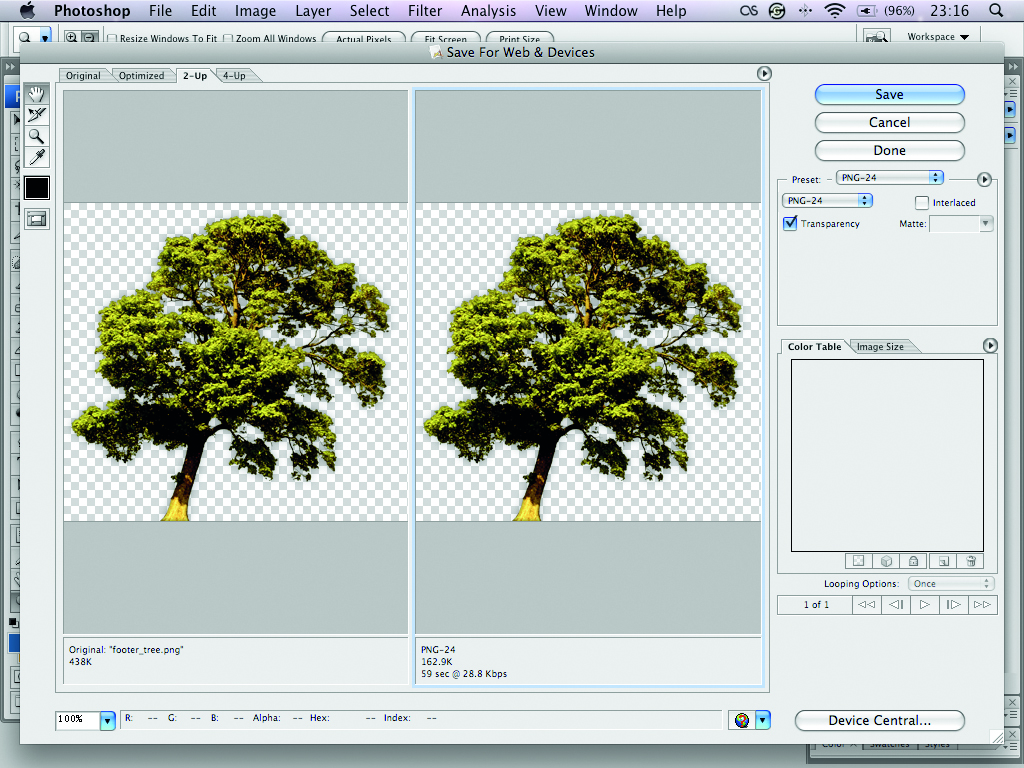
You only need three images: the tree, the feed icon (with the leaf) and a 1px wide repeater image for the main bar. As all of these images utilise full alpha transparency, you’ll need to save them all as PNG-24 files.
12. Starting point
Open index.html in your browser to see that we’ve got the main footer bar in place, with the content on top of it. Get familiar with the code in index.html and style_12.css. We’ll gradually improve the appearance of the footer by using different style sheets.
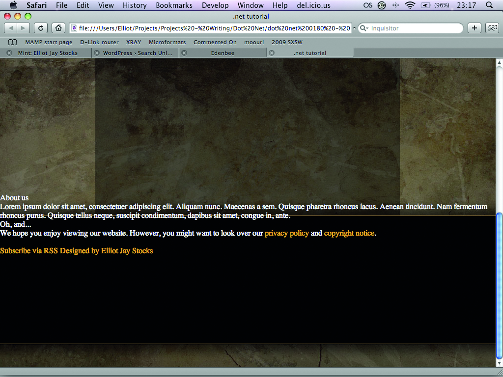
13. Inside out
Before we can do anything with the footer, we need to pull the content into the inner footer. In the <head> of your HTML file, change the CSS reference from style_12.css to style_13.css. Refresh your browser to see the improvements in place.
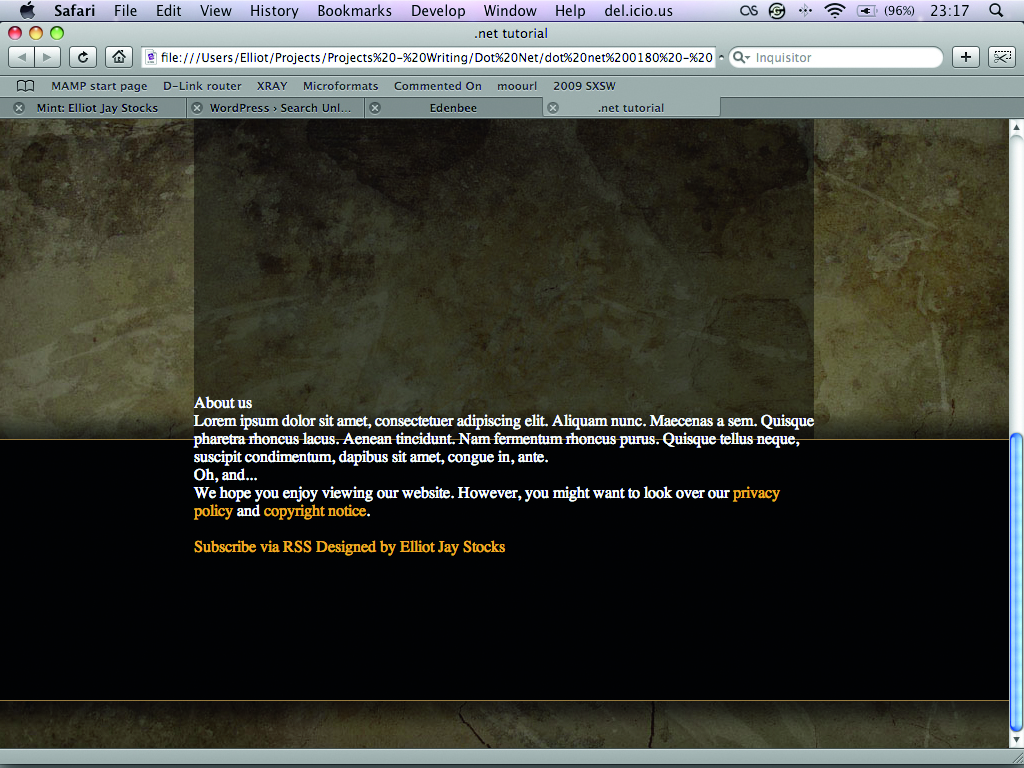
14. Columns
To make room for our tree image, we’ll need to move our text. There are two <div> elements that contain text, so we’ll display each one as a column floated to the left. Change the style sheet reference to style_14.css. Note that we have a <br> element to clear the floats.
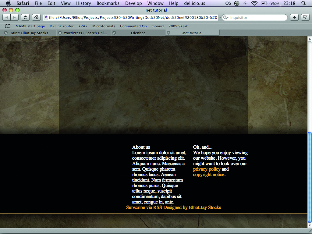
15. Place the tree
To place the image, we’re using a <div> element with the class of tree. Open style_15.css to see the code that defines the styles for this element. It’s positioned absolutely within the containing <div>, and shifted just outside the block with negative positioning.
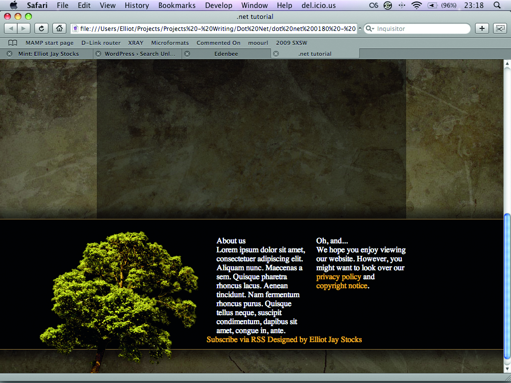
16. Image replacement
The <a> element with the class of feed – containing the link to our RSS feed – is positioned similarly to the tree. Open style_16.css and make sure you set display:block for this element, as <a> tags are not block-level elements by default.
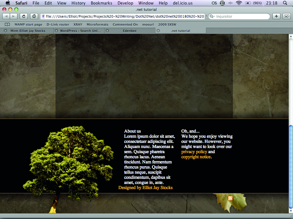
17. Nice typography
Our text looks rather horrible at the moment, as it’s based on browser defaults. Update your HTML file with a reference to style_17.css and you’ll notice the improved text once you refresh the file in your browser. The different font face and size helps add differentiation between the headings and paragraph text.
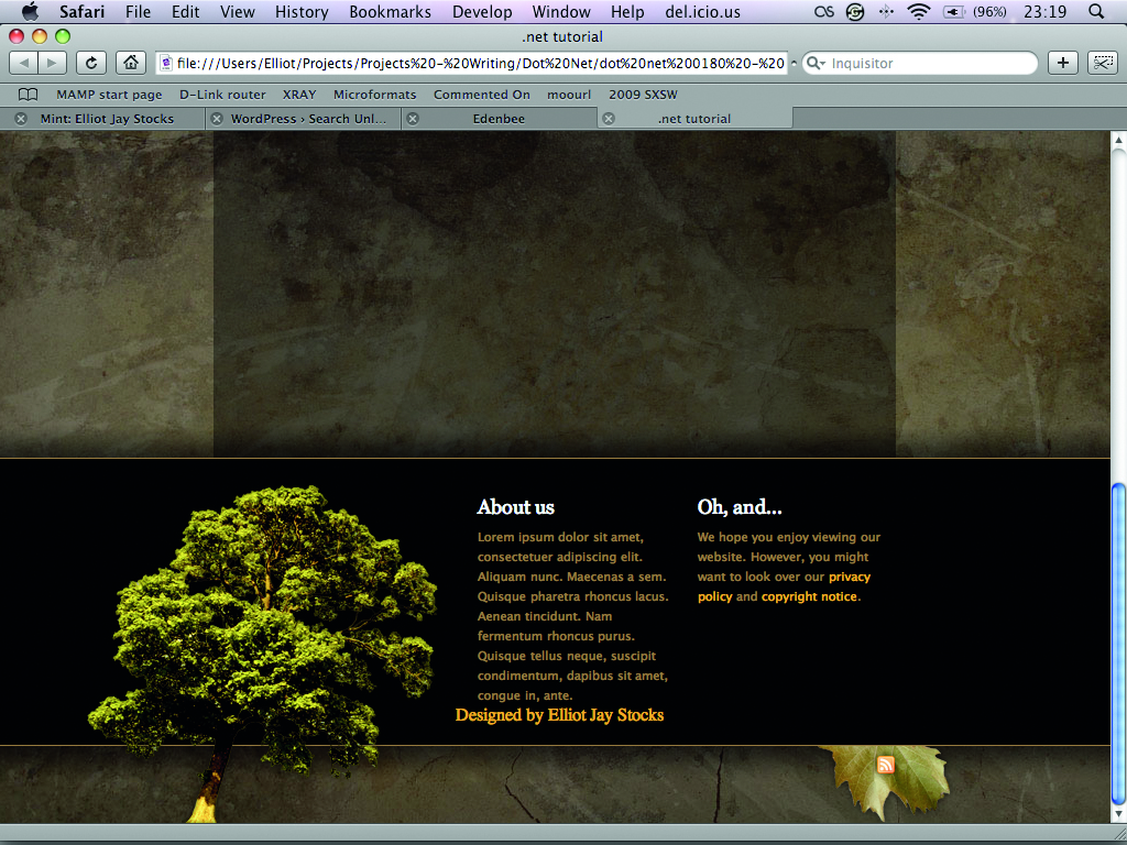
18. Credits
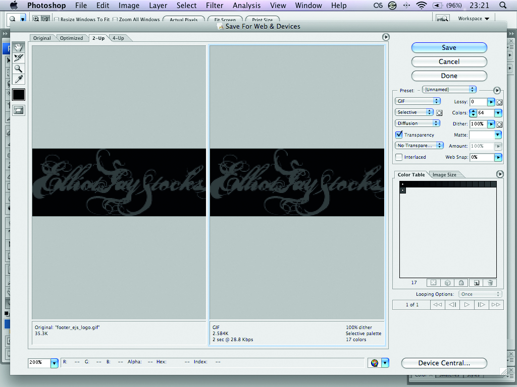
Lastly we need a style for the ‘Designed by’ credit. I’ve made a GIF of my logo the same width as one of the columns. Open style_final.css and notice it’s absolutely positioned so it sits exactly where we want it. The text is shifted off-screen using image replacement.
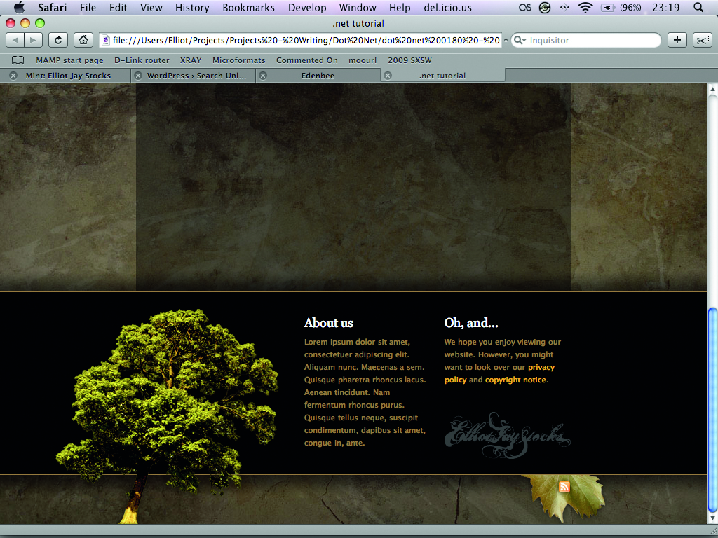
19. Finished!
Open demo.html to see the end result: a visually appealing footer that reflects the style of the header, and stands up well on its own. The content matches the grid above, but we’ve made it interesting by shifting some of the visual elements outside the blocks.

The Creative Bloq team is made up of a group of art and design enthusiasts, and has changed and evolved since Creative Bloq began back in 2012. The current website team consists of eight full-time members of staff: Editor Georgia Coggan, Deputy Editor Rosie Hilder, Ecommerce Editor Beren Neale, Senior News Editor Daniel Piper, Editor, Digital Art and 3D Ian Dean, Tech Reviews Editor Erlingur Einarsson, Ecommerce Writer Beth Nicholls and Staff Writer Natalie Fear, as well as a roster of freelancers from around the world. The ImagineFX magazine team also pitch in, ensuring that content from leading digital art publication ImagineFX is represented on Creative Bloq.
