How Clearleft built Code for America
Clearleft and Code for America explain how they created an accessible, consistent site for the US non-profit.
Sign up to Creative Bloq's daily newsletter, which brings you the latest news and inspiration from the worlds of art, design and technology.
You are now subscribed
Your newsletter sign-up was successful
Want to add more newsletters?
Five times a week
CreativeBloq
Sign up to Creative Bloq's daily newsletter, which brings you the latest news and inspiration from the worlds of art, design and technology.

Once a week
By Design
Sign up to Creative Bloq's daily newsletter, which brings you the latest news and inspiration from the worlds of art, design and technology.
Once a week
State of the Art
Sign up to Creative Bloq's daily newsletter, which brings you the latest news and inspiration from the worlds of art, design and technology.
Seasonal (around events)
Brand Impact Awards
Sign up to Creative Bloq's daily newsletter, which brings you the latest news and inspiration from the worlds of art, design and technology.
Bay Area non-profit organisation Code for America helps to make US government digital services beautiful, simple and easy to use. Its recent site overhaul, conducted in partnership with UK-based UX agency Clearleft, brought the same values to its own online presence. At Clearleft, Jon Aizlewood handled visual design, freelancer Anna Debenham took care of the frontend build, while Jeremy Keith oversaw work and wrote JavaScript. At CfA, UX evangelist Cyd Harrell handled IA, CTO Mike Migurski implemented changes, and senior marketing manager Dana Oshiro managed the project.
What were the goals of the project?
Mike Migurski: Our initial mandate was to replace the old, creaky Code for America website with something that looked more modern. As we started working on the project in summer 2013, we identified three goals that would help make the project better. First, Cyd Harrell's research on the motivations of our government and geek communities suggested that we should replace the jargon on the site with something written more directly for the audience.
Second, GOV.UK's launch focused new attention on the role of government websites and we wanted to have some meaningful first-hand experience to draw on when we advised city and county partners. Last, we realised that we had an enormous number of inconsistent-looking site designs for various initiatives, and we wanted a library of flexible, mobile-ready patterns to draw on when building future projects.
What UX research did you do?
Cyd Harrell: Since we were also working on our overall engagement model or architecture of participation, we did a more generative style of research than is typical for a website redesign. I conducted interviews with about 40 current, past and prospective participants in our various programs. I investigated people's motivations for working with us, their path from interest through full engagement, and the role the website played in their journey.
The most interesting discovery, which underlies much of the new website design, was an extremely strong desire to use their professional skills for good. Public servants and commercial technologists are blocked from this in different ways, and Code for America's activities offer ways past those blocks. So orienting our website to support people in acting and seeing the impact of their actions as quickly as possible became a top priority. You'll see this reinforced as we continue to develop the site.
How was the work divided?
Jeremy Keith: Usually when Clearleft is involved in a project, we cover the UX side of things, visual design, and sometimes frontend development (we deliberately choose not to do backend development). This project was a little different: Code for America had already been through a big content audit and worked through the user experience it wanted. That left us to do visual design and frontend development. As the work progressed, any issues relating to UX or information architecture were handled collaboratively.
How did you handle communication?
JK: We had a quick 'stand-up' conference call every day. For us, the call was at the end of the day: 5.30pm. That was 9.30am in San Francisco, just as people were getting into the Code for America office. That worked out surprisingly well. If we had anything we needed from them, we'd let them know at the end of our day; then they'd have their whole day to put that together so it was waiting for us when we get in to work the next day. These transatlantic chats were always nice and short. They rarely lasted longer than 10 or 15 minutes. That was long enough for everyone to get up to speed on what was happening. That level of continuous communication was just right: there were no unexpected surprises or 'big reveals' along the way.
Sign up to Creative Bloq's daily newsletter, which brings you the latest news and inspiration from the worlds of art, design and technology.
How did you adapt your process to manage time and budget constraints?
JK: Working on a tight timescale and limited budget meant that decisions had to happen fast: we didn't have the luxury of considering everything in great detail. That meant that ideas needed to be communicated in the quickest way possible. Sometimes that was just a sketch on paper. If more detail was required, Photoshop would come into play. If it was an interaction question, we'd try to quickly put some working code together.
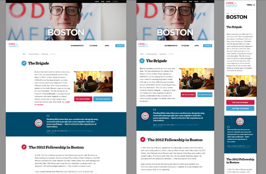
The short timescale also meant that design and development had to happen side by side: there just wasn't enough time to wait for the designs to be perfectly figured out before starting development. I think this had a positive effect. Designs were explored in Photoshop, but finalised in the browser.
Jon Aizlewood: Oddly enough the nine timezones between Brighton and San Francisco were a blessing in disguise. The daily stand-ups allowed us to talk through the work we had finished that day. Basically, each day was a sprint with a playback at the end, so we were designing, developing and iterating every day in time for 5.30pm. This meant no email tennis, no Basecamp novels, and very little project management as everyone was completely up to date with what everyone was working on. Alongside Google Docs for sharing content, page description diagrams and so on, we elected to use Trello for its Kanban-style approach of To Do, Doing and Done.
How would you characterise the project's core design values?
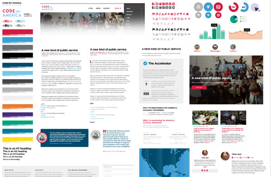
JA: The CfA team already had some branding work done by a stateside agency, which helped set the tone for the site's visual language. As we evolved this language for the web, we carried through the principles CfA uses as an organisation and represented them through the UI's strong, bold palette, large typography and overall simplicity. We wanted the site to be powerful and communicative, patriotic and approachable from any and all interested in the CfA movement.
MM: The three values driving the work were openness, currency, and optimism. The idea is that this is an accessible, welcoming place that shares its secret sauce, that the site is up to date both in terms of its content and how it actually works, and that citizens and governments can work together to make things better.
It sounds as though you got on pretty well. How did that affect the project?
JK: While Jon is a full-time Clearleft employee, Anna is a freelancer. But for this project, I insisted that she not only come into the Clearleft office but that she sat side by side with Jon. They didn't kill each other. In fact, I think they had a lot of fun. By the end of the project, Anna had almost convinced us of the merits of her controversial approach to making tea, documented at teamethod.co.uk. It was always nice to end the day with the transatlantic conference call to our counterparts at Code for America. The three people we were dealing with there were an absolute joy to work with.
Anna Debenham: We were on equal ground – the folk at Code for America really know their stuff, so they were able to give incredibly useful feedback and preempt problems. Building the system was just one part of the process. What's really going to determine how successful the project is will be based on how easy it is for Code for America to maintain and build upon it over the months and years.
What technologies did you use?
AD: We were asked to deliver CSS files rather than Sass, but we still used Sass during development to help with things like converting px values to rems and storing colour variables. The prototype templates were built with Jekyll, and this ended up being used on the live site because pages are stored as static HTML files instead of in a database, making it easy for other people to collaborate on. For managing tasks, we used Trello rather than sticking stuff up on a wall, so that at any point anyone could dip in and see what was in progress. Jon used Photoshop for the designs. This made me swear a lot, so he is not using Photoshop any more and is using Sketch instead.
For device testing and bug fixing, Ghostlab was a huge help. I could make changes locally to the prototype, refresh the browser on the desktop, and it would automatically refresh the browsers on all the devices. We used GitHub from day one for the prototype, and towards the end of the project, bugs were filed there. It's now where all the site files live, so it's easy to make changes.
Jon described this as 'the closest thing to a dream project'. How come?
JA: I think it the combination of constant dialogue, plus a client giving open and honest feedback is - to me - the cornerstone of any project's success. The daily sprints kept everything focused and on track, and the folks at CfA were receptive, quick to act, and knew what they were talking about. It doesn't hurt that they're just a really nice bunch of people who do good work for a good cause. All in all, it was a perfect mix.
AD: Code for America trusted us to deliver, and to experiment a bit - they were very open to ideas. It also helped that they liked all the designs, and shared our sense of humour!
How did you compile a pattern library?
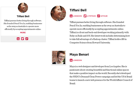
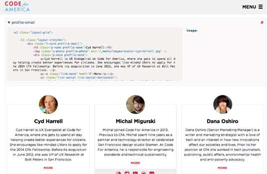
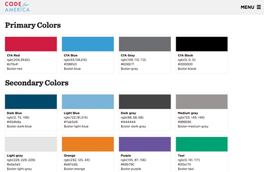
AD: Code for America sent us a brand style guide that they'd recently had produced. While Jon started mocking up templates, I picked through it and extracted out some of the things we'd need for the website: fonts, colours, icons and images. When we were ready to build mockups, I split the design up into patterns - separate modules of content - and built each of these and tested it on different devices. During our daily stand up, we'd go through which new patterns had been built and look at them in the browser together.
It was nice because having the code alongside the pattern meant sometimes Code for America would give us technical feedback on the HTML as well as the designs. Halfway through, I added a 'patchwork' view for the pattern library to help with device testing so we could check patterns at their full width rather than wrapped in a container.
Why did you share the library?
AD: Other than being a nice thing to do, why not? After all, if your website is public, the CSS and HTML are already available by viewing source. Not only is the library a great learning tool for others, putting it on GitHub means there's a place for people to suggest bug fixes or improvements. Also, knowing that the code is going to be in plain sight is a good incentive to write better, more thoughtful markup.
Why did you do an alpha release?
MM: We chose to do an alpha release six weeks before the main site launch for a couple of reasons. First, we wanted to be sure that our community had a chance to see and explore the new site before it replaced the old one, and take advantage of the content being on GitHub to send in corrections and additions. Second, as an organisation, we stand behind agile/lean development methodologies for our government partners and wanted to walk that talk. Also, it's less stressful to do a switchover when you can run it piece by piece over a period of time. Even now, the old site remains available.
How did you handle content migration from the old site?
MM: Content migration was the largest chunk of work. We started moving words months before we reached the visual design phase, rewriting and simplifying pages for the Governments and Citizens sections to reflect our constituent focus. Dana Oshiro, Cyd Harrell and I held half a dozen 'page culls' where we pruned and streamlined content, set up redirects, and built up new pages. Dana has an excellent blog post on this topic, 'Testing The Ugly Duckling'.
Once Clearleft's work was done, the month of January was an aggressive push to transfer remaining pages. Dana did the lion's share of this work, with a lot of copy/paste effort from Cyd and myself. It wasn't a glamorous job: we needed to strip down markup optimised for the old site's stylesheets, map out redirects so existing links didn't fail, move images and links, and continually test links between the two sites. A bit of Python code helped with the testing, a shared spreadsheet helped us co-ordinate, and an enormous number of HTTP redirects kept surprise 404s to a minimum. After alpha release, our community helped us complete page content via issues and pull requests.
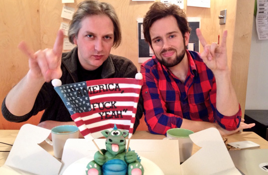
Did this project have a theme song?
JA: Funny you should ask. There's this film that has puppets, Matt Damon, and lots of swearing. Our days couldn't start until that particular film's theme song was played at full volume at least once. Code for America, Fuck Yeah!

Tanya is a writer covering art, design, and visual effects. She has 16 years of experience as a magazine journalist and has written for numerous publications including ImagineFX, 3D World, 3D Artist, Computer Arts, net magazine, and Creative Bloq. For Creative Bloq, she mostly writes about digital art and VFX.
