Turn visitors into customers with these newsletter signup tips
Signup is where people get their first impression of your business. Gene Crawford explains how to make it a good one.
Sign up to Creative Bloq's daily newsletter, which brings you the latest news and inspiration from the worlds of art, design and technology.
You are now subscribed
Your newsletter sign-up was successful
Want to add more newsletters?

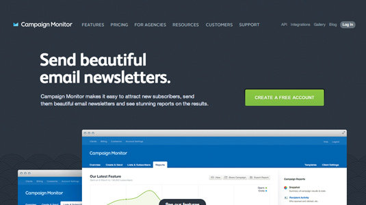
It’s crucial to get people to sign up when you have a software as a service (SaaS) business. There are a few basics we can think about that can help your conversion rate and bottom line. Having a clear call-to-action (making the link to your form easy to see and understand) will help you kick off the signup process.
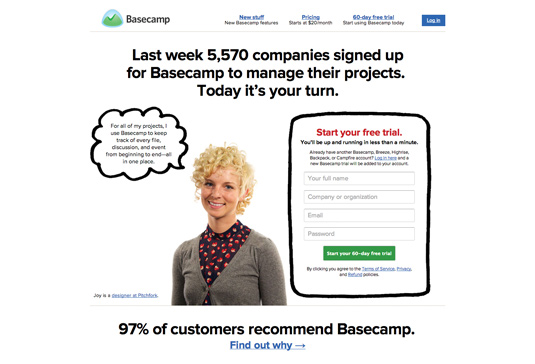
Keep the signup process fast and painless: it's a smart way to start doing business with a person. Placing informative information near the form can also contribute to conversions in a positive way. So if you have thousands of users, display that number. If you have endorsements, show those too. Use anything you have that can help build trust in your business or service right there on the form page.

Choose your weapons
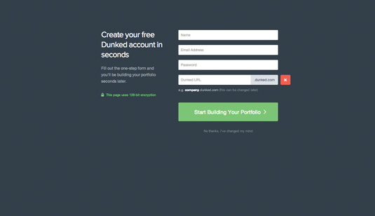
Any way you can show people that signup will be fast, accurate and easy will increase your ability to turn visitors into customers. Limit what you ask for 'upfront' on your form. If you get the customer into your system, or using your app in any way, you've won - and can ask for other non-essential details later. In its most basic form, this is called 'onboarding'. You can further improve conversions on your signup form by designing its layout in a way that makes it 'look' fast to complete to the user.
Article continues below 
The way you design your signup form visually can alter customers' perceptions of the process they're about to undertake. Stacking form fields and label placement can have a big effect on your form's visual flow. There are studies you can look up about best practices on these, but, for the most part, just be sure to take time to either consider the implications of your design decisions, or, in a best-case scenario, do some actual user testing.
Words: Gene Crawford
Gene Crawford's mission is to work tirelessly at providing inspiration and insight for developers. His projects include Unmatched Style and conferences such as ConvergeSE. This article originally appeared in net magazine issue 244.
Sign up to Creative Bloq's daily newsletter, which brings you the latest news and inspiration from the worlds of art, design and technology.

The Creative Bloq team is made up of a group of art and design enthusiasts, and has changed and evolved since Creative Bloq began back in 2012. The current website team consists of eight full-time members of staff: Editor Georgia Coggan, Deputy Editor Rosie Hilder, Ecommerce Editor Beren Neale, Senior News Editor Daniel Piper, Editor, Digital Art and 3D Ian Dean, Tech Reviews Editor Erlingur Einarsson, Ecommerce Writer Beth Nicholls and Staff Writer Natalie Fear, as well as a roster of freelancers from around the world. The ImagineFX magazine team also pitch in, ensuring that content from leading digital art publication ImagineFX is represented on Creative Bloq.
