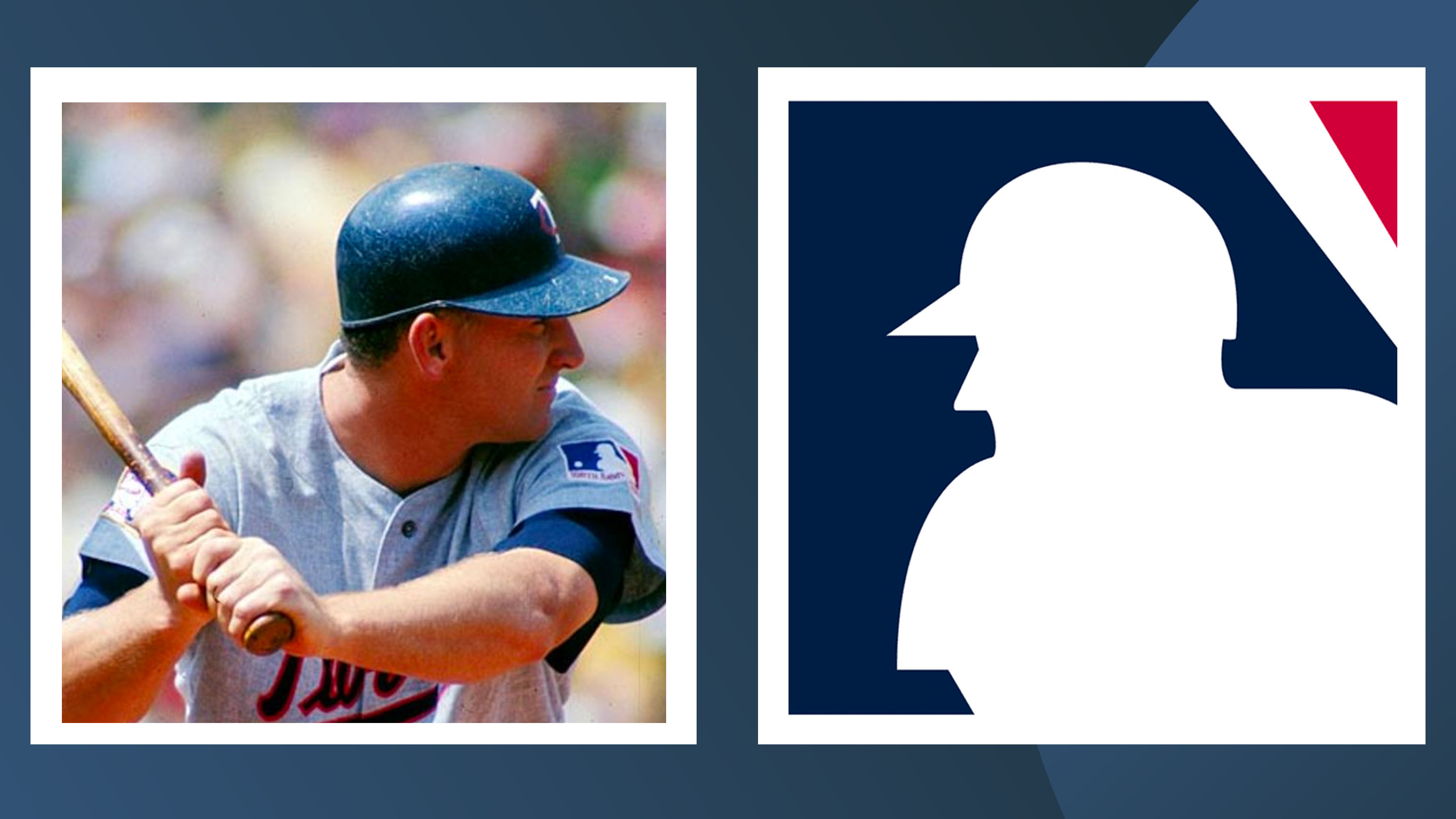
The MLB logo features a subtle yet genius optical illusion
What do you see?
From colour choice to shape, logos are designed to be both eye-catching and instantly recognisable. Most of the time, the simpler a logo is the better – and the iconic MLB is a great example of less is more. However, eagle-eyed baseball fans are noticing a hidden optical illusion that is a stroke of genius.
If you look closely, you'll notice that although the baseball player is mid-swing you can't actually tell whether he is stood facing the viewer or if his back is turned – and this is entirely intentional. (Feeling inspired? Why not check out our guide on how to design a logo.)

Designed by Jerry Dior, the logo shows an unknown baseball player wielding a bat mid-swing as a ball approaches. The illustration features a bold blue and red background, using negative space to create the white silhouette of the figure. It lacks any kind of outline or detailing – and that's the point. The logo is meant to symbolise all MLB players, and faces in an ambiguous direction to include left and right handed batters.

There has been oodles of speculation about who exactly the the original silhouette was based on. Some fans speculate it could be the profile of Harmon Killebrew who was at the height of his popularity during the original creation of the logo in 1968, but considering Dior stated that he couldn't remember who was in the original reference photos I guess we'll never know for sure.
Article continues belowOverall, the design choice is a clever way to represent the world of baseball without committing to any one player's likeness. If you're feeling the creative bug yourself, let us help get you started with our guide on how to download Adobe Illustrator. Or check out the best MLB logos to get inspired.
Read more:
- This epic optical illusion is making waves on Instagram
- Blink and you'll miss this awesome optical illusion
- 20 must-see optical illusions
Sign up to Creative Bloq's daily newsletter, which brings you the latest news and inspiration from the worlds of art, design and technology.

Abi Le Guilcher previously worked as Creative Bloq’s former ecommerce writer. With a Bachelor of Arts in Creative Design for Game and Film, Abi enjoys almost anything creative and will either be found crafting or gaming in her spare time. Her previous experience as a retail assistant at CeX means she has a wide range of knowledge in both technology and media and loves to keep up to date with the latest tech. Abi is an avid cosplayer and has most recently worked with PlayStation and Santa Monica Studio on a promotional campaign for the release of God of War Ragnarök.
