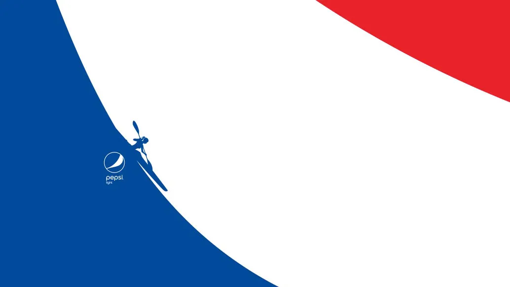
Soft drinks aren't exactly renowned for their health benefits. Pepsi Light's marketing revolves around its zero sugar and zero calorie content, but in an effort to build its outdoor credentials further, a new series of poster designs turn the drink's logo into a range of sporty activities.
In the project description for the ads, Sancho BBDO says the following: "Throughout its history, Pepsi Light has highlighted feminine curves; those linear figures that, at least conceptually, established the light spirit of our drink: thin, curvy women who freshened themselves with zero sugar and zero calories."
Article continues belowCrikey. However the agency wants to do more than simply highlight these "feminine curves" with its abstract ads. "It’s here where our curves, those that we have strengthened for more than 125 years, are going from something merely aesthetic to something really meaningful."
Check out these strengthened, meaningful curves in the posters by clicking left to right through the gallery below.


Related articles:

