American Express is one of the most instantly recognisable logo designs in the world. Yes, the fact that it has the company's name in big bold letters on it helps, but that iconic little blue box has become a symbol synonymous with AMEX. In fact, it's done its job so well since its inception in 1975 that it's remained the same ever since.
Until now.
For the first time in 37 years, AMEX has refreshed its visual identity, the design coming from Pentagram's Abbott Miller. But why now?

The refresh comes as part of the company's new global marketing campaign, called 'Powerful Backing: Don’t Do Business / Don’t Live Life Without It', which focuses on how deeply intertwined personal and work life can be, and the role that AMEX can play in supporting that.
The little blue box
Now serving hundreds of millions of customers across the globe, one of the main goals of the campaign was to reinvigorate the identity and optimise it across various platforms. To achieve this, the design team paid close attention to the iconic blue box logo.
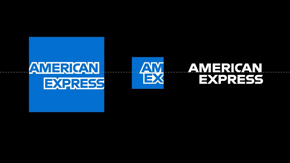
First introduced in 1975, AMEX's little blue symbol is instantly recognisable, so the aim was to preserve – but enhance – its design. To do this, the radial gradient was removed and the letterforms that cross through the centre of the blue square were redrawn and finessed in order for it to render in a clean, concise way that functions at both a large and small scale.
The classic outline of the lettering was also redrawn with a non-outlined version that operates outside of the box, a task undertaken by type designer Jeremy Mickel, who made sure to stay true to the original design.
The identity update also sees the introduction of an alternate mark for small-space digital use, such as Twitter and Instagram icons. This version of the blue box logo crops the larger wordmark to capture simply the 'AM EX'.

A number of other AMEX brand elements, including its distinctive Centurion and World Service pattern, have also been maintained and enhanced as part of the identity refresh.
The Pentagram website states: 'The new visual identity brings strength, simplicity, and rigour to the brand, extending a cohesive look and voice to American Express products, services and experiences.'

The overall campaign was a collaborative effort between mcgarrybowen, Pentagram, Ogilvy, Mindshare and Digitas. The advertising was directed by renowned director Lance Accord, and the photography by award-winning photographer Matthieu Young.
For more details on the AMEX project, head over to the Pentagram website.
Related articles:

