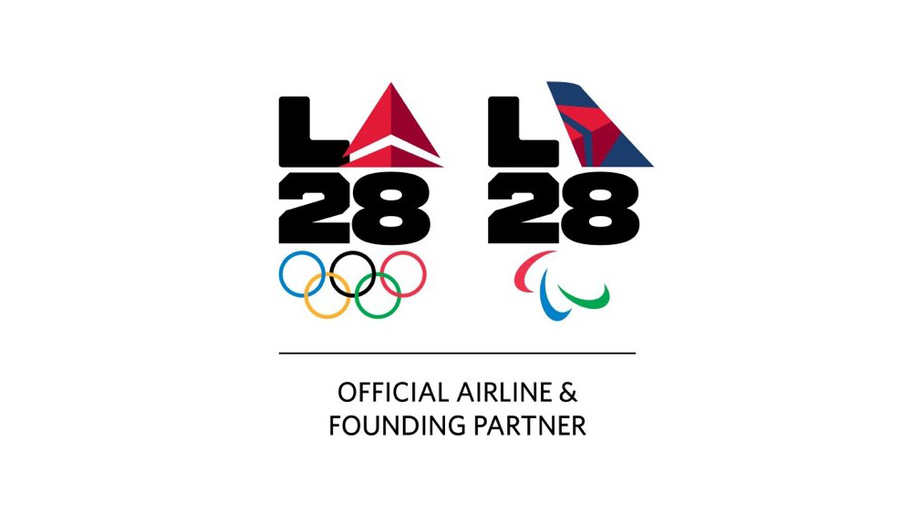
Delta's LA28 logos mark a controversial first in sponsorship
Delta's new LA28 logos show just how far brand sponsorships – sorry, partnerships – have evolved. The airline is the first of the LA28 Olympic Games corporate partners to take advantage of the LA28 logo's unique adaptability, putting its own logo not beside it, but inside it.
In case you missed the LA28 logo reveal back in 2020, it features an ever-evolving 'A' that can be adapted to take any number of forms. The idea behind that was supposed to be to represent the diversity of Angelenos, but it seems it will also represent corporate sponsors in what (we think) is a first in Logo design, and one that rewrites the rulebook on how to design a logo.

Brands are normally highly protective of their logos, setting out strict brand guidelines that forbid the designs from being altered in any way. We've just seen the International Olympic Committee itself follow that tradition with its new (and first ever) full Olympics branding.
Article continues belowWhen it comes to collaborations, partners and sponsors will often put their logos beside each other, but not interfering with each other in any way. There are often discussions about which goes first and how much space should be between each logo.
But the Los Angeles Olympics Games organisers have taken different approach with the LA28 logo, developing a modifiable 'A'. Some athletes have created their own versions, and top-tier sponsors have been given the opportunity too. “You can make your own,” LA28 chairperson Casey Wasserman said in 2020. “There’s not one way to represent Los Angeles, and there is strength in our diverse cultures."
LA28 🤝 Delta Air LinesProud to introduce the first of its kind LA28 and Delta integrated emblem!Delta is an inaugural Founding Partner and the official airline of LA28.Full release: https://t.co/w50VbD4WlR@Delta | @TeamUSA pic.twitter.com/SVYzE5evN8September 29, 2022
Delta Airlines is first off the block and... well, it's just replaced the 'A' with its regular logo and wing design. Emmakate Young, Delta’s managing director of brand marketing and sponsorships described it as “a symbol of our partnership with LA, our commitment to the people there, as well as those who come through LA, and a commitment to the Olympics."
Many people have praised the designs on Twitter, and have noted the opportunities the concept may open up for other collaborations. The PR pro Juliann Fritz said: "Never thought of access for a sponsor to an org's logo like how LA28 has done it, and that the Olympics would do it. Brilliant, edgy, and a bit dangerous." But not everyone is convinced/ "Just because you partner with someone doesn’t mean you need to use their ugly logo to make yours look worse," one person said. "Sad, they've commercialised the Olympics," another person said.
Sign up to Creative Bloq's daily newsletter, which brings you the latest news and inspiration from the worlds of art, design and technology.
Celebrating the world coming together, championing diversity, inclusion, respect, and integrity.@LA28, we're ready. #LA28 #LA28Creator pic.twitter.com/pHismhRL5jSeptember 2, 2020
Delta's effort is being talked of as the first example of an Olympics sponsor putting its touch on the malleable LA28 logo, but we recall Comcast's NBC coming up with the motion logo above a whole two years ago. Other LA28 'founding partners include Salesforce and Deloitte, so we look forward with some trepidation to what they'll come up with.
In the meantime, for more on logo history, see our pieces on the YouTube logo history and the Google logo history.
Read more:

Joe is a regular freelance journalist and editor at Creative Bloq. He writes news, features and buying guides and keeps track of the best equipment and software for creatives, from video editing programs to monitors and accessories. A veteran news writer and photographer, he now works as a project manager at the London and Buenos Aires-based design, production and branding agency Hermana Creatives. There he manages a team of designers, photographers and video editors who specialise in producing visual content and design assets for the hospitality sector. He also dances Argentine tango.
