
The Olympic Games symbol is one of the most recognised icons in the world. But perhaps strangely, despite logos and poster designs for each individual Olympics, and despite the measures it takes to protect its trademarks, the International Olympics Committee has never had a full brand identity.
Until now, that is. Some 125 years after the first modern Olympic Games, the IOC has developed a full package of brand assets, with colours, graphics, illustrations and three exclusive typefaces. As we'll see below, there are more colours than you might think. But the branding is very much like the Olympics itself, vibrant, colourful, exciting and with lots of rules. In fact, the style guide – or guides – are among the longest we've ever seen (and longer than some of our picks of the best graphic design books).


The International Olympic Committee has presented an epic new brand identity for the Olympic Games ahead of Paris 2024. Of course, the Olympic rings themselves remain as they are, but there's now a wide-ranging set of graphics, type, illustrations and colours with rules on possible combinations, all designed to strike a balance between “tradition and modernity” for a visual identity that can exist both online and in physical pieces.
The IOC says it's the first time it's created a full set of graphics and typefaces to represent the games across all channels. To do so it worked with the creative agency Hulse & Durrell, on a project that started way back in 2018. It's already begun using some of the new assets, but it's now published its full brand guidelines, full-style guides. At 129 pages, the full document is longer than the Olympic Charter, but here's a look at some of the highlights.
The new Olympic colours


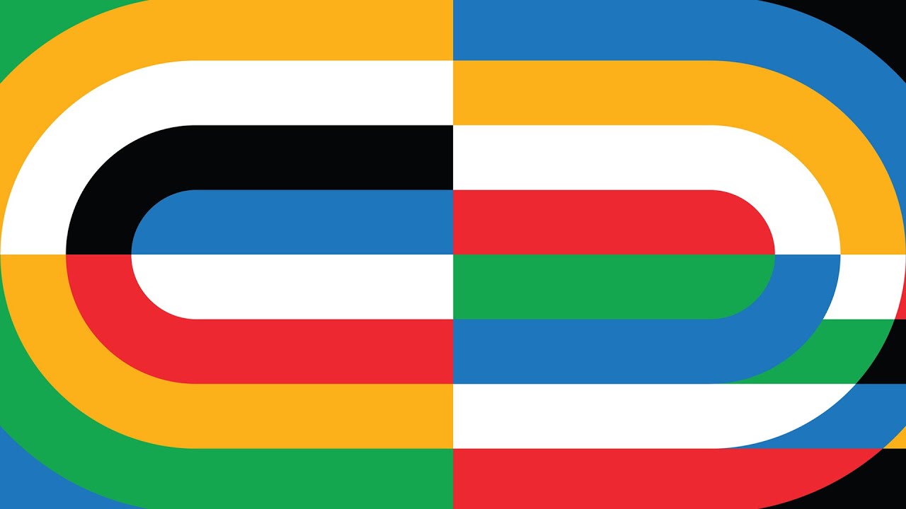
One big change is that the Olympic colour palette has been expanded to include additional darker and lighter shades of the five colours of the Olympics rings. The colours of the gold, silver, and bronze medals have also been incorporated into the palette, along with rules about how they can be combined.
Olympics branding graphics and illustrations


The Olympic brand guidelines include detailed guidance for everything from illustration styles to photography and infographics. The are 17 official hand-drawn illustrations. Created by artists Francesco Ciccolella, Abbey Lossing, and Karan Singh. the vibrant designs are intended to capture the spirit of the games and were conceived to allow a range of options for cropping to different applications.
There's also a set of graphics inspired by the geometry of the field of play in various Olympics sports and pictograms depicting all of the Olympics events. And there are plenty of rules and recommendations about each should be applied – a dream for anyone who loves directing brand guidelines.
The new Olympic typography


There's a full set of brand type too. Fabian Harb and Seb McClauchlan from the type studio Dinamo and Julien Hérbert from Canadian design agency Principal were drafted in to develop three exclusive typefaces for the Olympics: Olympic Headline, Olympic Sans and Olympic Serif. The first, with caps only, is described as "bold, athletic and proud" and was inspired by typography used in the Tokyo 1964 and Seoul 1988 emblems.
It's perhaps surprising that in 125 games of history only now are they getting a fully developed brand identity complete with proprietary fonts and graphics, but it's not the first time Olympic branding has been so beautifully presented – just check out that 1964 Olympic logo design sheet.
But the new Olympics branding is bright and vibrant and seems to gel well with the spirit of the games. It feels fresh and modern – but at the same time more in line with the Olympic tradition and legacy than the much-mocked Paris 2024 logo.
Read more:

