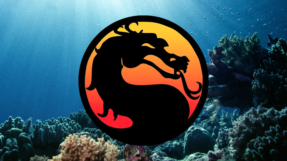
The Mortal Kombat logo defined an era of gaming. The yin and yang-like dragon silhouette against a sunset gradient seemed to perfectly represent one of the biggest gaming franchises of the early nineties. It felt dark, brooding and mystical. But, apparently, it was almost the game's first fatality.
Mortal Kombat's co-creator John Tobias has revealed that he almost went back to the drawing board because of a comment from his sister about one of his original sketches the design. The problem? She saw the fearsome dragon as a harmless seahorse (Mortal Kombat 11 doesn't make it to the list, but see our picks of the best Nintendo Switch games and the best PS5 games if you're looking for something new to play).

Tobias has taken to Twitter to share some of the process he and fellow game creator Ed Boon took for the development of the Mortal Kombat logo. He's shared his earliest sketch of the design, and he revealed that his sister mistook it for a seahorse and that he "almost tossed the dragon icon sketch aside."
The dragon icon seems the perfect fit for Mortal Kombat, but Tobias also revealed that it only really exists because the game almost had a different name. One of the titles he and Boon were considering was Dragon Attack (we're glad they thought better of that, but we're equally glad that they stuck with the memorable dragon logo).
Side Note: I almost tossed the dragon icon sketch aside when I was at home working on it at my drafting table and my sister mistook the dragon for a seahorse ¯\_(ツ)_/¯ pic.twitter.com/d1omW1as1ASeptember 22, 2022
In more delightful trivia, Tobias reveals that the Dragon Attack title was poached from a Queen song of the same name. And while he and Boon finally settled on a more convincing name, they stuck with designs for a coin-op cabinet with a dragon and red and black colours (two colours mentioned in the Queen song). The inspiration for the look of the dragon on the cabinet came from a golden dragon statue that belonged to Midway Games general manager Ken Fedesna.
The programmer John Vogel borrowed from Fedesna's desk and digitised it. It was the dragon on the cabinet design that Tobias then took as inspiration for a logo to represent both the game and the fictional tournament within in. His final sketch was then traced over with pixels to create the logo for use in the game itself. The logo was originally used facing in both directions. It was only when they had to trademark one design for use in console versions of the game that it was decided to have the dragon facing right.
I had been thinking of creating an icon to represent the fictional tournament, but also to brand the game with a symbol… like Superman’s “S” or Batman’s bat symbol. I used the dragon from my cabinet side panel sketch to inform the look of the dragon icon as our symbol… (7/9) pic.twitter.com/EV2NNQaXDgSeptember 22, 2022
Fans have been delighted by Tobias's revelations, including some who mention how the Mortal Kombat logo inspired their school art projects. It's also interesting to see that the ying yang reference was not accidental. The logo was designed that way intentionally.
It's a fascinating glimpse into the history of an iconic logo that's stood the test of time – twenty years after the release of the first Mortal Kombat, the logo's still being used in Mortal Kombat 11. And still looks as elegantly dark and mystical and it did back in the day... only now we'll never be able to not see it as a seahorse.
For more logo inspiration, make sure you see our pick of the best logos of all time and our guide to how to design a logo. And if you're a Sega fan, don't miss the new Sonic logo.
Read more:

