Designers react to the new Mastercard logo
For the first time in 20 years Mastercard has updated its logo. How has the rebrand gone down with designers?

Sign up to Creative Bloq's daily newsletter, which brings you the latest news and inspiration from the worlds of art, design and technology.
You are now subscribed
Your newsletter sign-up was successful
Want to add more newsletters?
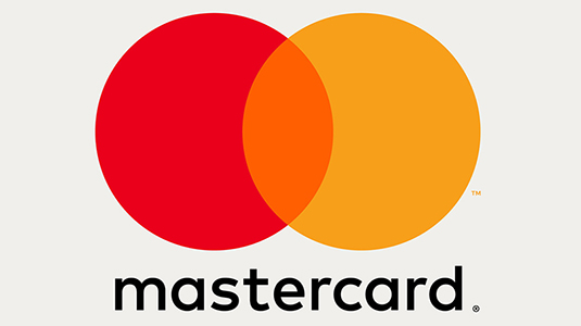
Mastercard has gone back to basics with their latest logo redesign by Pentagram, which was revealed last week. The overlapping red and yellow circles form one of the most instantly recognisable logo designs in the world – and this recent update simply tightens the image to work for an increasingly digital landscape.
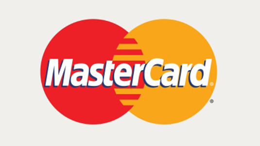
Whereas the previous iteration saw the colourful circles slotting together like a jigsaw, the new version sees them blending together like a Venn diagram and creating an orange section in between. This evolution of the design represents the simple and optimised services Mastercard offers.
“Today, it is all about connected-consumers, and digital is at the heart of enabling practically everything they do in all spheres of their lives,” explains Mastercard's Chief Marketing and Communications Officer Raja Rajamannar.
Article continues below 
The typography has also been overhauled and pushed beneath the logo. Gone are the drop shadows and the chunky serifs, in their place is the round FF Mark which mirrors the distinctive Mastercard graphics.
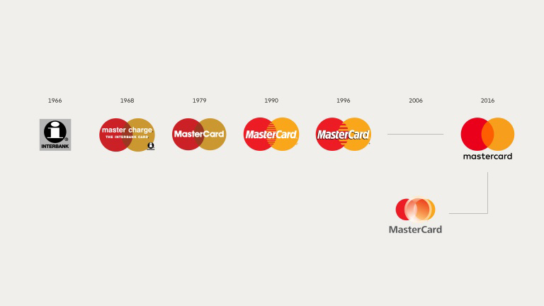
The new brand mark represents the first update to the design since the mid nineties, however the circular imagery can be traced back a few more decades to the late sixties.
Pentagram's Luke Hayman explains that the new symbol returns the brand to its fundamental roots. “At the same time, its basic characteristics have been used to generate a completely coordinated system of shapes, colours, and typography.”

With the new logo and branding set to appear across every touchpoint of the Mastercard brand, including customer cards, signage and digital devices, it's unsurprisingly drawn the attention of designers.
Sign up to Creative Bloq's daily newsletter, which brings you the latest news and inspiration from the worlds of art, design and technology.
Recent logo redesigns, such as the revamped Guinness harp, have drawn praise from the creative community for bucking the flat design trend, so how has this latest rebrand go down with designers?
Loving it. MasterCard Banks on New Logo - https://t.co/9SPczjx6IH #design #logodesignJuly 16, 2016
I support the new MasterCard logo #design.July 14, 2016
Loving the new Mastercard branding! A nod to the 1979 Logo! @Design_Week #design #brand #mastercard https://t.co/1m7HQLT9PWJuly 18, 2016
I want to renew my @Mastercard because of the new logo. #designJuly 15, 2016
Comments about the ™ on the MasterCard logo = Design trolls grasping at straws to hate on a successful logo. pic.twitter.com/Sql7Dn8UBYJuly 15, 2016
While most of the feedback has been positive, there are some who think a financial institution should have are more professional appearance.
Not digging it. Too playful | For the first time in 20 years, @MasterCard has a new logo https://t.co/4lQ9PcAWQN by @DianaBudds #logodesignJuly 16, 2016

Dom Carter is a freelance writer who specialises in art and design. Formerly a staff writer for Creative Bloq, his work has also appeared on Creative Boom and in the pages of ImagineFX, Computer Arts, 3D World, and .net. He has been a D&AD New Blood judge, and has a particular interest in picture books.
