Striking new Eurovision 2021 logo revealed – and Twitter is divided
Do you love it or hate it?

Sign up to Creative Bloq's daily newsletter, which brings you the latest news and inspiration from the worlds of art, design and technology.
You are now subscribed
Your newsletter sign-up was successful
Want to add more newsletters?
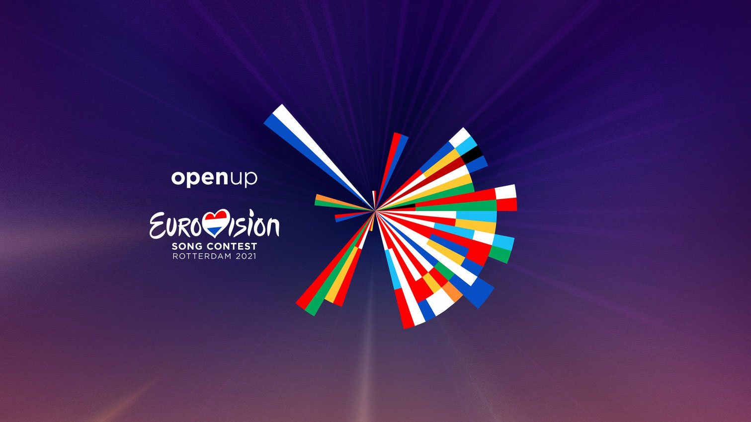
If you're looking for some joyful news to top off your week, maybe this will do it for you. Eurovision's 2021 logo has been released, bringing with it a sense of normality. Now, given 2020's logo never actually got to be used (despite it winning two major design awards), we weren't surprised to learn that the new logo is largely based on the previous incarnation – after all, the poor thing deserves to have its moment in the sun.
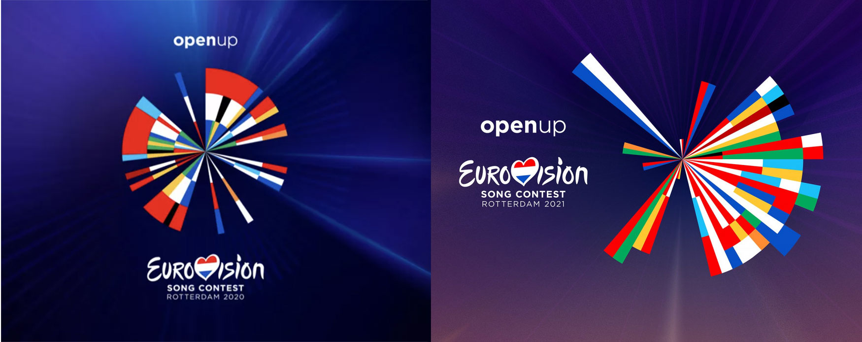
In case you didn't know, Eurovision will be held in Rotterdam this year (after the event was cancelled last year because of, well, you know). And while last year's design was a data-driven manifestation of the competition's 65-year history, 2021's edition has been tweaked to be based on the composition of the world map, with Rotterdam at its heart. Does it rival the best logos ever?
Created using software developed in-house by design agency Clever ° Franke, the logo is based on themes of connection and "coming together". Gert Franke, the agency's co-founder, explained that they "extended the style from last year to 2021", retaining the "simple, intelligent, minimalist and experimental" elements. Check out the versions side-by-side below.
Article continues below 
The agency explained the logo in a tweet (below).
The new logo of @Eurovision 2021 symbolizes togetherness and connection. Using a custom developed software, we renewed last year’s logo by emphasizing the geographical location of participating countries.Check it out:https://t.co/2UDgwlGBer pic.twitter.com/v925XG4SSjDecember 4, 2020
We really enjoy the data-driven approach to logo-ing as the software makes for striking, meaningful design, which is open to endless analysis. And the responses to Eurovision's tweet (below) proves how well it works as a talking point. However, the style is not for everyone, and there are certainly some fans who are unhappy with the design, or see how it could be tweaked further.
Should look like this if you want an accurant map representation 😅 pic.twitter.com/x3UMbOxTcMDecember 4, 2020
Ucrania es esta pic.twitter.com/qj1K0ONtT2December 4, 2020
To be honest, I really love the fact that they added purple colour in the background https://t.co/WscgU154mTDecember 4, 2020
It was a big oof moment hahaDecember 4, 2020
Love that the overarching concept from 2020 remains, but tweaked for a new year. However, I wish it wasn't so skewed to one side. Maybe they could have started from Lugano? https://t.co/MNi4MouNZ8December 4, 2020
Eurovision is determined the event will take place in some form next year, whether virtually or in person so hopefully this logo will have its chance to shine. What do you think of the new design? And how do you feel it compares to last year's version?
Let us know on Twitter @creativebloq, Facebook @creativebloq, or Instagram @creativebloqofficial.
Sign up to Creative Bloq's daily newsletter, which brings you the latest news and inspiration from the worlds of art, design and technology.
Read more:
- Eurovision Song Contest reveals 2017 logo
- Logo design: All you need to know
- Where to find logo design inspiration

Georgia has worked on Creative Bloq since 2018, and has been the site's Editor since 2023. With a specialism in branding and design, Georgia is also Programme Director of CB's award scheme – the Brand Impact Awards. As well as immersing herself with the industry through attending events like Adobe Max and the D&AD Awards and steering the site's content streams, Georgia has an eye on new commercial opportunities and ensuring they reflect the needs and interests of creatives.

