Eurovision's data-driven 2020 logo is all about unity
Colourful new logo represents every participating nation.
Sign up to Creative Bloq's daily newsletter, which brings you the latest news and inspiration from the worlds of art, design and technology.
You are now subscribed
Your newsletter sign-up was successful
Want to add more newsletters?
The annual Eurovision Song Contest has long been a favourite of anyone who appreciates an evening of cheesy international pop combined with a nail-biting judging process. And while it's generally been a Europe-focused event, the rest of the world is gradually catching on to its kitsch delights, and the contest is becoming bigger every year.
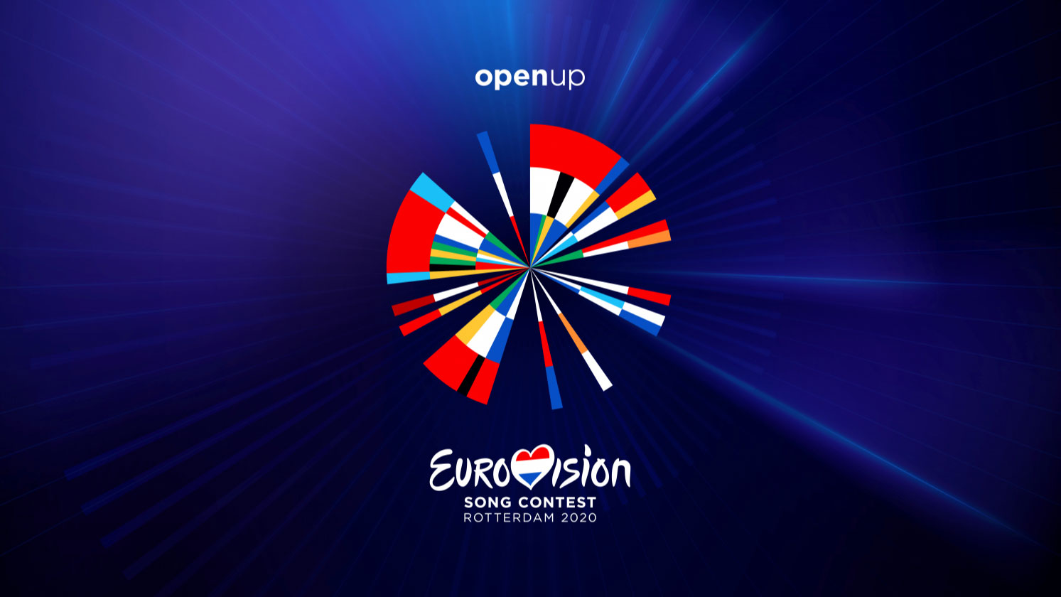
The first Eurovision Song Contest, 65 years ago, involved just six countries; over the years, more and more countries have got involved, and next year's contest in Rotterdam sees 41 countries participating. And to celebrate the contest's ever-expanding inclusivity, next year's Eurovision has a data-driven logo design that cleverly involves every country taking part.
The abstract logo design is the work of data visualisation agency CLEVER°FRANKE, and follows on from previous circular designs used when the Netherlands have hosted the contest in the past. Informed by the minimalistic, experimental and innovative characteristics of Dutch design, the new logo features the flag colours of each country competing in the 2020 contest, in the order in which they first participated in Eurovision.
Article continues belowWe’re proud to announce that we’ve created the visual identity of one of the world’s longest-running TV events: The Eurovision Song Contest 2020!@Eurovision will take place in Rotterdam in May, with 41 countries participating and the show being watched all around the world. pic.twitter.com/QePnx2H9cGNovember 28, 2019
As well as the flag colours, CLEVER°FRANKE has also squeezed in a couple of cheeky little references to the Netherlands' own Eurovision record. Not only does the design start off with the Dutch colours – fair play, as the Netherlands opened the first Eurovision Song Contest in 1956 – but the radial background of the design also features five bright beams of light, each one representing the five times the Netherlands won the competition, the last time this year.
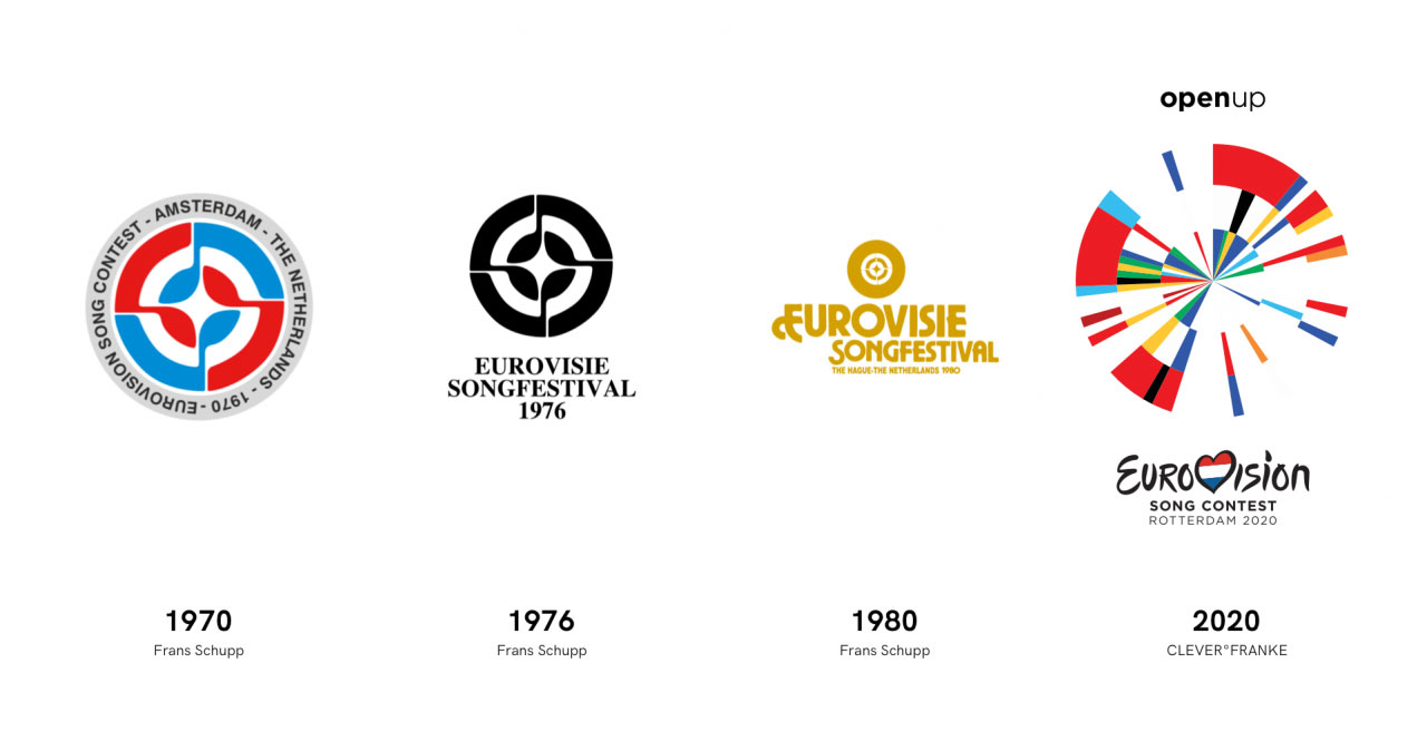
It's not an especially minimal logo, but it's hard not to like this dynamic and versatile design from CLEVER°FRANKE, and we love how it can be used in various ways, focusing on small sections of the design to create vivid, eye-catching bursts of colour that look great on all manner of applications.
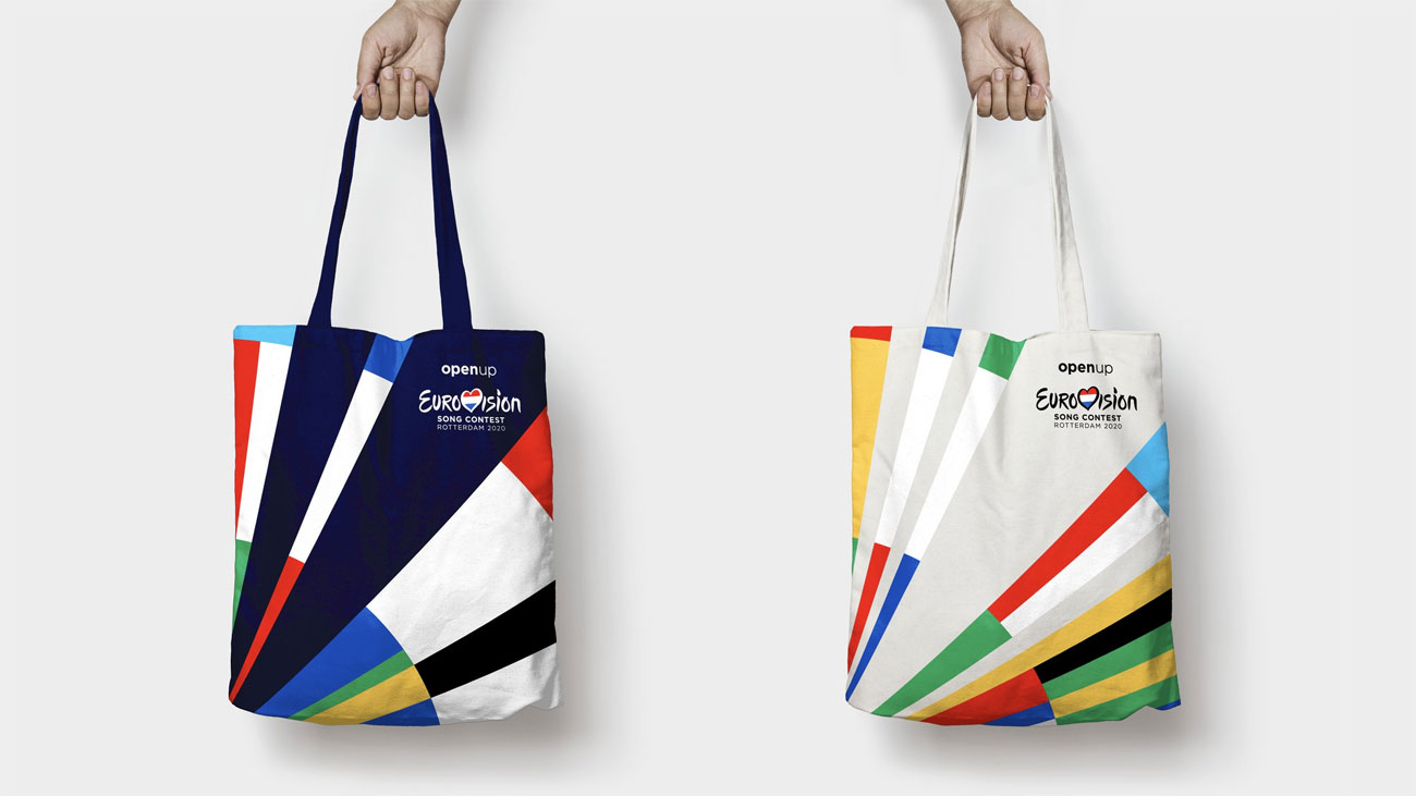
The 2020 Eurovision Song Contest takes place in Rotterdam between 12-16 May; you can find out more about the logo design here.
Related articles:
Sign up to Creative Bloq's daily newsletter, which brings you the latest news and inspiration from the worlds of art, design and technology.
Jim McCauley is a writer, performer and cat-wrangler who started writing professionally way back in 1995 on PC Format magazine, and has been covering technology-related subjects ever since, whether it's hardware, software or videogames. A chance call in 2005 led to Jim taking charge of Computer Arts' website and developing an interest in the world of graphic design, and eventually led to a move over to the freshly-launched Creative Bloq in 2012. Jim now works as a freelance writer for sites including Creative Bloq, T3 and PetsRadar, specialising in design, technology, wellness and cats, while doing the occasional pantomime and street performance in Bath and designing posters for a local drama group on the side.
