In a year that's seen Europe go through a bit of turbulence, the Eurovision Song Contest looks to restore some order to the continent with its new logo design.
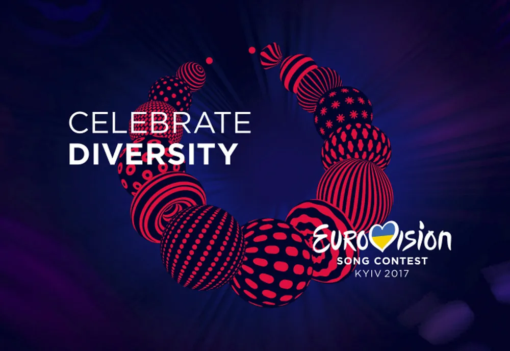
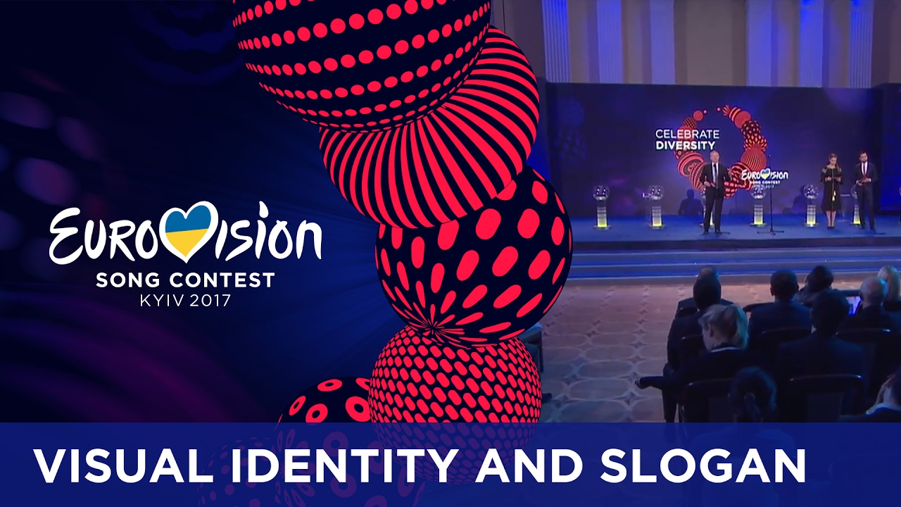
Created in collaboration between two Ukranian agencies, namely Republique and Band, this logo is all about inclusivity. Topped off with the slogan 'Celebrate Diversity', viewers and attendants can expect to see this design plastered all over the contest when it takes place in May at the Ukrainian capital, Kiev.
According to festival executive supervisor Jon Ola Sand: "the concept of celebrating diversity [...] perfectly matches the values of Eurovision: total inclusion and openness to countries across Europe and beyond, uniting together to celebrate both our common ground as our unique differences as well as good music. "
The logo takes its inspiration from a traditional Ukrainian necklace called Namysto. This necklace is said to be more than just a piece of jewellery, in fact it is a protective amulet and a symbol of beauty and health. Made up of different balls, each with their own design, Namysto celebrates both diversity and individuality.
For the logo, the design studios gave the necklace a modern twist by introducing bright colours and eye-catching patterns. Each ball on the necklace will have an individual design that is intended to symbolise a continental connection through a shared love of music.

Related articles:

