There's a big problem with Joe Biden's campaign logo
Online design critics have spotted some major flaws.

Last month saw former vice president of the United States Joe Biden throw his hat into the ring as a candidate for the 2020 presidential race. Announced with a sobering video and a new website, Biden's campaign features a logo that has attracted the wrath of online design critics.
What does and doesn't make for a good logo can be a heated topic at the best of times, but chuck politics into the mix and it looks like you've got a match made in hell. We've already covered everything you need to know about good logo design, so let's take a look at how the Biden campaign measures up.
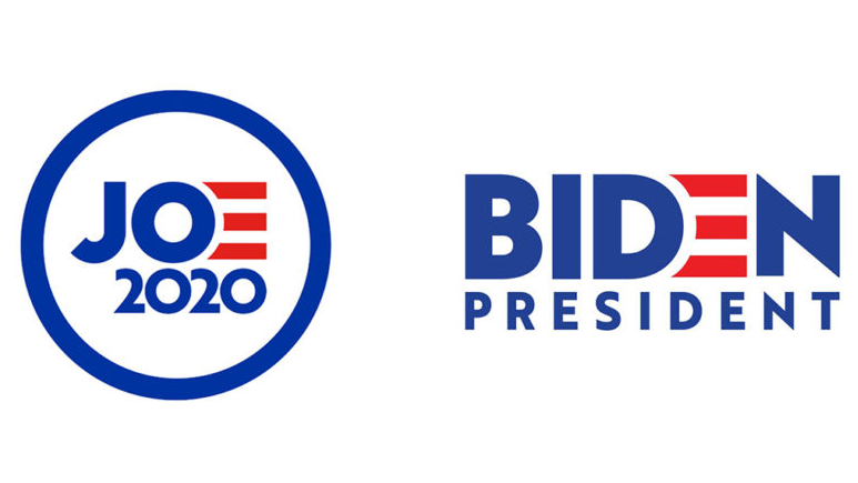
The campaign includes two logos, a circular version and another one that confidently stacks the word 'Biden' on top of 'president'. Each is suitably decked out with the familiar red, white and blue of the Star-Spangled Banner, and they firmly establish Biden as the front runner of the Democrats.
Article continues belowOur country is being put to the test, but I’ve never been more optimistic about America. Together we can do this. Make a Day One donation to join us. https://t.co/xfD5pLtmAf #Joe2020 pic.twitter.com/UbLPMfE8UiApril 25, 2019
The most notable element of the logo though is that the 'e' in Biden strays away from the rest of the sans-serif lettering. Instead, it's depicted with red flag stripes. Why is this notable? Well, it depends on who you ask. We're going to remain as politically neutral as possible here, but it's impossible to discuss the kickback to these logo without addressing Biden's behaviour.
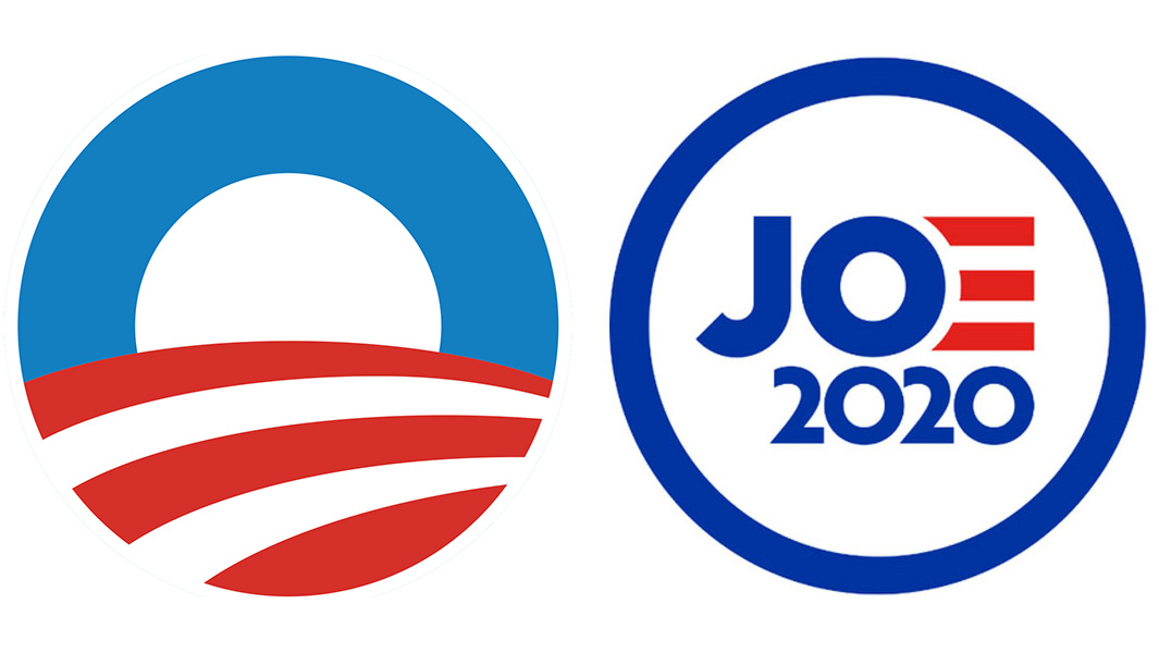
Let's start off with one of the most popular criticisms. Type 'Joe Biden logo' into Twitter and you'll instantly run into users comparing the design to a similar-looking icon used by Obama during his campaign. There's the same 'O' shape at the heart of it, plus some swooping red and white stripes, so you can see where they're coming from.

Of course Biden is closely linked to Obama, having served under him during his time as president. However maybe it would've been a good idea for Biden's campaign to set him apart from Obama, rather than appearing to rely on a connection to what's gone before.
Other complaints focus on the shape of the lettering and the spacing between the red stripes. According to critics, these have been laid out in a haphazard manner, with the slant on the letter 'J' not running parallel with the slope on the number 2.
Sign up to Creative Bloq's daily newsletter, which brings you the latest news and inspiration from the worlds of art, design and technology.
A misalignment of the logo elements is also being blamed for why viewers might be finding the design difficult to look at without knowing exactly why. This gripe reminds us of the diagram Riot Games released to justify their new logo. We'd forgive you for writing off these complaints as logo design pseudoscience, because functional and well designed logos don't have to line up neatly to work.
There's no shying away from the major flaw some people have found though, and it all comes back to those red stripes. According to critics, these conjure up the image of a red hand. This is also an open goal for Biden's opposition to remind everyone of his harassment allegations, especially as they claim that the kerning looks like the letter 'e' getting a little too up-close-and-personal with the letter 'n'.
Of course, reading into the logos of politicians is nothing new. Cast your mind back to the 2016 presidential race, and similar attacks we're being launched at Clinton's logo. At the time her opponents were claiming that it was stolen from WikiLeaks and that it contained hidden meanings.

If we were to be design nitpicks though (and we are), we'd criticise the profile picture logo on Joe Biden's official Twitter account. No matter your political leanings, the wonky spacing on that thing is unforgivable!
Related articles:

Dom Carter is a freelance writer who specialises in art and design. Formerly a staff writer for Creative Bloq, his work has also appeared on Creative Boom and in the pages of ImagineFX, Computer Arts, 3D World, and .net. He has been a D&AD New Blood judge, and has a particular interest in picture books.
