Medium reveals a new logo... again
The online publishing platform has already replaced the logo it introduced in 2015.

Sign up to Creative Bloq's daily newsletter, which brings you the latest news and inspiration from the worlds of art, design and technology.
You are now subscribed
Your newsletter sign-up was successful
Want to add more newsletters?
How much time does it take for a brand identity to become stale? For Medium, less than two years seems to be long enough. Earlier this week the online publishing platform unveiled a new logo (above) and wordmark to replace the colourful, three-dimensional logo design it used from late 2015.
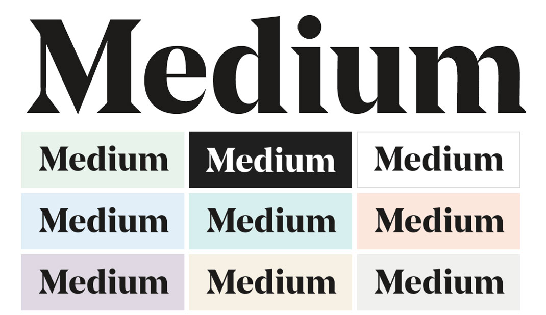
Created by Medium's in-house designers and San Francisco-based design and branding studio Manual, the new black and white logo is an abrupt change that calls back to the original look of the site from 2012 through to 2015.
The new logo is sure to be a welcome change for eagle-eyed designers who had a negative reaction to the Medium 2.0 rebrand. While the vibrant 2015 design (below) came under scrutiny for its inconsistent corners and the questionable quality of its 3D effect, the 2017 logo takes a more mature approach with flat, sleek letter shapes.
Article continues below 
When looking through the evolution of the Medium brand, the new logo looks like a logical refinement of the site's original monogram (below). The glyphic serifs give Medium an authoritative editorial look that also manages to appear more personable than the square corners found on the platform's first identity.

This brand journey, circling back to a mature and sophisticated look, only helps to highlight Medium's 2015 whacky phase. While the colourful logo was certainly fresh and distinctive, perhaps it deviated too far from what Medium wants to be known for.
The 2017 identity does include a nice range of tasteful palette options, though, which Medium might not have hit upon if it didn't experiment with colour before.

The good news for Medium is that plenty of designers appear to like this refined rebrand. Many have already taken to social media to sing the praises of the new look and crack a joke at what has been appropriately described as the 'teenage phase' of the 2015 logo being over.
Sign up to Creative Bloq's daily newsletter, which brings you the latest news and inspiration from the worlds of art, design and technology.
However, many were left scratching their heads as to why the 2015 design was scrapped so quickly. Whatever the reason, let's hope it's a case of third time lucky for the site.
Related articles:

Dom Carter is a freelance writer who specialises in art and design. Formerly a staff writer for Creative Bloq, his work has also appeared on Creative Boom and in the pages of ImagineFX, Computer Arts, 3D World, and .net. He has been a D&AD New Blood judge, and has a particular interest in picture books.
