Kanye West's Yeezy x Gap logo is finally here (and we have questions)
Where's the swagger, Ye?
Sign up to Creative Bloq's daily newsletter, which brings you the latest news and inspiration from the worlds of art, design and technology.
You are now subscribed
Your newsletter sign-up was successful
Want to add more newsletters?
There have been whispers of Kanye West's collaboration with high street favourite Gap for a while now, and it seems the Yeezy x Gap mashup is about to become official. The logo design appears to have been revealed on legal documents – and we're a bit confused.
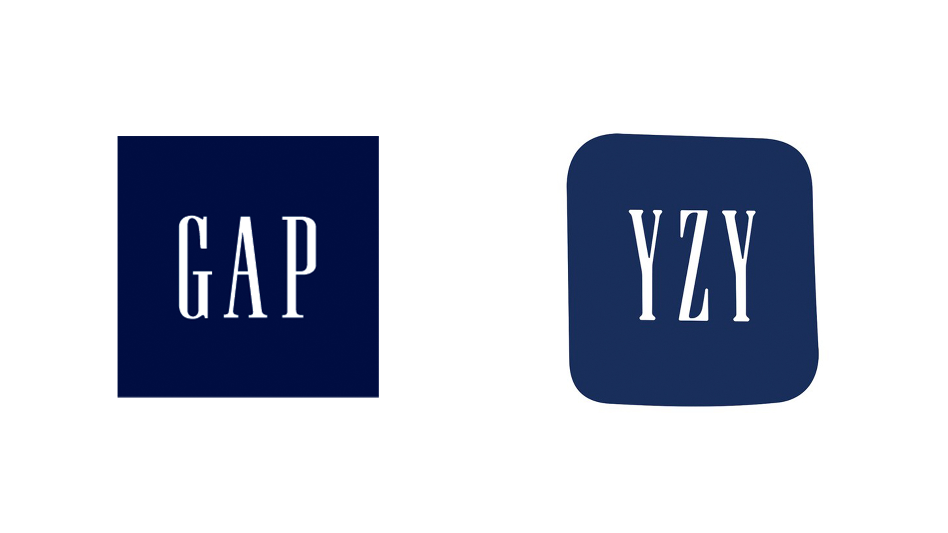
Almost a carbon copy of the current Gap logo, the Yeezy collab design (see it below) is a sort-of-rounded-square in the exact blue hue as the Gap iconography, with the letters 'YZY in Gap's signature typeface (check out our best free fonts if you're looking for typographical inspiration).

The logo seems to be the exact same design that Kanye shared on Twitter (below) last year. While it isn't clear whether the rapper designed it himself, the legal filings (reported by TMZ) suggest the collaboration will indeed look as he envisioned it back in June.
Article continues belowYEEZY AND GAP FORM PARTNERSHIP #WESTDAYEVER pic.twitter.com/NyxgfYTjJMJune 26, 2020
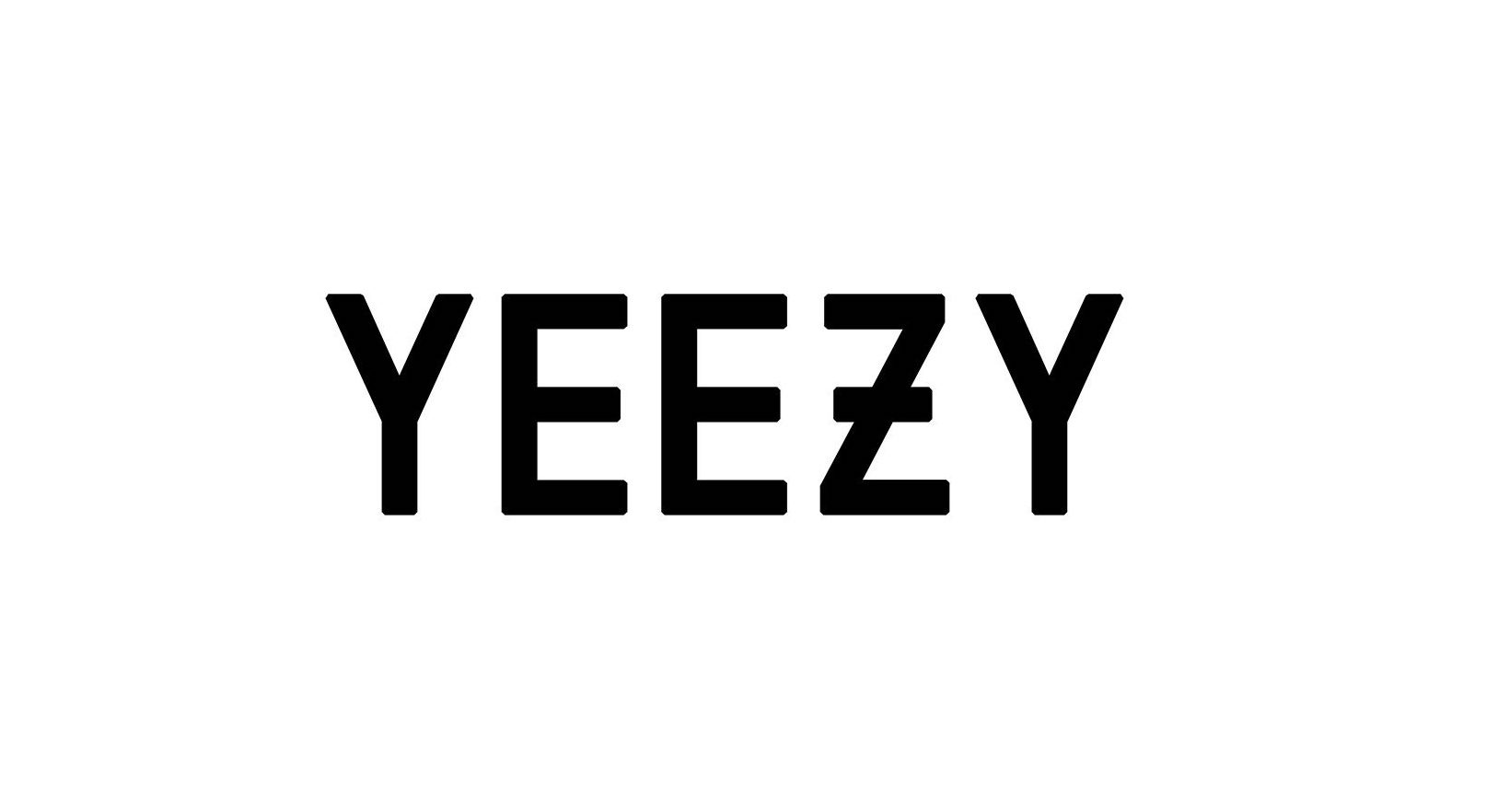
As for the design itself, we can't help but think it looks a little too... Gap? For a supposed collaboration, the logo looks curiously weighted towards just one of the brands. At first glance, it could easily be mistaken for Gap's logo, thanks to the identical colour and font. With the Yeezy logo (below) known for the strikethrough on the Z, could it not have been incorporated into this new design?
And what's with the shape? Being ever-so-slightly lopsided, the design as a whole has a generally imperfect appearance, but one that's too subtle to be immediately placeable. In short, it doesn't look entirely deliberate. Surely a little more commitment to the distortion would have resulted in something with more obvious swagger.

And while many a Kanye fan is excited about the collaboration itself, plenty of Twitter users are unconvinced by the logo. "Isn't it literally just the Gap logo?" one asks, while another replies, "Some dude got paid to type YZY instead of GAP."
Still, although it's hardly yielded one of the best logos of all time, we've no doubt the Gap/Yeezy partnership will prove highly lucrative for both brands. And hey, at least the new logo isn't trying to look too cool (we're looking at you, CIA). If you fancy embarking on your own logo design project, check out today's best Adobe Creative Cloud deals below.
Sign up to Creative Bloq's daily newsletter, which brings you the latest news and inspiration from the worlds of art, design and technology.
Read more:

Daniel John is Design Editor at Creative Bloq. He reports on the worlds of design, branding and lifestyle tech, and has covered several industry events including Milan Design Week, OFFF Barcelona and Adobe Max in Los Angeles. He has interviewed leaders and designers at brands including Apple, Microsoft and Adobe. Daniel's debut book of short stories and poems was published in 2018, and his comedy newsletter is a Substack Bestseller.
