Lion King logo is STILL infuriating typographers
There's something wrong with that 'G'...

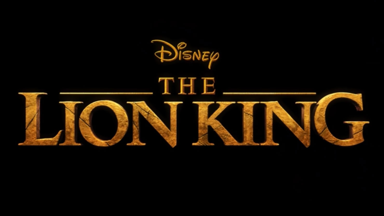
We were recently reminded of the Lion King logo, and how something is just a little, well, off. Which part? Well, that G at the end, of course, which is more unbalanced than Mufasa when he's hanging off the edge of the cliff. Too much? Sorry. But the point stands. It's universally agreed that there's something wrong with that G, and a host of designers have been itching to fix it.
It was reddit user wintergreebliss who noticed how the G throws the composition off. Posting in the r/Design channel, she commented "[h]aving the G sit right on the baseline was making my eye twitch, so I fixed it 😂".
Check out her tweaked version below, which nudges the G down ever so slightly to make the logo more pleasing to the eye.
Do you agree that this subtle change evens out the design? Or does the alteration throw the composition off even more? Commenters on the channel seem to support with wintergreenbliss' update, with reddit user thedoomfruit chipping in to say "Disney really f*****G up on that one." See what they did there?
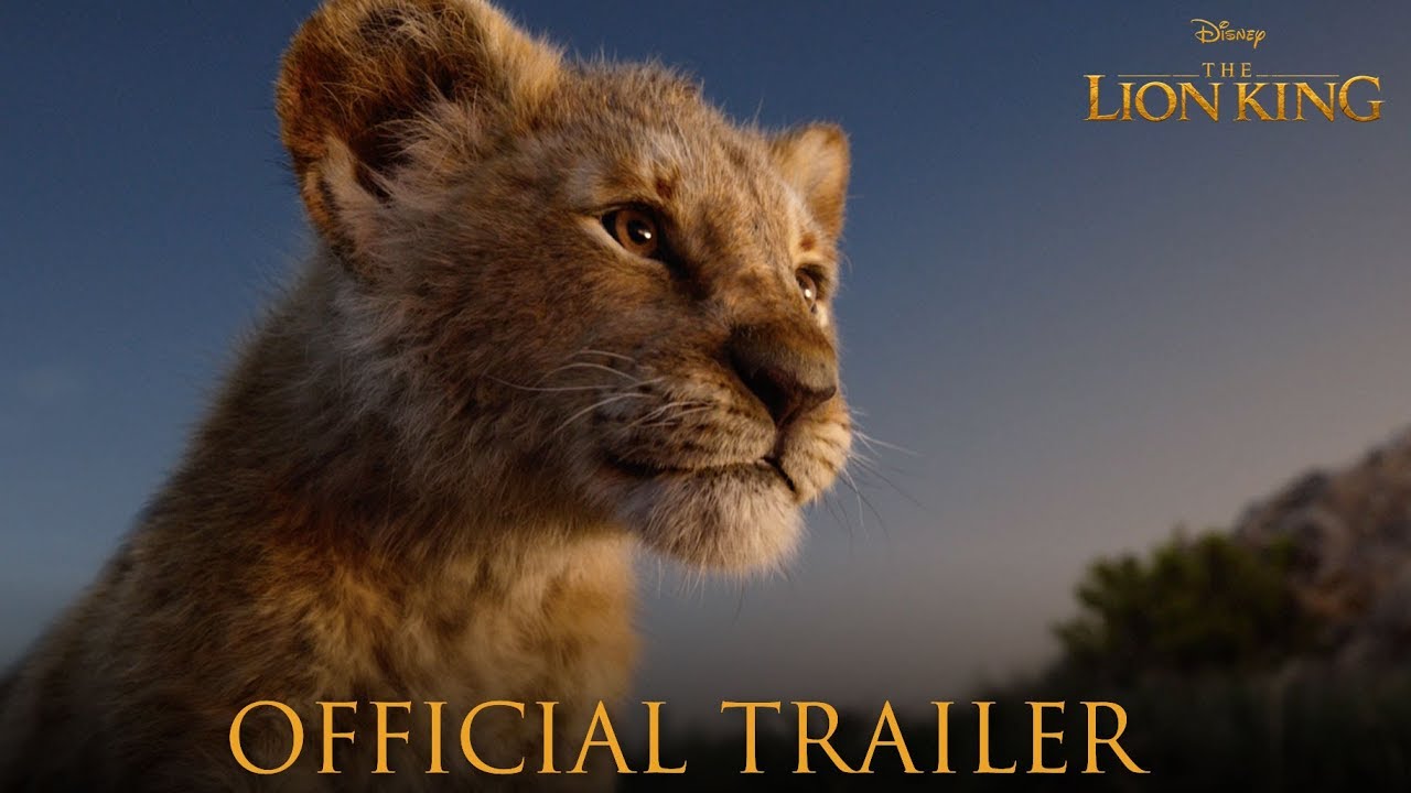
Typographic niggles aside, The Lion King was a feast for the eyes (even if there were some issues around character design). Remind yourself of the trailer below and enjoy the jaw-dropping 3D visuals – then go behind the scenes at the Lion King.
Related articles:
- Perfect font pairings
- The best free fonts for designers
- Typography design: Rules and terms every designer must know ...
Sign up to Creative Bloq's daily newsletter, which brings you the latest news and inspiration from the worlds of art, design and technology.

Dom Carter is a freelance writer who specialises in art and design. Formerly a staff writer for Creative Bloq, his work has also appeared on Creative Boom and in the pages of ImagineFX, Computer Arts, 3D World, and .net. He has been a D&AD New Blood judge, and has a particular interest in picture books.


