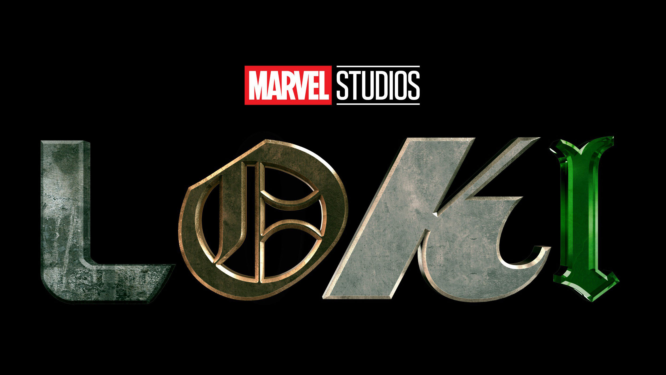
New Marvel logos include this Loki abomination
New Loki logo leaves Twitter enraged.

Sign up to Creative Bloq's daily newsletter, which brings you the latest news and inspiration from the worlds of art, design and technology.
You are now subscribed
Your newsletter sign-up was successful
Want to add more newsletters?
It's been a big weekend for Marvel. Not only did Avengers: Endgame overtake Avatar to become the highest-grossing film of all time, but at last weekend's San Diego Comic Con the studio announced a glut of new films, series and animations for fans to look forward to over the coming years.
And to give audiences a taste of what to expect from these upcoming titles, Marvel also revealed their accompanying logos. These include a thunderously retro logo for Thor: Love and Thunder, and a Stranger Things-esque design for Doctor Strange In The Multiverse of Madness.
But perhaps the most notable identity is the unashamedly chaotic look for the Disney + series, Loki, which throws out of the window everything you need to know about logo design.
Article continues belowCheck it out below, but you might want to brace yourself first.
Just announced in Hall H at #SDCC, Marvel Studios’ LOKI, an original series with Tom Hiddleston. Streaming exclusively on Disney+, Spring 2021. pic.twitter.com/Ntb8g9SSwqJuly 21, 2019
Okay. Deep breaths. Just remember that Marvel Studios is a massive entertainment company so they know what they're doing with this logo. To a designer with no interest in Loki or the Marvel Cinematic Universe though, this identity sure looks like a ransom note written in WordArt.
But perhaps the logo makes some sort of sense when you consider that Loki is based on the Norse god of mischief. So what better way to represent a troublesome god than with a logo that flies in the face of typographic convention and the principles of good design? You could even argue that, given the circumstances, the Loki logo is so bad it's good.
However social media, with it's knee-jerk reactions and hyperbolic opinions, has been less patient with the Loki logo.
Sign up to Creative Bloq's daily newsletter, which brings you the latest news and inspiration from the worlds of art, design and technology.
pic.twitter.com/MWa6K7dCCeJuly 21, 2019
bruh i’m not a marvel fan but this shit look like 8yo me cutting letters from magazines and put them together,,,July 21, 2019
Person who designed that logo: pic.twitter.com/A24J9Ni016July 21, 2019
Plenty of people even suggested that Marvel Studios use a popular fan logo designed by BossLogic.
Please just use @Bosslogic's logo. It's more elegant. 😐 pic.twitter.com/OMjSRh60CFJuly 21, 2019
Whatever your feelings on the logo, there's no denying that it's an unforgettable design. If we were to try and defend it, we'd say good on Marvel Studios for daring to try and do something different. The MCU is a franchise that's pretty much printing its own money at this point, so at least they didn't let themselves go stale.
And perhaps the studio felt it could be more creative with this logo because it's for a Disney + series, not a fully fledged film.
The other logos for Phase 4 (that's what Marvel calls the next batch of releases) were all uploaded individually on the Marvel Studios Twitter page. But you can take a look at them all in one handy image courtesy of this post by Logo Geek. Which is your favourite?
Marvel Studios have announced logos of all upcoming movies. What's your thoughts?? #ComicCon #ComicCon2019 pic.twitter.com/POMQ4K6JJZJuly 21, 2019
Related articles:

Dom Carter is a freelance writer who specialises in art and design. Formerly a staff writer for Creative Bloq, his work has also appeared on Creative Boom and in the pages of ImagineFX, Computer Arts, 3D World, and .net. He has been a D&AD New Blood judge, and has a particular interest in picture books.
