The new Minor League Baseball logo looks very familiar

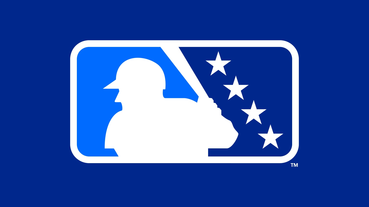
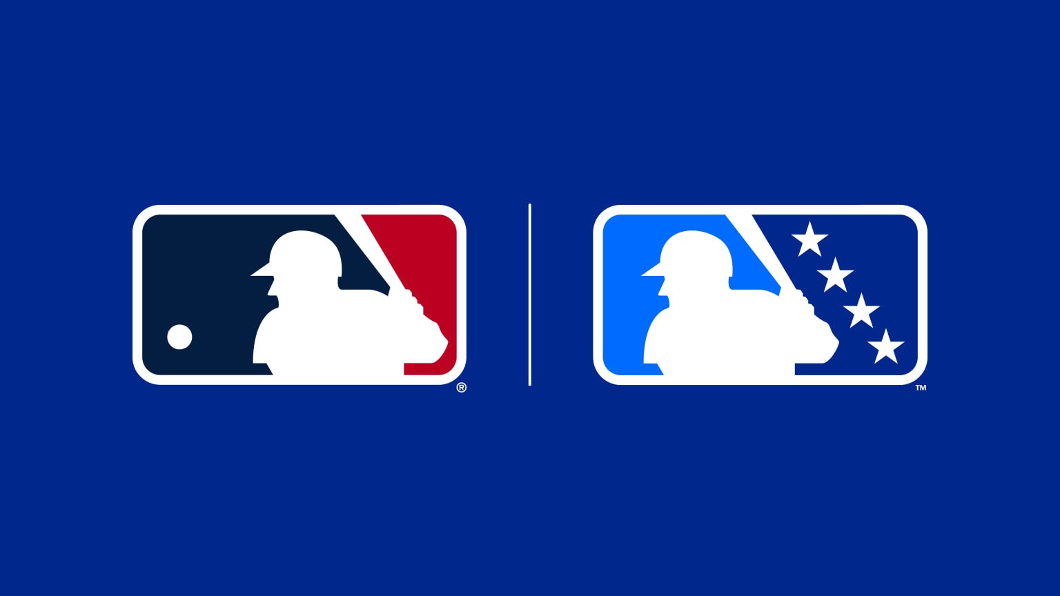
There's a new Minor League Baseball logo. And if you think it looks a little familiar, that's completely intentional. The new design is intended to resemble the Major League Baseball logo in order to communicate a more evident connection with the league's bigger sibling.
Minor League Baseball, or MiLB, contains teams affiliated with MLB clubs, and the MLB has adopted a "One Baseball" philosophy in recent years, looking to extend its influence over the lower leagues. But many fans seem to think the new logo is confusing similar to the MLB's identity. And they don't like it (see our pick of the best sports logos and the best MLB logos for successful designs).

We've heard plenty of people complaining that logo designs are becoming very similar, but the new MiLB logo takes that to an extreme. The league has adopted the silhouetted batter icon from the MLB logo in order to highlight the “One Baseball” connection within the new MLB Player Development league structure.
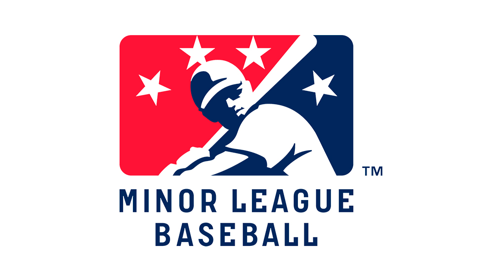
Article continues belowThe new design still includes the four stars from the previous MiLB logo, now placed on a diagonal "to reflect both player progression through the Minors – one star per level – and the future stars of Major League Baseball". But it drops the colour red, presumably to create some distinction from the MLB logo.

“The relationship between Minor League and Major League Baseball has never been stronger, and this new brand identity is a testament to that strength,” MLB executive vice president of baseball operations Morgan Sword says of the design, which will represented the MiLB's14 leagues and 120 teams across four classification levels. MiLB senior director of marketing for Kristin Barnett described the new logo as a "small but important step toward recognizing MiLB as part of the broader 'one baseball' initiative.”
But fans don't seem to be impressed by a change that gives the impression that the MLB is swallowing up lower leagues. Many have taken to the social media platform formerly known as Twitter to say they preferred the previous design and that the new look is "too blue" and too similar to the MLB logo. "It looks like a hypothetical MLB Winter League Logo if it existed," one person wrote. "The two levels should have their own identity. I don’t know why MLB and MiLB have to have the same logo," someone else wrote.
The new MiLB logo can be seen in the context of a general move towards greater consistency in sports branding - something we've seen in everything from the World Cup logo to the Super Bowl logo. But sometimes it's possible to be too consistent. Many fans seem to have preferred the less polished approach of the past, with all the variety that it brought.
Sign up to Creative Bloq's daily newsletter, which brings you the latest news and inspiration from the worlds of art, design and technology.
The MiLB will debut the new logo tonight (Saturday) in the MLB Network telecast of the Triple-A National Championship game in Las Vegas and at the MiLB Awards Show on 2 October. It will be rolled out across all MiLB media platforms throughout the off-season and implemented across leagues for Opening Day 2024. For more recent rebrands, see our pick of the best new logos.

Joe is a regular freelance journalist and editor at Creative Bloq. He writes news, features and buying guides and keeps track of the best equipment and software for creatives, from video editing programs to monitors and accessories. A veteran news writer and photographer, he now works as a project manager at the London and Buenos Aires-based design, production and branding agency Hermana Creatives. There he manages a team of designers, photographers and video editors who specialise in producing visual content and design assets for the hospitality sector. He also dances Argentine tango.
