If there's one thing that all of the best logos have in common, it's that they're instantly recognisable. But while you might think you know your stuff, recalling even the most famous logos from memory can be a little trickier than it sounds.
Online ticket marketplace TickPick recently asked over 100 members of the public to draw various music-related symbols, from band logos to streaming service icons – and the results range from impressively accurate to hilariously off the mark. If you want to see what a truly memorable logo looks like, our 10 best logos of all time are as unmistakeable as they come.

When it comes to streaming services (above), it seems the easiest logo for users to remember belongs to Pandora – but then again, it is just a large 'P'. Despite being the most popular music platform, Spotify's logo was less easy to recall – with more than one person depicting it as a large 'S' in a circle.
But some of the most hilarious attempts belong to the band logo category. From Kiss and Wu-Tang Clan to Nirvana and BTS, it seems some band's logos aren't as memorable as they might hope. Nirvana's logo is mixed up with its most famous album cover (featuring a baby underwater), while that Kiss face – well, the less said about that the better.
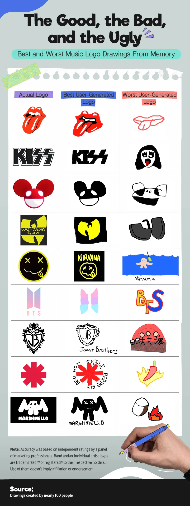
TickPick says that of the 1,300 logo renders it received from the public, "the average rendition was barely recognisable" – perhaps because for many music fans, the songs themselves are more important than graphic design. Still, a band's logo a hugely important part of its identity – a point currently being argued by Nirvana in its messy legal dispute with Marc Jacobs.
You can view the whole collection on TickPick's website. Like these car logos hilariously drawn from memory, the project proves that creating an unmistakeable and instantly recognisable design is harder than it looks. But if you're looking for tips, our logo design guide has you covered.
Read more:

