Is Neumorphism really 2020's hottest design trend?
Neumorphism's got people talking. But is it worth the hype?
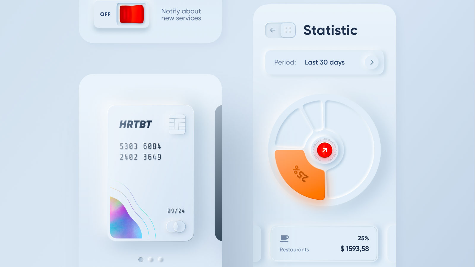
Everybody's talking about Neumorphism, a hot new design trend that's appeared out of nowhere over the past couple of months – but is it really all that?
Designers love a good trend, and there's much about Neumorphism that suggests this could be a big one (people are already talking about it as a potential look for iOS 14) rather than an exercise in experimental design. Flat design and its Google-sponsored cousin, Material Design, have been a dominant look in interface design for a good few years, ever since iOS 7 came along and unceremoniously booted out the previous trend for skeuomorphism.
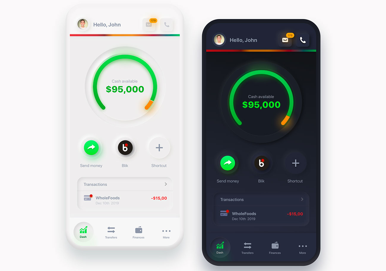
While the name Neumorphism suggests a similar look, don't panic. Nobody's about to go back to the bad old days of interfaces made out of fake real-world materials. We did the whole thing of apps that made you feel like you were working on an antique Victorian bureau, and it's safe to say that we got it out of our collective system.
Article continues belowInstead, Neumorphism combines the best of flat design and skeuomorphism; we're talking about clean interfaces, given a big hit of solidity through clever use of highlights and shadows. The name was coined by UX designer Jason Kelley in a comment on an article by UI designer Michal Malewicz, and it's stuck hard.
In his article, Malewicz explored how Neumorphism could be used in interfaces, and concluded that while it was a fun trend to play around with, it came with its own accessibility issues that would cause enormous problems if it was rolled out on a large scale. Specifically, buttons.
To most viewers, Neumorphic buttons look great; all chunky and solid. But for users with sight problems they're not so hot; there's just not enough contrast for them to be easily spotted. And even for users with 20:20 vision, a Neumorphic button isn't exactly going to leap off the page. If you want to grab your users' attention, then Neumorphism isn't the way to do it.
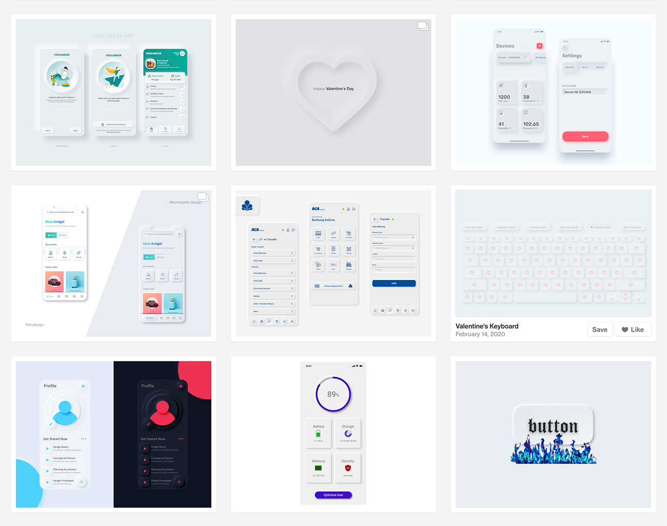
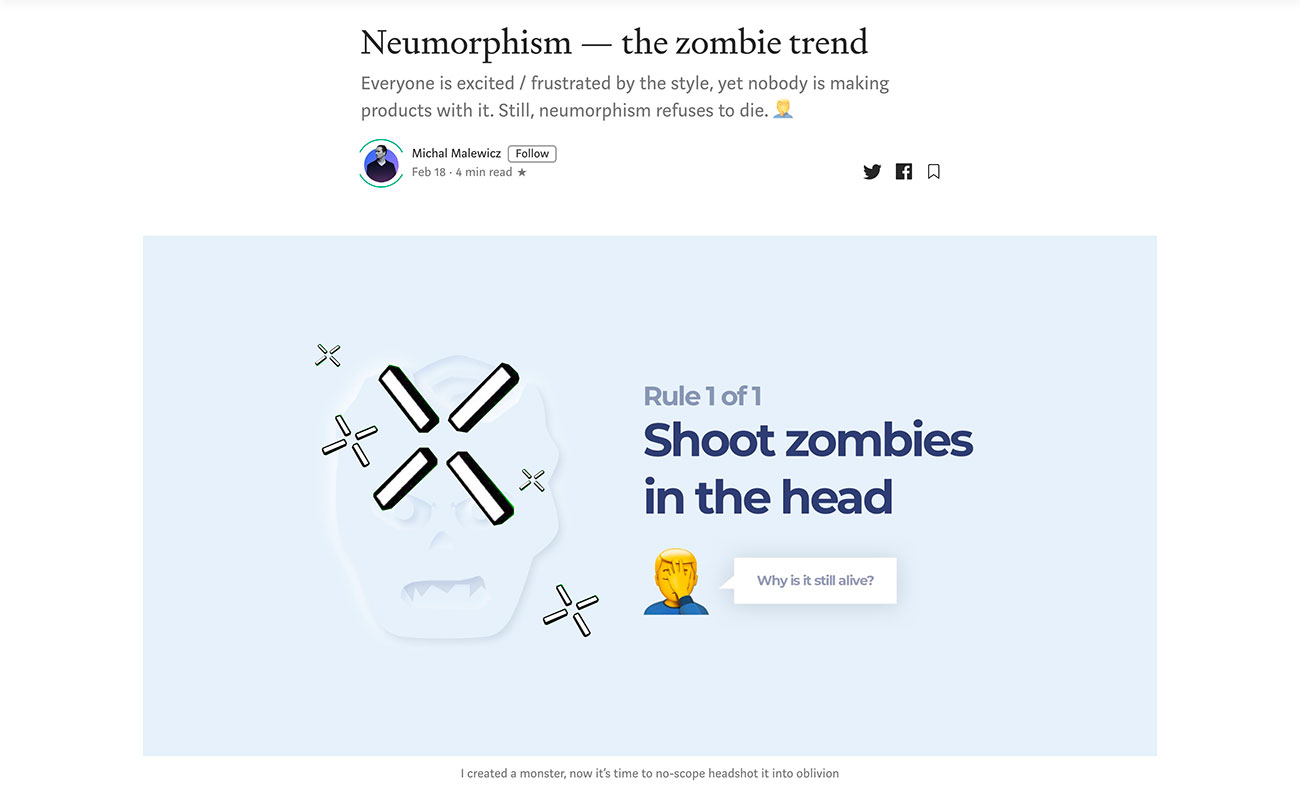
In his latest piece on Neumorphism, Malewicz refers to it as 'the zombie trend'. He notes that plenty of people are talking about Neumorphism, but nobody's making any products with it, and yet it refuses to die. So while Dribbble is absolutely packed with Neumorphic mockups, and Cult of Mac is dreaming of Apple implementing Neumorphic looks for iOS 14, there's very little in the way of real-world examples to give us a feel of whether it really works or not.
Sign up to Creative Bloq's daily newsletter, which brings you the latest news and inspiration from the worlds of art, design and technology.
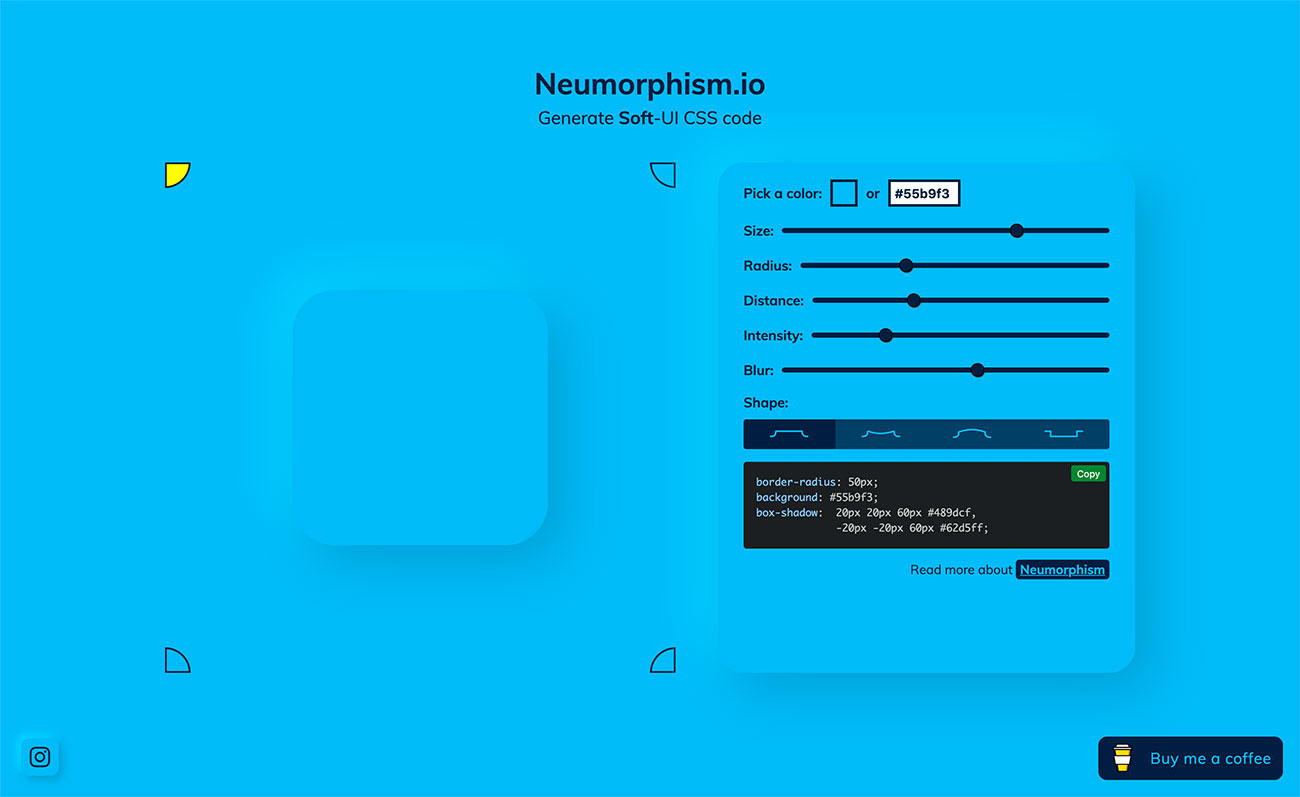
Chris Coyier, who shares much of Malewicz's scepticism, found this handy generator for building Neumorphic buttons in CSS. Have a play with it and you'll quickly see the problem: Neumorphic page furniture only really works with muted colour schemes. Turn up the saturation to any degree and the effect gets lost; this isn't a look for anyone who enjoys working with bold tones.
So, while there's much to like about the Neumorphic look – and let's face it, flat design's looking a little tired, so it would be lovely to hit a new visual paradigm sometime soon – it does't seem to be ready a full design trend.
Maybe smart designers will iron out the problems and turn it into a working design system – and one that's properly accessible. Right now, though, it's a pretty design toy set; fun to play with, but you wouldn't want to build a serious project with its tools.
Related articles:
Jim McCauley is a writer, performer and cat-wrangler who started writing professionally way back in 1995 on PC Format magazine, and has been covering technology-related subjects ever since, whether it's hardware, software or videogames. A chance call in 2005 led to Jim taking charge of Computer Arts' website and developing an interest in the world of graphic design, and eventually led to a move over to the freshly-launched Creative Bloq in 2012. Jim now works as a freelance writer for sites including Creative Bloq, T3 and PetsRadar, specialising in design, technology, wellness and cats, while doing the occasional pantomime and street performance in Bath and designing posters for a local drama group on the side.
