New Golden Syrup packaging celebrates Pancake Day
The classic Lyle's Golden Syrup tin gets a seasonal redesign ahead of Pancake Day.
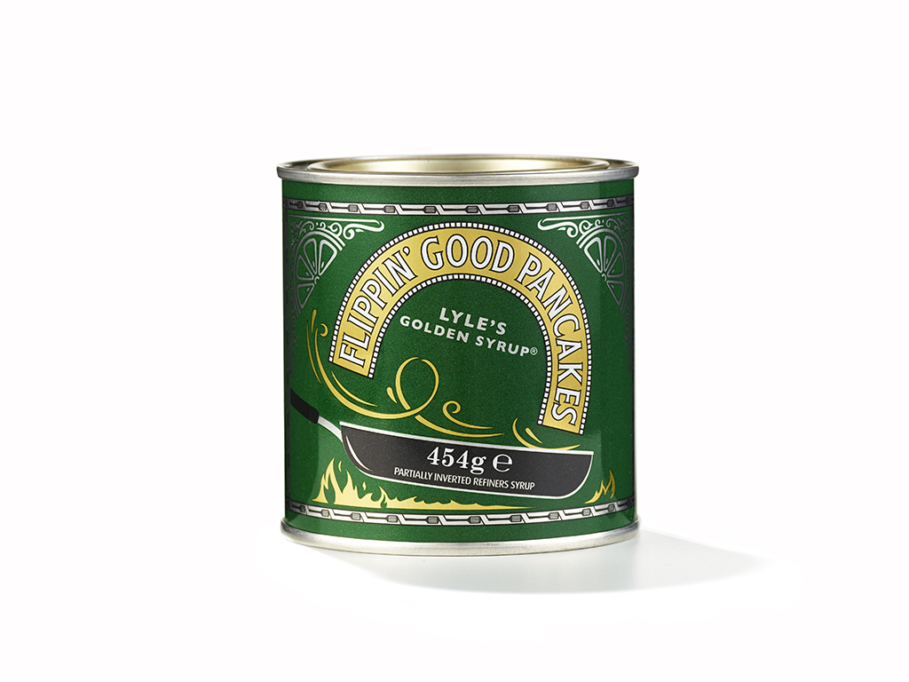
In the run up to pancake day, which, this year, falls on 28 February, Lyle's Golden Syrup has revamped its packaging design with the help of independent brand design agency Design Bridge. The syrup's traditional dead lion logo complete with buzzing flies has been temporarily sidelined in favour of an exciting design that visually communicates the tradition of flipping a pancake.
The playful design has been created to encourage consumers to 'make it Pancake Day, every day.' This might not be the healthiest diet choice, but with Lyle's Golden Syrup often spooned and squeezed onto pancakes, it's sure to be a tasty one.
Mike Stride, Creative Director at Design Bridge commented, “We’ve loved creating one-off, limited edition tins for Lyle’s Golden Syrup in the past for special occasions like Christmas and the Queen’s 90th birthday, so it was a new and exciting challenge to create a seasonal tin that will stay on shelf for a much longer period of time.
Article continues below"The main challenge here was to capture the fun traditions we all associate with Pancake Day while inspiring consumers to enjoy making and eating pancakes more regularly, rather than just on one day of the year.”
See how Design Bridge lived up to the challenge in the gallery below:
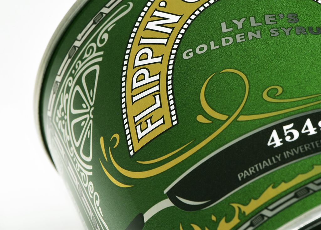
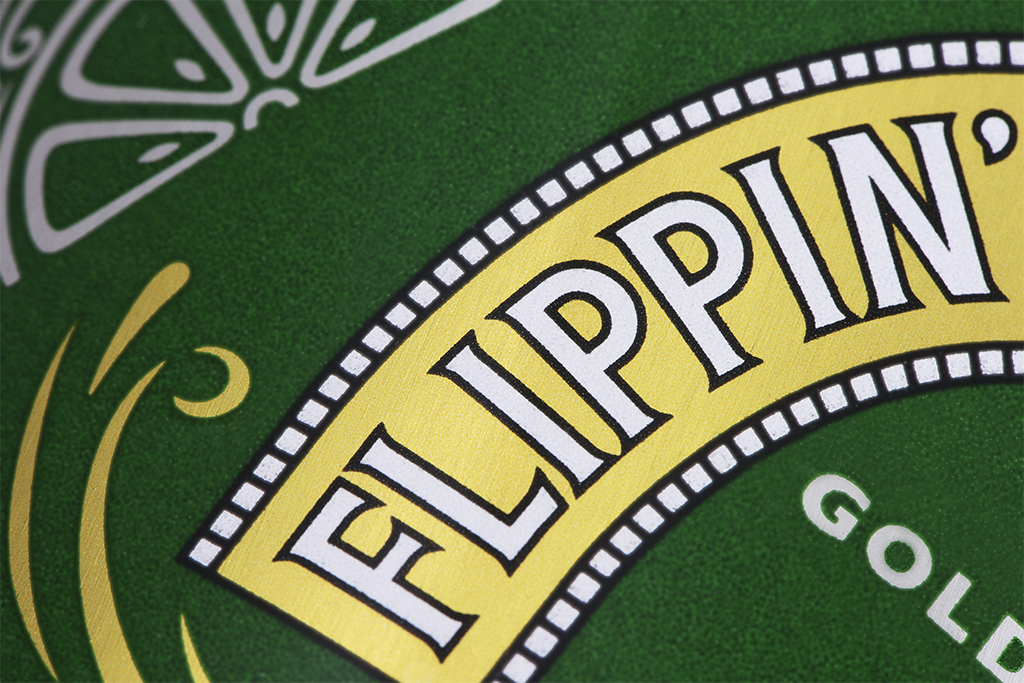
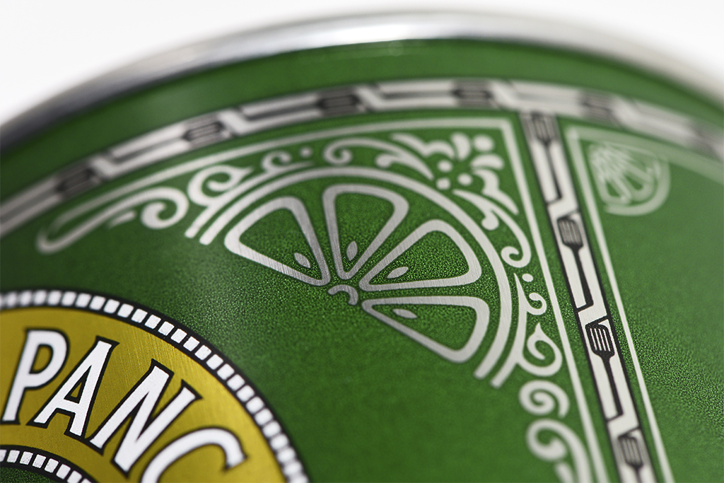
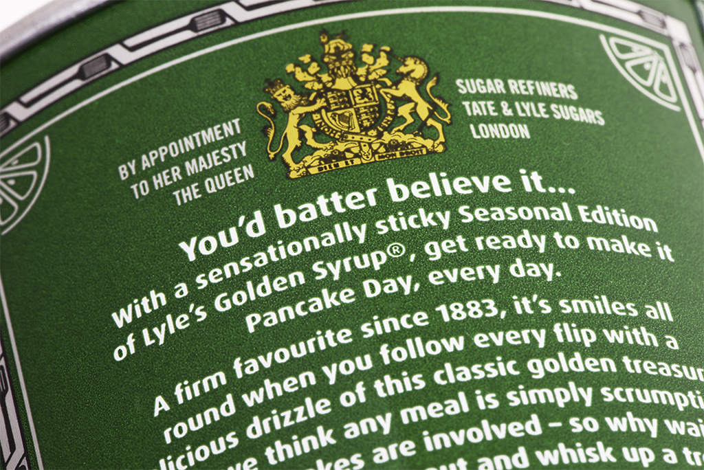
The new design will appear on tins and squeezy bottles for three months, the longest period of time to date that Golden Syrup has replaced its traditional look.
Related articles:
Sign up to Creative Bloq's daily newsletter, which brings you the latest news and inspiration from the worlds of art, design and technology.

Dom Carter is a freelance writer who specialises in art and design. Formerly a staff writer for Creative Bloq, his work has also appeared on Creative Boom and in the pages of ImagineFX, Computer Arts, 3D World, and .net. He has been a D&AD New Blood judge, and has a particular interest in picture books.
