Pandora reveals vibrant new logo design
Music streaming platform Pandora has unveiled a bold new rebrand as it goes head to head with Spotify.
Sign up to Creative Bloq's daily newsletter, which brings you the latest news and inspiration from the worlds of art, design and technology.
You are now subscribed
Your newsletter sign-up was successful
Want to add more newsletters?
Broadcasting over the digital airwaves since 2000, music streaming platform Pandora is one of the longest standing brands in the industry. And just as music tastes and trends evolve and change over the years, Pandora has decided it's time to update their logo design and branding.
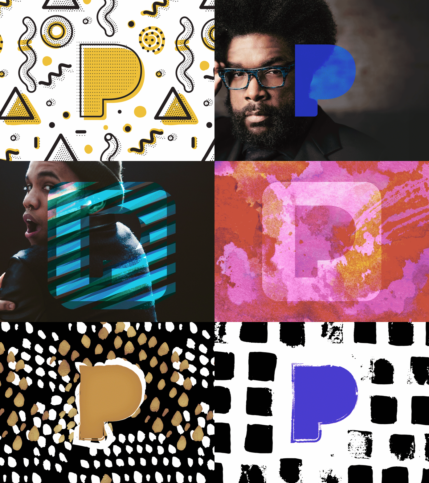
Arriving in a flurry of dazzling images centred around the letter P, the new Pandora logo represents a huge departure from their previous efforts which were mainly single colour serifed wordmarks.

"Our dynamic brand is composed of form, colour and pattern, which we implemented into the new P icon and serves as your portal into the unique and diverse range of music you love," explains Pandora's VP of Creative Services, Tony Calzaretta.
The vibrant clip above, which shows the different iterations of the Pandora logo users can expect to see, harks back to some of the saturated, whacky designs MTV rolled out in the '80s. And just as MTV have recently revisited their '80s aesthetic as they've brought the look of the web to the TV, it seems that Pandora have decided to follow suit with these vibrant and energetic designs.

The rebrand is also being observed as an effort by Pandora to establish itself in an increasingly crowded music streaming marketplace. With the likes of Spotify, iTunes Radio and Apple Music to name but a few of the brands muscling in on Pandora's territory, the company appears to be making a serious attempt to grow by appealing to new users.

However some think Pandora haven't done enough to re-establish themselves. "This is the right time and the right amount of change for Pandora," says Brand Union New York's Executive Director Sam Becker. "Unfortunately, the whole thing feels skin deep.
"It’s very telling that their website (in addition to imploring me to install Adobe Flash) still exhibits the old brand. Pandora needed more than a redesign to stand out in what’s become a cutthroat space. The app, symbol and wordmark are all pleasing enough but could have used a real story, broadly delivered, to compel people to think differently about the brand."
Sign up to Creative Bloq's daily newsletter, which brings you the latest news and inspiration from the worlds of art, design and technology.
But what do you think? Give us your opinion in the comments…

Dom Carter is a freelance writer who specialises in art and design. Formerly a staff writer for Creative Bloq, his work has also appeared on Creative Boom and in the pages of ImagineFX, Computer Arts, 3D World, and .net. He has been a D&AD New Blood judge, and has a particular interest in picture books.
