Patreon's rebrand is giving me serious modern design fatigue
Formless blobs are the future, folks.
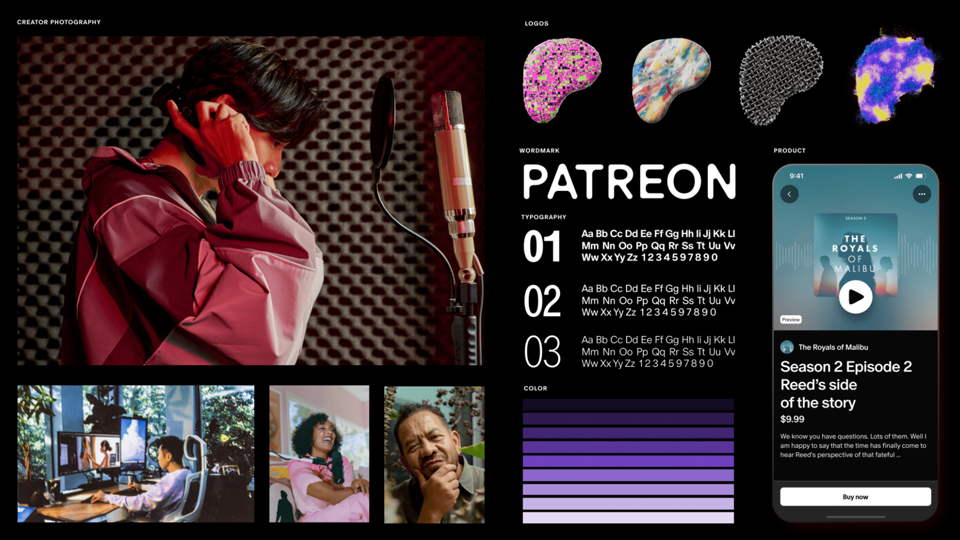
Monetisation platform Patreon has unveiled a new brand identity featuring fresh typography and colour schemes, an updated wordmark and most contentiously, a new logo. The rebrand delivers the platform a contemporary new look while establishing its identity around the creators that keep the platform alive – but the update hasn't come without controversy.
The new identity has sparked some debate. Has it improved the brand's image? And was it necessary at all? While the update is set to optimise the platform with improved creator tools, community chat features and a digital marketplace, the redesigned logo has been criticised for its formless identity, leading the platform to feel equally as indistinct. (It's safe to say that Patreon's new identity won't be making an appearance in our list of hot logo design trends).
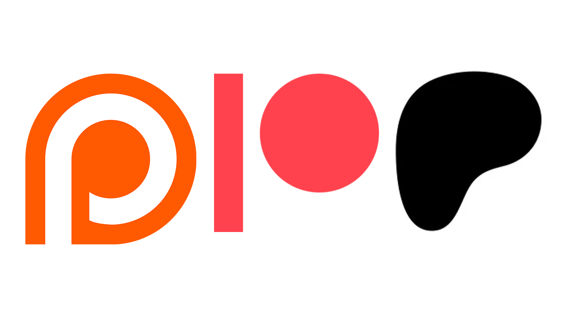
Patreon's new logo has been roughly redeveloped from its past iterations, loosely maintaining the 'P' shaped motif. The new logo is best described as a formless blob, but that's not as scathing a review as it seems, as Patreon has embraced the fluid nature of its redesign, stating that the new logo is purposefully ephemeral.
Announcing the news on its website, Patreon stated: "Our new logo does not have an exact canonical form, there isn’t one definitive Patreon logo. It is a dynamic object in constant motion that represents the energy of creativity and the ever-evolving nature of culture and art," – not the most revelatory announcement I must admit.
Allow me to put that into layman's terms. Patreon’s new logo is an ever-changing design that reflects the platform's evolution into a diverse content creation tool and social outlet for audiences and creators. While the changing logos will always return to the 3D 'P' motif, each iteration will be different to reflect the platform's ever-evolving identity, which promises to be dynamic, disruptive and thoroughly modern.
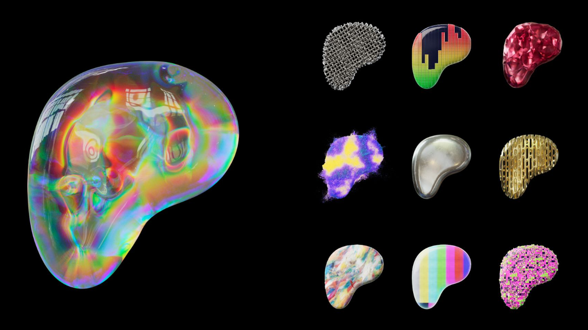
The brand has showcased a number of new forms that the logo will assume, such as a chain-linked design that unveils a TV colour test screen, or an undulating holographic creation that morphs into a bright pink diamond. While visually, the new logos are certainly interesting, it does raise questions as to how they're reflective of the brand – and the internet definitely wasn't afraid to voice strong opinions.

After an announcement on X, users shared their thoughts on the controversial redesign, voicing their distaste for the update. "Ah yes, the pinnacle of logos... a shapeless blob. 10/10 branding, graphic design is my passion," one user scathingly commented. "A big amorphous blob. It really fails to standout as identifiable," another commented, while one user simply stated: "It looks like my liver."
Sign up to Creative Bloq's daily newsletter, which brings you the latest news and inspiration from the worlds of art, design and technology.
While it's certainly not the most inspired design, Patreon is developing a tool that will allow users to easily create their own iterations of the new logo, honing in on the spirit of community that has guided the rebrand. (Hopefully, creators will be able to design some more evocative artwork).
“A brand as expressive as the creators it represents.” Inside the Patreon rebrand: https://t.co/tDT7WgeY4V pic.twitter.com/q5Gb2arGCwOctober 5, 2023
It seems that when brands attempt to modernise, they often resort to stripped-back retro-futurism style design, and while this has a time and place, it's a trend that is becoming a little tired. Similar to the X rebrand, the minimalistic approach has stripped Patreon of its identity for the sake of appearing contemporary, unfortunately resulting in vague and uninspired branding.
Patreon's new identity may not have been received well, but there are plenty of recent rebrands that we love, like this playful insurance rebrand, or Android's latest rebrand that's packed with personality.

Natalie Fear is Creative Bloq's staff writer. With an eye for trending topics and a passion for internet culture, she brings you the latest in art and design news. Natalie also runs Creative Bloq’s 5 Questions series, spotlighting diverse talent across the creative industries. Outside of work, she loves all things literature and music (although she’s partial to a spot of TikTok brain rot).

