The US's longest-running independent film festival, Sundance, has just revealed a new logo and its first full brand identity intended for long-term use. And the design is perfect for a festival that champions independent movies, paying homage to the big screen and the history of moviemaking.
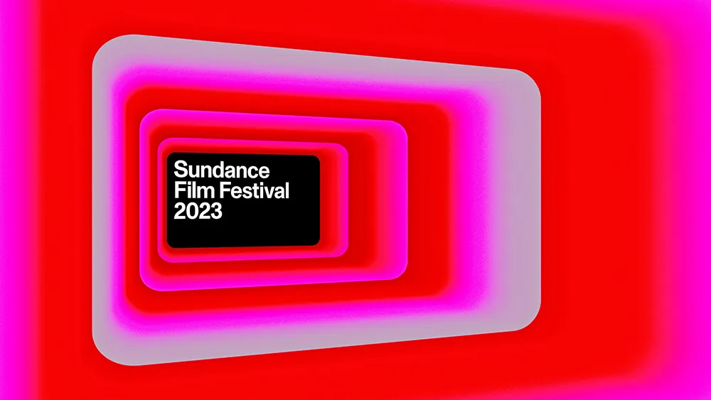
The new logo design is inspired by the standard cinematic widescreen aspect ratio of 16:9. Okay, so basically, it's just a rectangle, right? Well, yes. But it's a rectangle that says so much. Within the wider branding system, it will serve as a framing device, like the big screen itself, framing footage and stills from the festival archive (see our tips on how to design a logo for more inspiration).


Designed by New York creative agency Porto Rocha, the new logo is just one part of what is the Sundance Film Festival's first long-term brand identity. The festival has been running in Utah since 1978, but each event has had its own identity, with no continuity from one to another. That's fine for a small event but problematic when faced with the quantity of assets and year-round communication it deals with today.
The festival decided it needed a more permanent identity to cover all assets and also reinforce public recognition of the annual event. "The identity needed to represent a legacy as well as a forward-looking ethos – at once timeless and contemporary," Porto Rocha says. “To do this, we developed a brand language that – just like the festival – supports all kinds of stories.


Other elements of the brand system include typography set in Monument Grotesk, which makes an impact while being neutral enough to fit diverse genres and titles. Meanwhile, visual assets develop the shape of the logo into new stories connected to filmmaking, capturing the energy of watching a movie in a cinema with animated 3D compositions in a broad neon palette.
Need to update your own design tools? See the best current prices on Adobe's Creative Cloud below, and see the best graphic design books for more inspiration.
Read more:

