Facebook's controversial Meta logo looks even weirder in 3D
We will never unsee this.

Sign up to Creative Bloq's daily newsletter, which brings you the latest news and inspiration from the worlds of art, design and technology.
You are now subscribed
Your newsletter sign-up was successful
Want to add more newsletters?
It's been less than a week since Facebook rebranded itself as Meta and introduced users to its metaverse-orientated plans. Although the 2D Meta logo might be growing on us, the 3D version is not what we expected at all.
Meta has released an article that explains the new design in more detail, from the name to the colour palette. It turns out the logo, featuring an artsy M shape (for Meta) is jam-packed with design treats for us creatives to enjoy. Using a number of fancy gifs, Meta demonstrates the versatility of the design and some of the hidden features in the logo that you may have missed at first glance. If you fancy designing your own logo, then make sure you check out our article on the 15 golden rules of logo design.

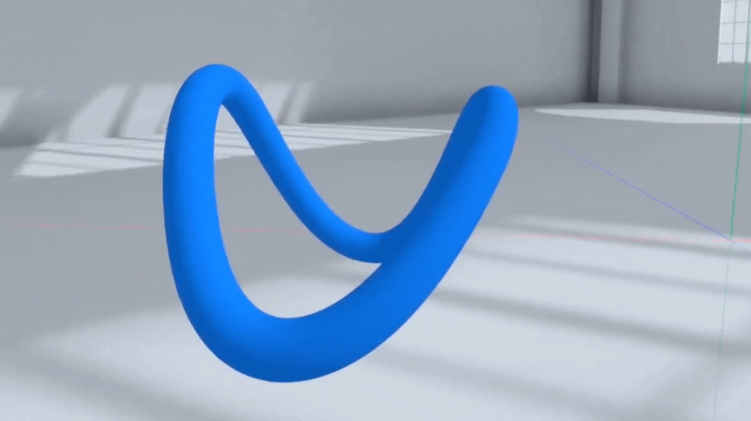
Meta explains in an article on its website that the logo "was designed to dynamically live in the metaverse — where you can move through it and around it." In a gif made by Meta, viewers are shown around a VR version of the logo, revealing that the shape is actually 3D. The clever design works as a 3D shape that can be explored in VR, as well as on 2D platforms like print.
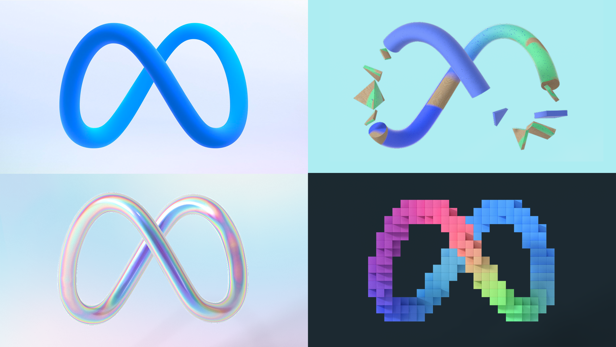
Article continues belowWe're a little surprised by the 3D design, and it reminds us of the unnerving view of the PlayStation logo from behind. In 2D, the shape doubles up as an M for meta, as well as an infinity symbol, which Meta says symbolises "the infinite horizons in the metaverse." But viewed from the side, it's just, kind of, a blob.

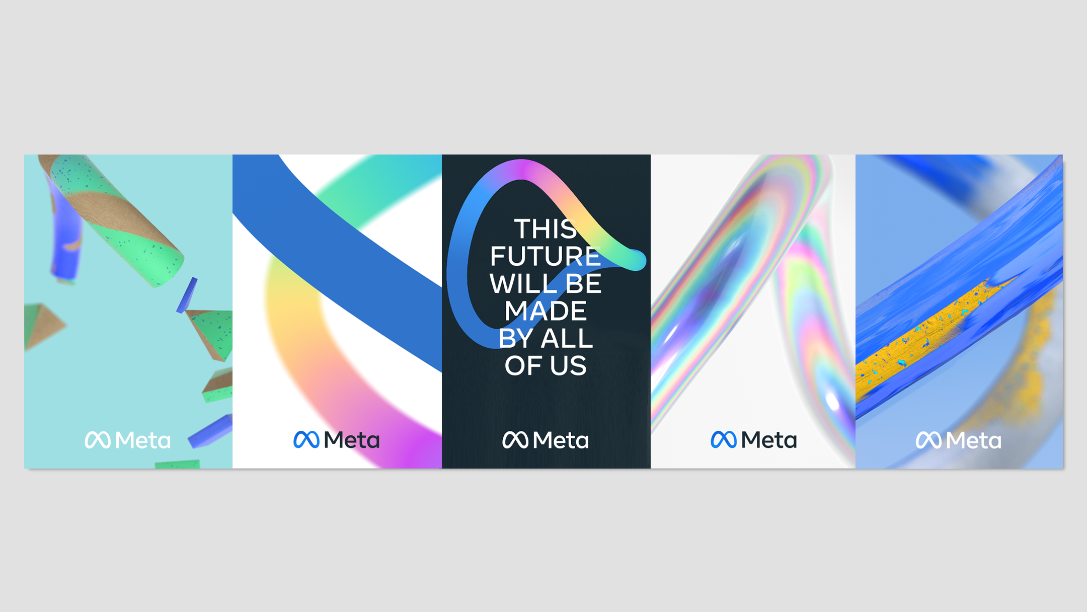
Meta explains that the logo can "take on infinite textures, colours and movement, capturing the creativity and imagination of a 3D world." which suggests it's opening its doors to a whole new world of creative collaboration, which could lead to a number of new 3D and VR opportunities for creatives. Meta also points out that the blue gradient colours used in the logo take inspiration from its core products (I.E. Facebook) which it explains is "connecting our future to our company’s origins."

We know what you're thinking, but why 'Meta'? Apparently, Zuckerberg and co. chose Meta as a name because it can mean 'beyond'. Meta explains that "This next chapter is a future made by all of us that will take us beyond what digital connection makes possible today — beyond the constraints of screens, the limits of distance and even physics." We can appreciate Meta's attempt at making its new name sound as inspirational as possible, but we can't help but think that technology "beyond the constraints of screens" sounds fairly terrifying.
For days now, the design has been ridiculed by the internet in a hilarious fashion, and despite Meta's best efforts to explain the new design, people aren't warming to the rebrand. Over on Twitter, someone said the design reminded them of "droopy dog eyes," another user said that it looks like a bra, and now we can't unsee it.
Sign up to Creative Bloq's daily newsletter, which brings you the latest news and inspiration from the worlds of art, design and technology.
I don't have a problem with Meta. Actually pretty excited about the possibility of doing some VR programming in a few years if Meta can design a usable + cheap consumer device + create good dev toolsIf React + GraphQL are any indication of what they can do, a lot is possibleOctober 31, 2021
The new #meta has some strange looking design, I guess massive margins is going to be the new design meta. pic.twitter.com/i6u1rAmCHUOctober 28, 2021
pic.twitter.com/Xx1LoQPROxOctober 28, 2021
It's early days for Meta, but we are hoping that it will create new and exciting opportunities and collaborations, especially for 3D and VR artists. If you fancy having a go at creating your own 3D art, then why not check out our guide on how to create a realistic 3D sculpture.
Read More:
- How to make and sell an NFT
- This might just be the wildest iPhone 14 concept we've seen
- These are the most valuable movie posters of all time

Amelia previously worked as Creative Bloq’s Staff Writer. After completing a degree in Popular Music and a Master’s in Song Writing, Amelia began designing posters, logos, album covers and websites for musicians. She covered a range of topics on Creative Bloq, including posters, optical illusions, logos (she's a particular fan of logo Easter eggs), gaming and illustration. In her free time, she relishes in the likes of art (especially the Pre-Raphaelites), photography and literature. Amelia prides herself on her unorthodox creative methods, her Animal Crossing island and her extensive music library.
