New Suicide Squad logo goes back to its roots (but has it lost its edge?)
It certainly looks familiar.

We don't know much about the upcoming sequel (or is that prequel?) to 2016's Suicide Squad, but details will no doubt be revealed during 22 August's online-only DC FanDome event. Ahead of the event, director James Gunn has now shared the film's official title treatment – and it looks rather familiar.
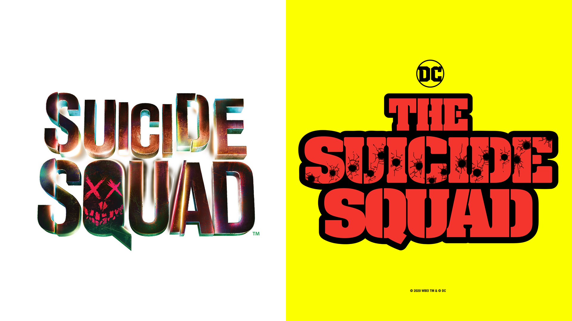
Revealed on Twitter (below), the logo is a decidedly zesty affair, featuring bright red, bullet hole-ridden text over an ever brighter yellow background. Gunn didn't just share one title treatment, but was generous to share the logo in various languages. Fans are already guessing at the significance of the sixteen bullet-holes, as well as what inspired the design (check out our logo inspiration guide if you're looking for ideas of your own).
#TheSuicideSquad team just got me these amazing new official title treatments for my birthday. And the cast and I have so much more to show you guys on Aug 22 at https://t.co/ioRsge6g7f. See you there! 💥 #DC #DCFanDome @SuicideSquadWB pic.twitter.com/OwGc7nnkG2August 5, 2020
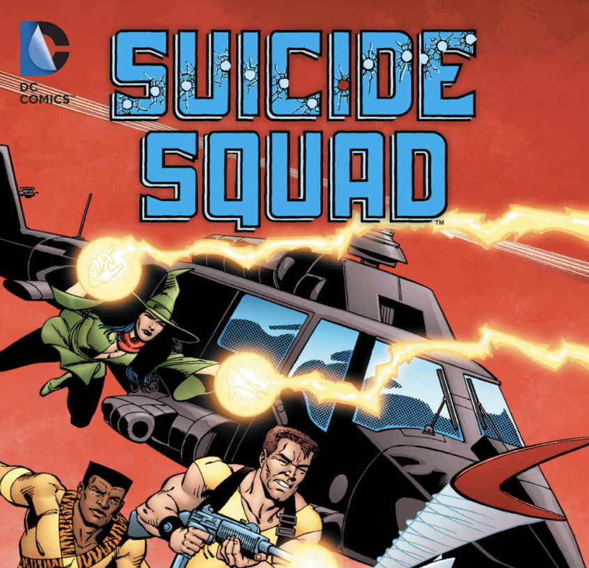
Unlike the edgier logo for the critically panned Suicide Squad (above), this new design seems to have lost some character. The colours are bright and fun, suggesting we could be in for a lighter film – but we can't help but miss the sense of danger and unpredictability evoked by 2016's design. The new logo itself, with its diagonal bullet holes, appears to be a direct reference to the logo used on the original Suicide Squad comics in the 1980s (below).
Article continues below 
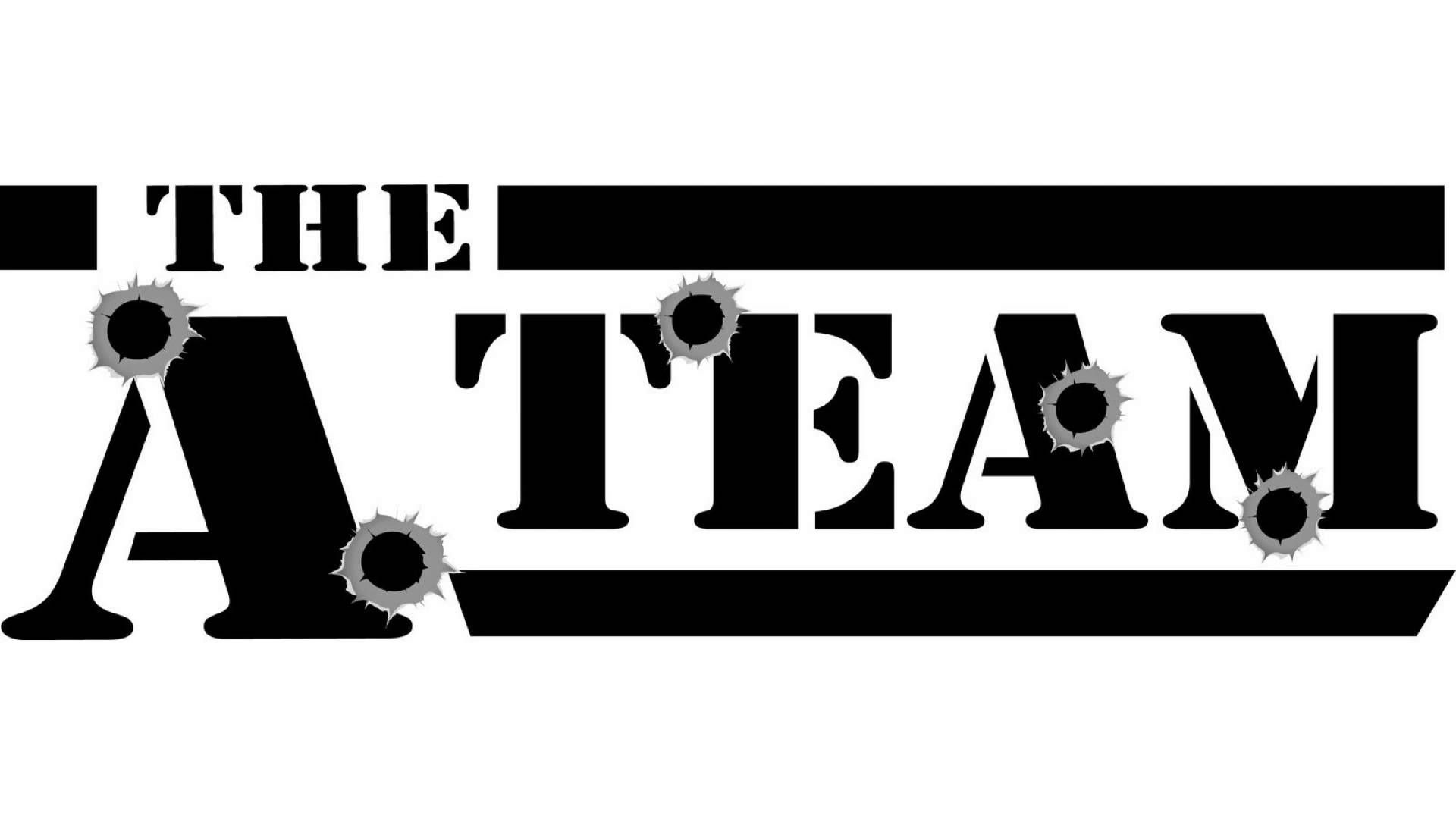
Speaking of the 1980s, the logo could have a much more unexpected inspiration from that decade. Indeed, those bullet-holes scream The A Team (below) to us. If Gunn is planning on going full 80s, can we expect a cameo from Mr T and the gang? Now there's a crossover we'd love to see.

We'll no doubt learn more about the film during DC FanDome, and whether we can expect the lighter touch this logo seems to be pointing towards. As 2016's Suicide Squad demonstrated, a great logo doesn't necessarily mean a great film – so while this new design has left us a little cold, the film itself could make up for its predecessor. If you're looking for more typographical inspiration, check out our best free fonts.
Read more:
- Apple patents: 8 game-changing ideas we wish would come true
- Comic Sans on Instagram is the update nobody asked for
- Apple's 'brand new' iMac is here (and we can't help but feel a bit disappointed)
Sign up to Creative Bloq's daily newsletter, which brings you the latest news and inspiration from the worlds of art, design and technology.

Daniel John is Design Editor at Creative Bloq. He reports on the worlds of design, branding and lifestyle tech, and has covered several industry events including Milan Design Week, OFFF Barcelona and Adobe Max in Los Angeles. He has interviewed leaders and designers at brands including Apple, Microsoft and Adobe. Daniel's debut book of short stories and poems was published in 2018, and his comedy newsletter is a Substack Bestseller.
