Elon Musk took an unusual approach with his overnight rebranding of Twitter as X. He asked users on the platform to submit designs, and immediately implemented the first X that was "good enough". But should he have waited for more suggestions?
Some say the current, apparently temporary, X logo, has been described as aggressive and intimidating. One alternative aims to resolve that, using Twitter colours and a little love for a friendlier transition (see our pick of the best social media logos for more inspiration).
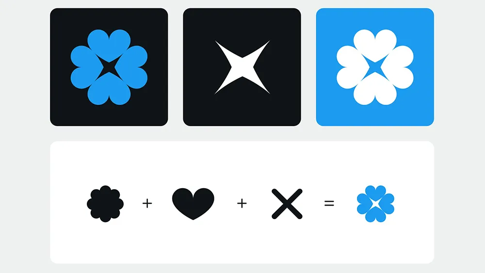
My suggestion for the @x logo:✓ Utilizing the familiarity of the blue checkmark✓ Showing positivity by incorporating the like button✓ Hinting at the new X shape in the negative space pic.twitter.com/74KrPFgS3MAugust 3, 2023
Musk might have already made his choice, but people on Twitter continue to respond to his request for design proposals for an X logo. And while the X that Musk went for turns out to be a generic letter from several typefaces, some of the alternative suggestions still coming in have a much more considered rationale behind them.
Designer Gal Shir has proposed an X logo design and wider branding system that seeks to rebrand Twitter in a much less abrupt and drastic way with a design that's more in keeping with the Twitter logo history. He uses the familiarity of the Twitter brand colours and the blue checkmark to ease the transition while also promoting a more positive feel by incorporating multiple like button hearts. The platform's new name, X, is formed in the negative space between a cluster of four hearts.
Damn this is so cool 🙌🏻August 4, 2023
@elonmusk oya comeAugust 3, 2023
Clean 😮💨August 3, 2023
It's impressive how thoroughly Shir has developed the system, fleshing it out with motion design and a loading animation and wide brand assets. While some think the X shape has an unfortunate resemblance to something else, a lot of people seem to prefer it to Musk's chosen X. And since Musk has suggested that the current X is only temporary (even if he did try to put a giant illuminated X on top of Twitter's offices), perhaps something like this would have made more sense to ease the transition.
"I really love this whole context," one person wrote. "Love this solution, it makes the X make sense!" someone else tweeted. "This is great! Wouldn't feel icky clicking the X logo if it was like this," was another opinion (see our pick of the best Twitter alternatives if you're feeling the same way.

