Do these 10 big brands look better stripped back?
What would happen if you stripped the packaging of well-known brands down to their basics?
Sign up to Creative Bloq's daily newsletter, which brings you the latest news and inspiration from the worlds of art, design and technology.
You are now subscribed
Your newsletter sign-up was successful
Want to add more newsletters?
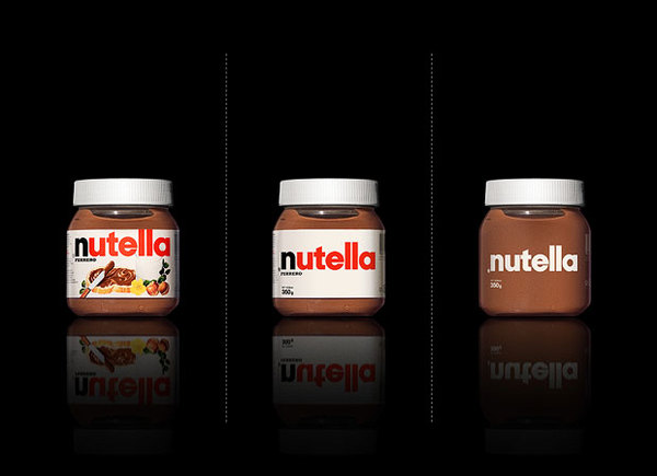
In order to grab our attention on the shelves, well-known brands have to translate their identities through to their packaging designs. But when trying to cram multiple messages on to one piece of packaging or logo design, the branding values often get a little lost.
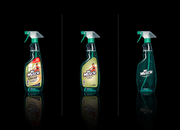
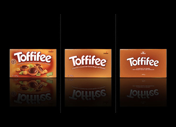
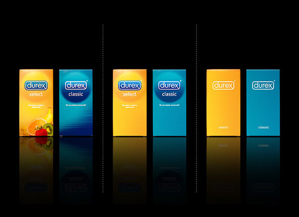
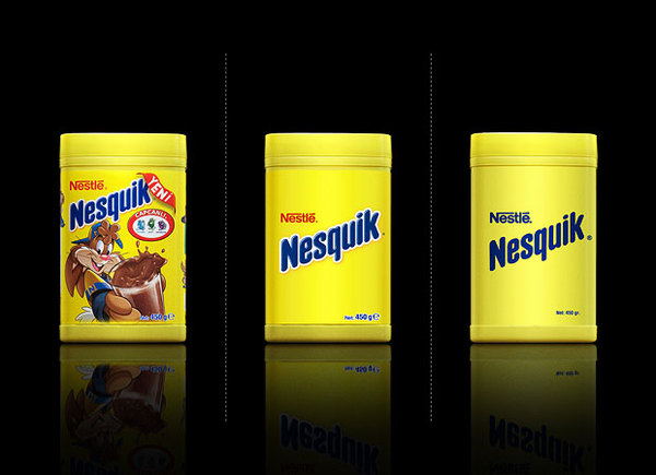
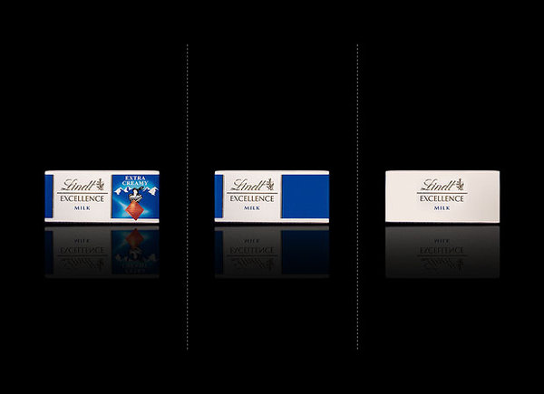
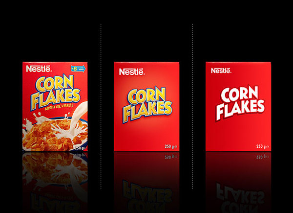
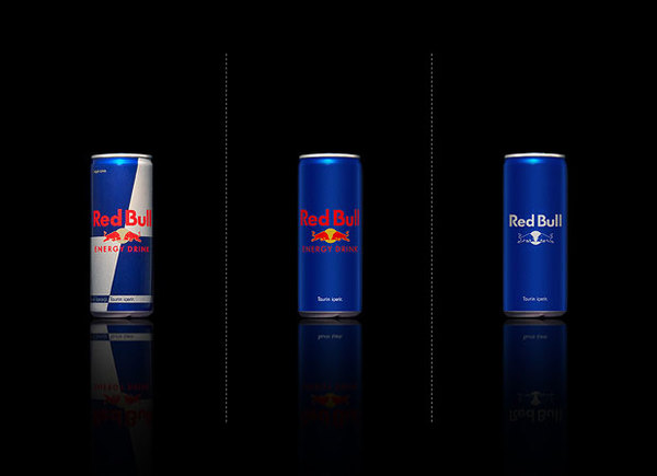
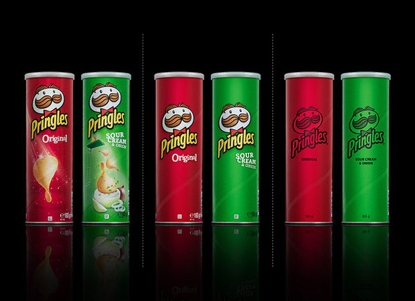
A little while ago, London-based designer Mehmet Gozetlik decided to embark on a concept that saw many of these well-known brands stripped back to their basics. Using a minimal approach, he rids the likes of Nutella, Nesquik and Lindt of their 'busy branding'.
Product that are adorned with fancy typography, garish graphics and over-the-top colours have now been replaced with a simple execution. So, do you think these new designs look better? Or should these brands stick to what we're used to?
Article continues below 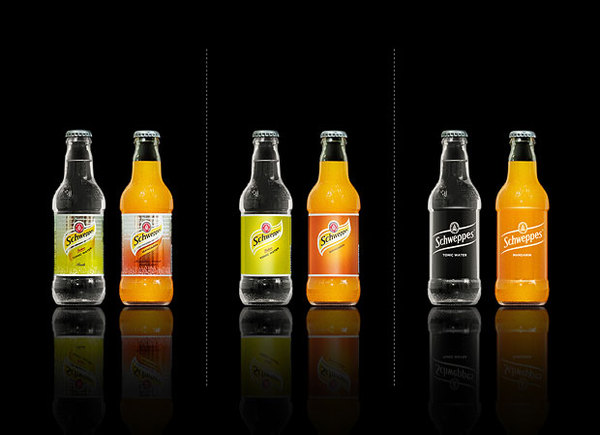
Sign up to Creative Bloq's daily newsletter, which brings you the latest news and inspiration from the worlds of art, design and technology.

Sammy Maine was a founding member of the Creative Bloq team way back in the early 2010s, working as a Commissioning Editor. Her interests cover graphic design in music and film, illustration and animation. Since departing, Sammy has written for The Guardian, VICE, The Independent & Metro, and currently co-edits the quarterly music journal Gold Flake Paint.
