An ode to the beauty of neon
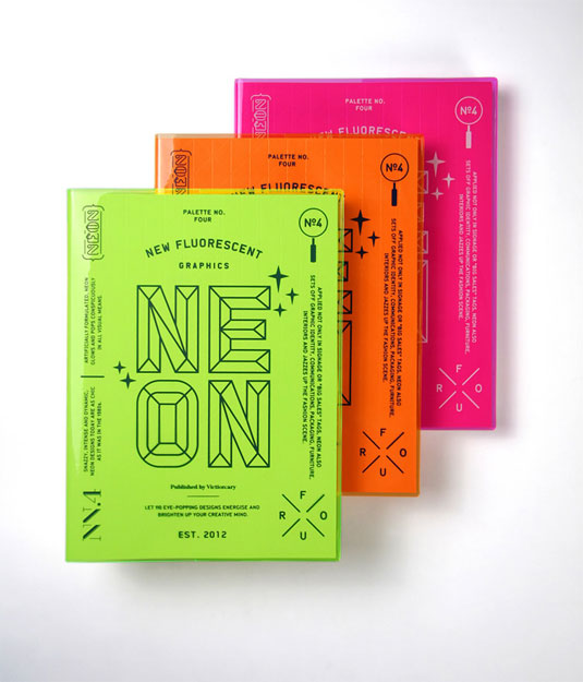
The latest in viction:ary's Palette book series examines the appeal of fluorescent graphics and where they work best.
Sign up to Creative Bloq's daily newsletter, which brings you the latest news and inspiration from the worlds of art, design and technology.
You are now subscribed
Your newsletter sign-up was successful
Want to add more newsletters?
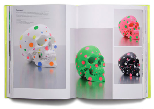
Picking the right colour palette for your design work is always a difficult decision. Whilst some favour the more understated, others opt for the bold and bright. This beautiful book, the latest in viction:ary's Palette series, takes a look at what makes fluorescent a favourite for many.
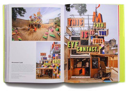
The 296-page book, entitled 'Palette No.4: Neon, New Fluorescent Graphics', showcases the applications of fluorescent colours in the design world, examining where they work best.
Including branding, interior design, and fashion, a total of 110 loud and colourful projects, by designers across the globe, are featured. Be sure to check it out for some serious colour inspiration.
Article continues below 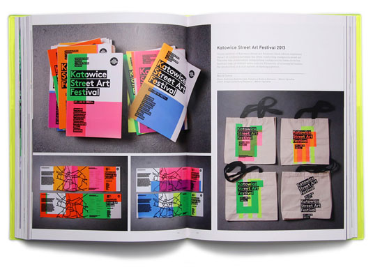
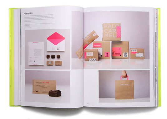
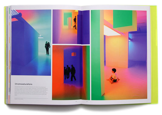
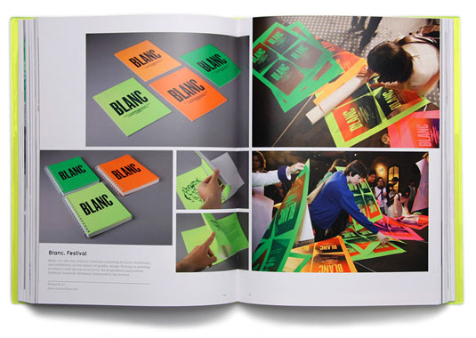
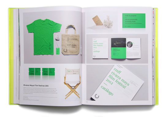
[via We Heart]
Like this? Read these!
- The ultimate guide to logo design
- Our favourite web fonts - and they don't cost a penny
- Useful and inspiring flyer templates
Do you think neon is over- or underused in the design world? Let us know in the comments box below!
Sign up to Creative Bloq's daily newsletter, which brings you the latest news and inspiration from the worlds of art, design and technology.

The Creative Bloq team is made up of a group of art and design enthusiasts, and has changed and evolved since Creative Bloq began back in 2012. The current website team consists of eight full-time members of staff: Editor Georgia Coggan, Deputy Editor Rosie Hilder, Ecommerce Editor Beren Neale, Senior News Editor Daniel Piper, Editor, Digital Art and 3D Ian Dean, Tech Reviews Editor Erlingur Einarsson, Ecommerce Writer Beth Nicholls and Staff Writer Natalie Fear, as well as a roster of freelancers from around the world. The ImagineFX magazine team also pitch in, ensuring that content from leading digital art publication ImagineFX is represented on Creative Bloq.
