Our Verdict
An invaluable book of inspiration and ideas, compiled thoughtfully and exhaustively to reveal trends, quirks, and fascinating pieces of design work in isolation. This book is bound to trigger your own ideas or at the very least, show you what you do and don’t like when it comes to making a brand mark.
For
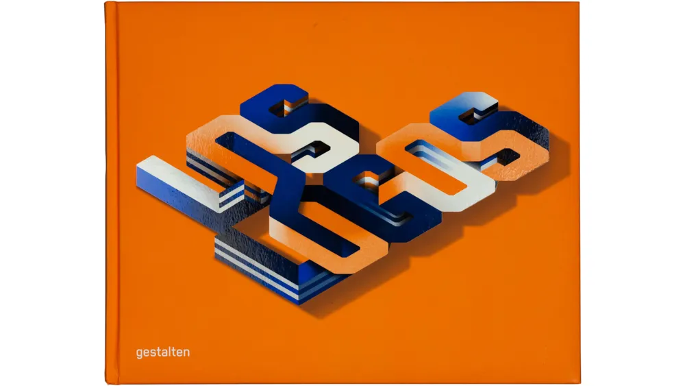
- Beautifully designed, lovely cover
- Superb curation
- Excellent layout
Against
- It’s another Los Logos book
Why you can trust Creative Bloq Our expert reviewers spend hours testing and comparing products and services so you can choose the best for you. Find out more about how we test.
There are a few things that are certain in life: death, taxes, and logos. That’s why the people behind the Los Logos compilations are really on to something. They’re never going to be short of content, and creative types are never going to tire of reading it.
The newest edition in the series is Los Logos 8, and there’s a reason this particular series is going strong: it’s excellent. As a person who spends most days writing about graphic design, it’s a total eye-opener, revealing some brilliant smaller studios, undiscovered branding work, and truly innovative and interesting approaches to logo design.
Sure, designing a logo is just one small component of a branding project, as anyone from an agency will tell you. However, in extricating that one element and placing it alongside its peers you get a real sense of trends across a moment in time.
And not only in what’s current either – also the moments in design history we’re looking back to, typographic styles, colourways, use of illustration and a whole bunch more.

As ever, Los Logos 8 is exhaustively and thoughtfully put together, showing work from across the world and from smaller agencies alongside the big guns like Wolff Olins. And it’s not just about range: every piece deserves its mention, for one reason or another. Quite how the editors managed this, I’ve no idea, but I commend them for it.
Sure, if you’ve a million hours and a lot of patience you could find a lot of this work online through blogs or platforms, but I’d argue that seeing these logos laid out like this as a physical artefact makes for a better understanding of the work. We see how it plays out in print, and how it potentially sits next to other images or different typefaces.

It’s also a dream for the people the book is likely aimed at – designers, brand managers, trend folk, and marketing types – as it’s much more satisfying to flick through pages in a meeting and pore over something tangible than to idly bookmark a blog post to never be seen again.
The book opens with an insightful intro from a man who knows his logos better than most: Michael Wolff. “There’s bound to be work you like and work you don’t,” he says.
“With some of the logos you’ll be able to appreciate the wit and craftsmanship when you feel it’s involved, with others you’ll find the work poor. But poor work can be inspiring too… Los Logos is a book full of graphic ideas and designs, which to some are inspirations and to others surprises – 'Plus ça change, plus c’est la même chose'.” Exactement, Michael.
out of 10
An invaluable book of inspiration and ideas, compiled thoughtfully and exhaustively to reveal trends, quirks, and fascinating pieces of design work in isolation. This book is bound to trigger your own ideas or at the very least, show you what you do and don’t like when it comes to making a brand mark.

