10 steps to code-free RWD with Macaw
Macaw is a new breed of web design tool – Tom Giannattasio explains how it can boost your responsive design workflow.
Sign up to Creative Bloq's daily newsletter, which brings you the latest news and inspiration from the worlds of art, design and technology.
You are now subscribed
Your newsletter sign-up was successful
Want to add more newsletters?
Responsive design is time-consuming and difficult, but Macaw can help alleviate some of those woes. It was built specifically for the modern web, with speed and ease of use in mind. Designers familiar with Photoshop or Fireworks should feel right at home within its interface.
Macaw enbles you to draw and manipulate elements on a canvas. The usual suspects are all present: transforming, drag and drop, nudging, and a new friend called pudge. Elements can be grouped and depths can be managed as if they were layers.
The difference is that all of these familiar manipulations are being translated into HTML and CSS on the fly. When you move an element around the canvas, Macaw automatically calculates the margins, floats, clears and other properties that are necessary to place that element in a static document flow.
Article continues belowMacaw is built on the same framework as Google's Chrome browser and therefore inherits its rendering capabilities. This opens a wealth of opportunities, especially when it comes to responsive design. You can simply resize the canvas, insert a breakpoint and optimise the layout for different screen sizes, all within a single file.
In this tutorial, I'll show you how to use Macaw to create a responsive coming soon page without touching Photoshop or a single line of code.
01. Enter the cavas
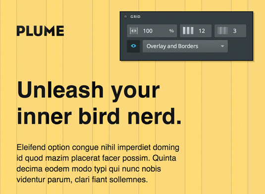
The canvas in Macaw can be resized at any time to see how your design flows in different viewports. It also has a fluid, column-based grid, which can be modified to your liking. The grid provides useful aids during the design process. For example, click Cmd+right or left to nudge an element perfectly to a grid column.
For this project, we'll use a 12-column setup, with a 100% width grid and 3% gutters. You can set these properties in the Grid palette, which is visible when no elements are selected.
Sign up to Creative Bloq's daily newsletter, which brings you the latest news and inspiration from the worlds of art, design and technology.
02. Draw a button
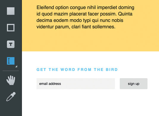
Adding elements is as simple as drawing shapes in Photoshop. Select the Input tool ( N ) and draw a shape on the canvas below the orange header. You'll notice a blinking cursor inside the shape, which indicates that this is a text editable element.
Type the words 'Email address' and press Cmd+Return to commit. This will be used as the placeholder text when published. Drag the input into place below the blue header. If your grid is visible, you should be able to snap the input into place. Note the blue guides that appear when moving an element. These are positioning guides, used to help visualise an element's margins and coordinates.
Draw a button next to the email input using the Button tool (B). Again, you can directly edit the text used in the button. Type 'Sign up' and press Cmd+Return to commit.
03. Meet the styling tool
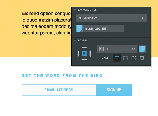
With our elements in place, let's add some styling and advanced options. Select the input using the Select tool (V). The Inspector will update with applicable options. In the section labelled Input Options is a drop-down that lets you set the input's type. Change it to Email.
Now select the button. In the Backgrounds palette, click the colour icon and select a bright blue. Click OK and continue adding styles to the input and button. It's easy to experiment with gradients, shadows and border properties.
04. Containers
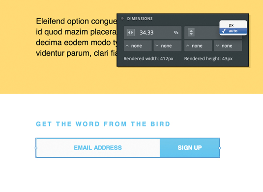
Select both the input and the button (hold Shift while using the Select tool). Press Cmd+G to group the elements together in a container.
Containers are much like Photoshop groups, but they have actual dimensions and can receive styling. They also gain abilities like auto height, which allows it to shrink or grow based on the rendered height of its children.
Change the container's height to auto by clicking the px suffix in the Height field in the Dimensions palette and select Auto .
05. Beautiful typography
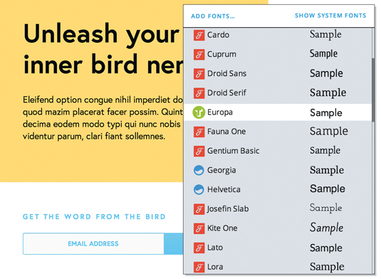
Let's add some beautiful fonts using Typekit. First, you will need to create a kit on the Typekit website (typekit.com). Be sure to add 'localhost' to the kit's allowed domains.
Back in Macaw, dive into the container you created in step 4 by double-clicking it using the Select tool. This lets you work inside the container without affecting elements outside of it. Select the input and button. Click the Font Name field in the Typography palette to open the Font Picker. Click the Add Fonts… button and add your Typekit ID in the dialog. Now the Font Picker will include the fonts from your Typekit account.
Change the fonts on your form and the text elements in the header. You may need to dive in and out of containers to access these elements.
Double-click a container to dive in and double-click outside of it to dive out. You can also use the breadcrumb bar at the bottom to jump to specific locations.
06. Image assets
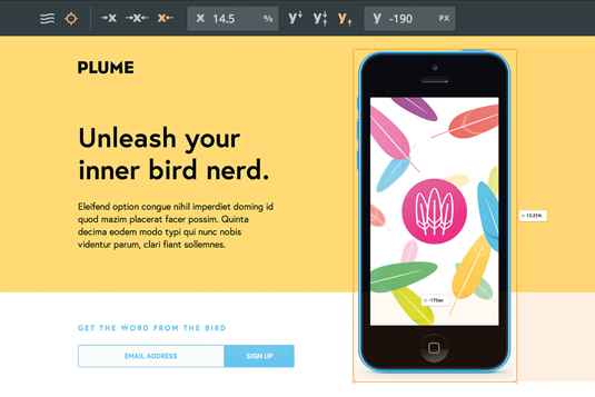
Let's add some images to that boring header. Click the Library tab. This is where you manage a project's assets. You’ll see that there are a few images already in the library. Macaw stores assets in the mcw file so you can pass it along to others without losing references.
We'll add the phone to the page. Double-click on the header, then click and drag phone.png from the library to the canvas. This is a retina-ready image and, if you're using a high-resolution display, Macaw will automatically convert it. You can check by navigating to the Image palette in the Inspector. This palette lets you examine the current size of an image in relation to its original size. Make sure that the @2x icon is selected.
We want to position the phone so it's always extending below the bottom of the orange section. To do so, we’ll use absolute positioning. Select the phone and click the crosshair in the Property bar. Set the x origin to right and the y origin to bottom using the x and y icons in the Property bar. Now move the phone so that it's positioned to the right of the text and extending below the orange. Even though the header has an auto height, the phone will now extend down as we'd like it to.
07. Background images
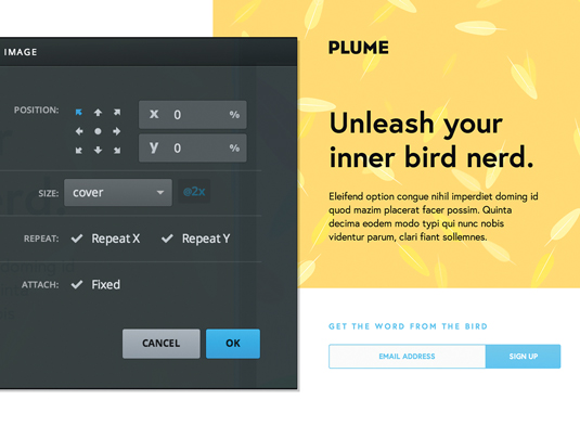
We'll now add some pizzazz to the header by adding a background image. Click body on the breadcrumb bar. Select the header and click the + button in the Backgrounds palette. Choose Image… from the drop-down. This opens the background image dialog.
Click Choose from library... and select feather.png. Set it to cover, using the size drop-down to ensure it always fills the orange header. There are plenty of other properties in here, so feel free to experiment.
08. Go responsive
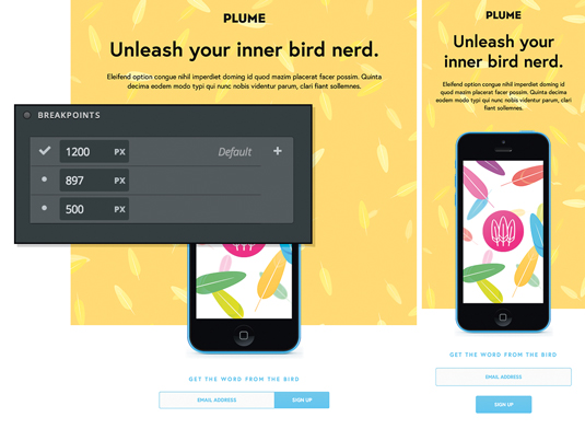
To make sure the design holds up in different viewports, scroll to the right of the canvas and move the drag handle to the left to resize the canvas and watch your elements flow down the page. Macaw has automatically calculated the document flow, so you can see exactly how your design will behave in the browser.
Let's add a breakpoint. While resizing the canvas, you'll see a tooltip appear, indicating the width. Drag the handle down to a width of 900px and press Cmd. Click Yes in the alert to insert a breakpoint. You can now modify your design to cater to this specific width. Layout can be changed and styles can be reworked. You can easily toggle between breakpoints using the Breakpoints palette or by hovering breakpoints on the ruler.
When working with breakpoints it's important to understand that properties trickle. When you change a property, it's applied to the current breakpoint. That value will trickle to the breakpoints below it, but it does not travel upwards. If you have different values set for a property across breakpoints, Macaw will outline the field in blue.
When you hover over one of these fields, a property table will display showing the values on each breakpoint. You can quickly grab a value and apply it by clicking on one of the values in the table. You can also distribute a value to all breakpoints by Cmd+clicking it. Go ahead and add breakpoints wherever you think the design starts to break down. I added them at 900px and 500px.
09. Make the HTML
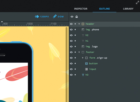
Macaw uses a powerful design-to-code engine to convert your document into clean, succinct HTML and CSS. Macaw will handle the heavy lifting for you, but it needs some help first.
Click the Outline tab. Here you can rename and organise elements in a manner similar to Photoshop's Layers palette. Renaming elements plays a key part in publishing, because it defines the semantics and class names to use.
Macaw uses a simple dot-syntax naming scheme. The first word used in the name is parsed as a tag name. If that tag exists in the HTML spec, it will be highlighted in green and used when publishing. Macaw then looks for a full stop followed by a class name.
This is a simple and way to define the semantics inside your document. Select the container element you created earlier, double-click its name in the outline and rename it 'form.sign-up'. You'll see that form is highlighted in green because it's a valid HTML tag.
10. Admire your work
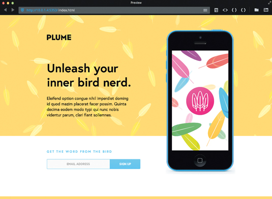
Our design is optimised for all breakpoints and elements are all named semantically. You can publish your document at any time by pressing Cmd-P. This will generate all the HTML and CSS for your project and open the preview browser. From the preview window you can ensure proper rendering, view other pages and inspect the generated code.
Macaw also has a built-in feature called Remote Preview, which enables you to broadcast your design to other devices on the same wireless network. Simply navigate to the IP address shown in blue in the preview window’s address bar and Macaw will automatically reload updates made to the published project to that device.
Words: Tom Giannattasio
Tom Giannattasio is an interaction designer and also Macaw's Founder. This article originally appeared in net magazine issue 256.

The Creative Bloq team is made up of a group of art and design enthusiasts, and has changed and evolved since Creative Bloq began back in 2012. The current website team consists of eight full-time members of staff: Editor Georgia Coggan, Deputy Editor Rosie Hilder, Ecommerce Editor Beren Neale, Senior News Editor Daniel Piper, Editor, Digital Art and 3D Ian Dean, Tech Reviews Editor Erlingur Einarsson, Ecommerce Writer Beth Nicholls and Staff Writer Natalie Fear, as well as a roster of freelancers from around the world. The ImagineFX magazine team also pitch in, ensuring that content from leading digital art publication ImagineFX is represented on Creative Bloq.
