15 amazing HTML examples
Get inspiration for your website from these HTML examples.
Sign up to Creative Bloq's daily newsletter, which brings you the latest news and inspiration from the worlds of art, design and technology.
You are now subscribed
Your newsletter sign-up was successful
Want to add more newsletters?
Five times a week
CreativeBloq
Sign up to Creative Bloq's daily newsletter, which brings you the latest news and inspiration from the worlds of art, design and technology.
Once a week
By Design
Sign up to Creative Bloq's daily newsletter, which brings you the latest news and inspiration from the worlds of art, design and technology.
Once a week
State of the Art
Sign up to Creative Bloq's daily newsletter, which brings you the latest news and inspiration from the worlds of art, design and technology.
Seasonal (around events)
Brand Impact Awards
Sign up to Creative Bloq's daily newsletter, which brings you the latest news and inspiration from the worlds of art, design and technology.
Many of the best HTML examples are dynamic and engaging websites that push the boundaries of what's possible in web design to captivate users. Others are simply superbly usable due to their well-considered UI design. The best website designs usually combine both of these elements.
We've rounded up some of our favourite examples of HTML from the web, and whether you're using simple HTML or diving into WebGL and 3D CSS, you'll find something here to inspire you. Also see our picks of CSS examples and CSS animations.
15 great HTML examples
01. Lusion
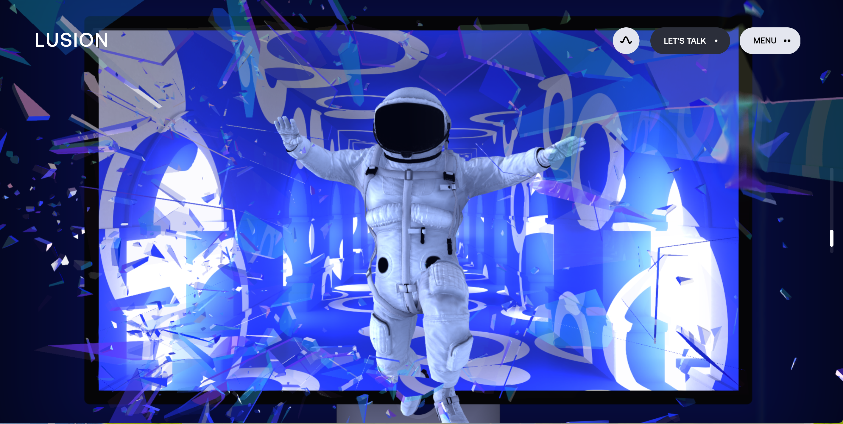
The website for the Bristol based creative production studio Lusion is quite a calling card. The studio specialises in 3D visual storytelling and interactive web experiences, so its makes sense that the website goes all out to engage and show what they can do.
Scroll animation and reactive cursor interaction may be every where today, but this example still stands out since it feels like they truly enhance the experience rather than get in the way. They draw the user through the site, which ends with a surprising call to action to contact the studio.
02. Unseen Studio
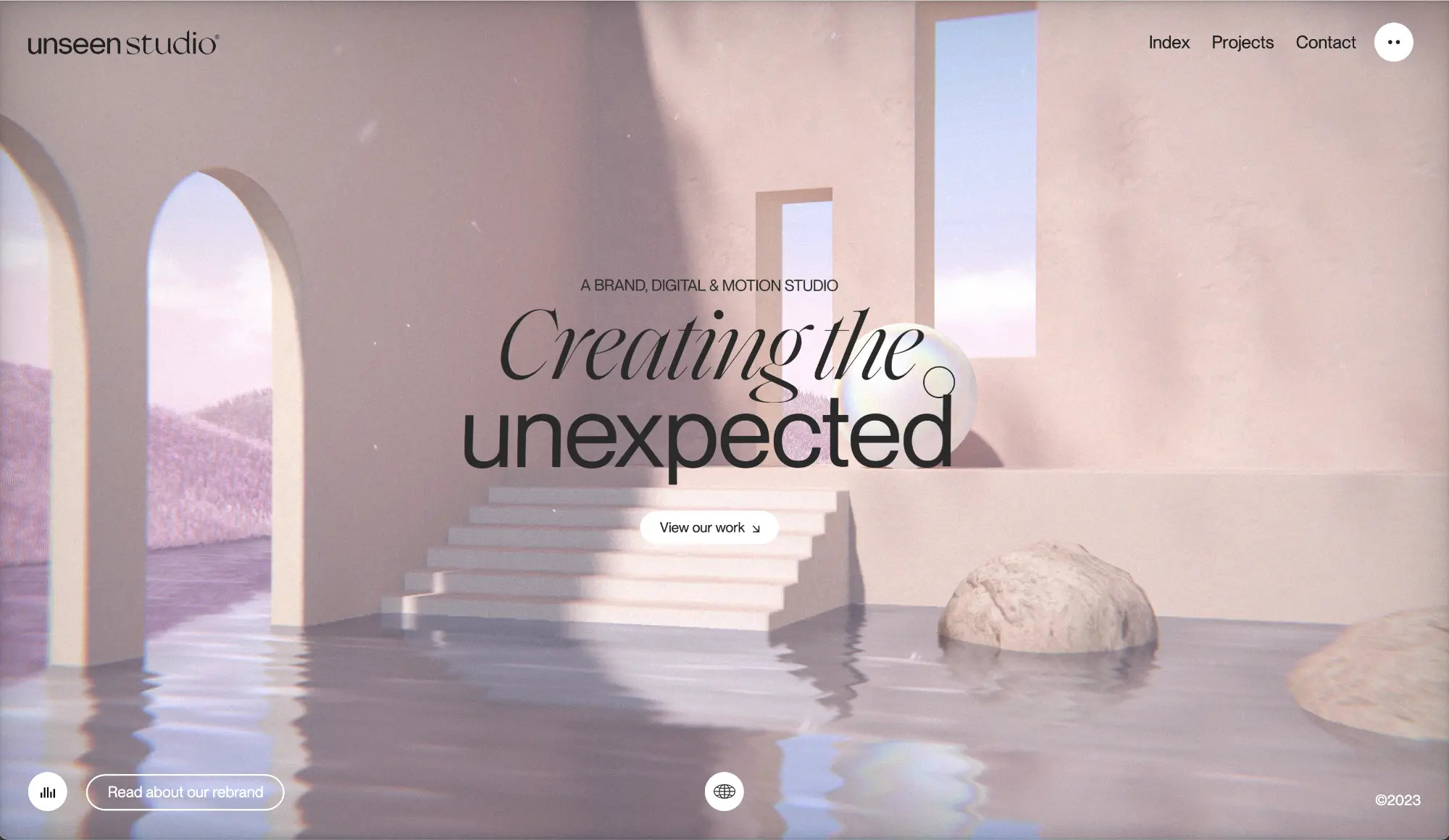
The website for Unseen Studio was honoured with an Awwwards Site of the Month (SOTM) award in February 2023. The digital and motion studio created an engaging online experience to invite viewers to explore its portfolio. Moving the cursor around the home page shifts the screen view slightly. Pass it over the menu text, and lettering changes colors and shimmers. The music and the whole user interface is relaxing and soothing, while bold and sound and visual effects draw attention to core information.
03. Allbirds
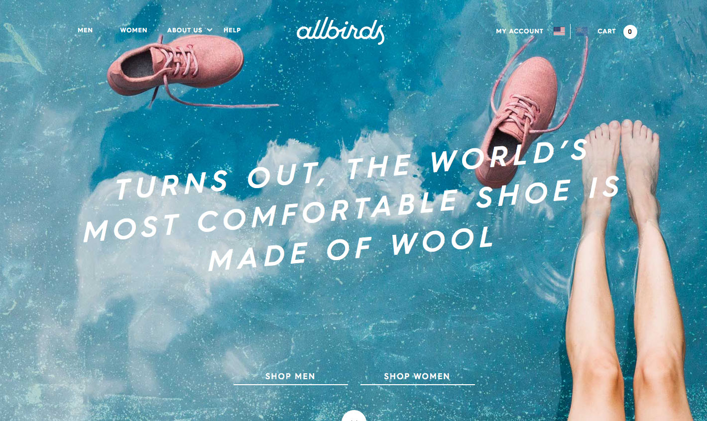
Allbirds is a sports shoe brand from the land of 29,221,344 sheep. It began when co-founder Tim Brown observed the amazing qualities of Merino wool, and wondered why it had never been used in footwear before.
The website, built using Shopify, mixes lifestyle photography with illustrations. The result is a delightful experience that doesn’t just tell the story behind the Allbirds, but also gives you a feel for the product itself.
Sign up to Creative Bloq's daily newsletter, which brings you the latest news and inspiration from the worlds of art, design and technology.
"It’s designed to showcase the incredible attention to detail and thought behind our product design," explains Brown on the reasoning behind the site. "We invested heavily in photography – and NYC-based kiwi photographer Henry Hargreaves – to bring the site to life and articulate our mission of making better shoes in a better way."
Both Brown and the Red Antler team talk of their extreme dedication to the UX of the site and how they leaned into the details that so often are overlooked. The mundane FAQ section is brought to life with animated GIFs, and illustration is used throughout the site as unexpected storytelling motif.
04. Karim Rashid
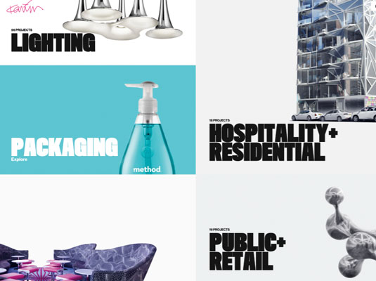
Designer Karim Rashid is as prolific as he is celebrated. With over 3,000 designs in production and work in 20 permanent collections worldwide, it is perhaps no surprise that his own website had taken a back seat for the past 10 years. Until he commissioned Anton & Irene, that is.
With its trademark embrace of engaging interactions, emotive typography and truly device-agnostic layouts, the duo has delivered a site that invites vigorous exploration. Which was, of course, the point: "Our main goal was to showcase the plethora of products and projects in a visually enticing way," say the pair on their blog.
This plethora of products also presented a challenge. How does one deliver 5,000-plus images of varying shapes and sizes in a responsive environment? The solution: a re-imagining of conventional layouts and a lo-fi approach to structuring to give a precise, flexible grid combined with bold (yet unobtrusive) typography.
Perhaps the most impressive thing about Rashid's site is the seamless transitions between viewports. "We always design all screens simultaneously ... The moment we have an idea for a component or a layout we try it on all screens and see if it makes sense across the board."
05. Histography
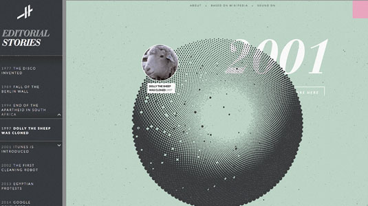
Histography – Israeli designer and developer Matan Stauber's final year project at Bezalel Academy of Arts and Design – is an interactive timeline spanning no fewer than 14 billion years, from the Big Bang to present day. Literally extending over the entire history of the known universe, it is an immense, interactive infographic that challenges our preconceptions of how to communicate complex subjects.
Covering topics ranging from literature and music to assassinations, inventions and religion, Histography's timeline invites us to explore events from our rich past, each dynamically pulled from Wikipedia and represented on screen as a small black dot. There are two modes: the horizontal, left-to-right view that allows the user to home in on a specific time period; or the helix-like time machine that presents a curated list of key events.
Stauber says he has always been fascinated by the idea of showing history unfold over time: "Timelines are the most popular way of visualising history, and yet I felt they where always very limited. From the beginning of this project I knew I wanted to create a timeline that is not limited to a year, decade or a period. I wanted a timeline that could contain all of history."
06. On the Grid
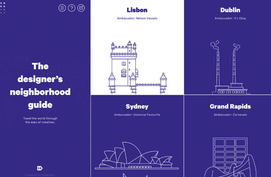
Although stressful to many, moving office can also be a great source of inspiration. When Hyperakt relocated to Gowanus, Brooklyn, the team's excitement at discovering the hidden treasures of their new surroundings led to the incarnation of On the Grid: an international neighbourhood guide, curated by designers.
The site is minimalist yet impressionable, and was "designed to be highly structured, yet playful and dynamic, just like the content on the site". The no-nonsense aesthetic shuns the typical hero image trap and makes great use of the viewport even at extreme sizes.
And then there's the attention to detail. From the animated logo to the 100 (and counting) unique city illustrations and simple animations, On the Grid clearly isn't just another lifestyle blog.
On its blog, Hyperakt explains how it wanted to create "a reliable resource that captures the true essence of the places we love, through beautiful photography, candid descriptions and design-driven curation." With more curators joining every month, On the Grid may soon come to a neighbourhood near you.
07. LS Productions
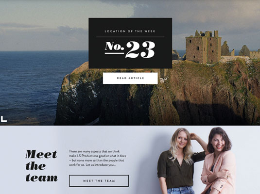
LS Productions expanded its horizons when it change its name from Location Scotland. It's now the UK's largest stills and motion service production company. Its branding and website was produced by Edinburgh agency Whitespace.
Senior designer Mike Bryant says the priority was to let the company's work do the talking: "They have such an incredible portfolio, ranging from stills to motion, that our main task was to create a structure that complemented minimal type with image." This approach is immediately evident on the homepage, which encapsulates the company's broad offering with a fitting mixture of animated typography and video.
The main technical challenges – keeping load times to a minimum and managing different crops for the high-quality imagery – were overcome by replacing higher-res images where required, and using JavaScript to dynamically manage the height and aspect ratios of images at various screen sizes.
The final result, Bryant says, is a "stripped-back site that uses modular panels, clean type and a minimal colour palette to act as a subtle backdrop for the beautiful work".
08. Lordz
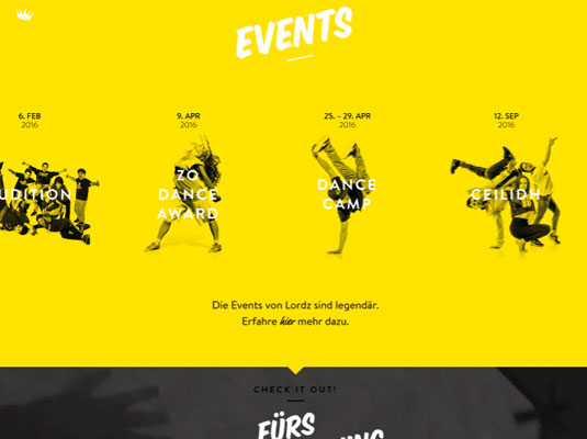
"Play is older than culture, for culture... always presupposes human society, and animals have not waited for man to teach them their playing." Thus begins Johan Huizinga's Homo Ludens, where the author discusses the impact of play in society.
The element of play is one that Lordz, a dance academy based in Switzerland, takes seriously. For Lordz, dance is not just about movement; it is an art form, a playful means of cultural expression. Tasked with designing a site for the academy, Eidenbenz/Zürcher used this ethos to guide its artistic direction.
"We wanted to create something that confronts the digital experience with the very heart of Homo Ludens," explains art director and partner Daniel Zürcher. "A playful way of getting an insight into the daily practice of dancing; the movement, the feelings, and so on. To achieve this, we used the newest technology in filming, post-production and, of course, programming."
The result is quite stunning; a uniquely recognisable and inspiring site that truly captures the heart of the organisation through the use of video – a rare feat these days.
09. Monotype
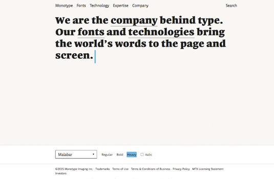
The Monotype site is, at first glance, extremely simple. Its journey from conception to launch started when iA joined an in-house team at the type foundry to help develop the vision for the future of Monotype online.
The project began with extensive research in order to simplify the corporation's domain structure and information architecture. Rigorous user testing over a period of six months informed the initial HTML prototypes, from which the main concept was born.
"We worked on the the visual language, developing a series of font micro-sites that were tested and optimised over time. The basic idea is that the type is the star," explains Oliver Reichenstein, founder of iA. "The homepage is reduced to the essence. The deeper you dive in the richer it gets." The team also decided on the daring idea of using a type tester on the homepage.
The concepts were developed into content prototypes using Kirby. This allowed iA to not only test the design in a live environment, but also to produce supporting content, and continuously refine and systematise the design. "Overall," Reichenstein says, "Monotype.com was a model of modern web development, from research, to concept to production. And we hope it shows."
10. Halo 5: Guardians Visualizer
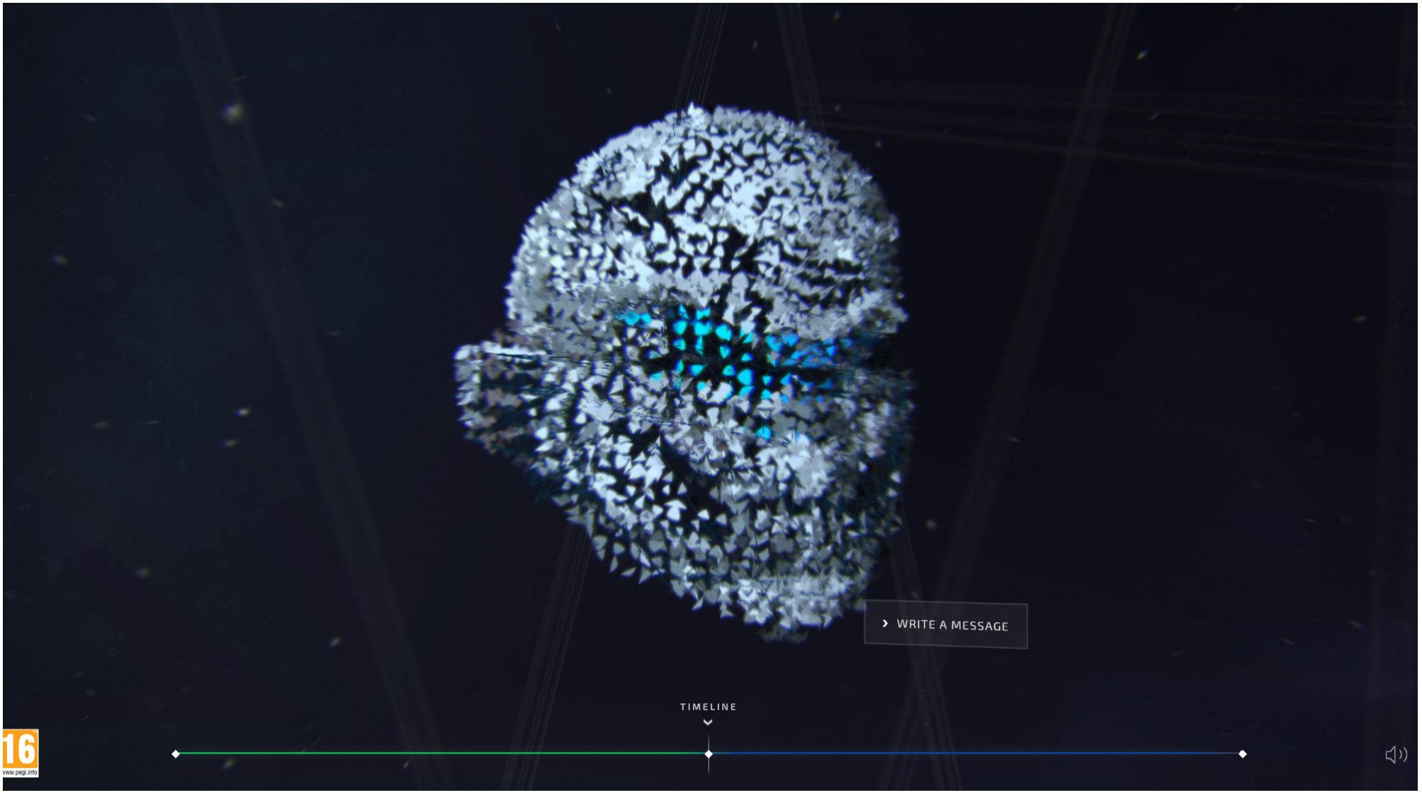
This site for part of the video game franchise Halo has such an extraordinary navigation structure. The user moves through an intuitive, timeline-esque view, with fractured pieces of Halo helmets acting as user engagements for the game.
"We used WebGL particles that use a 3D model to form the shape of the game characters' helmets, 3D CSS to animate in the pieces of user content, and Canvas to draw and animate the timeline at the bottom," says Rachel Smith, interactive developer at Active Theory. "It's a good example of combining web technologies depending on what the interface needs."
The mysterious shattering and rebuilding of elements could be disorienting, but instead, feels completely fluid. The slight tilting of the user stories, and even elements such as contact modals, unite the design and motion across every part of the site. The spatial atmosphere becomes a language in itself.
11. Over the Tiny Hills
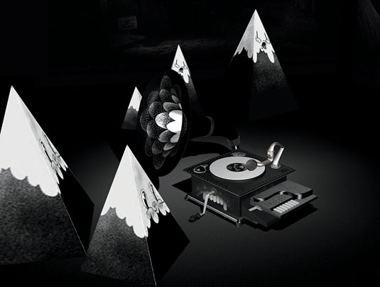
Over the Hills was created by French digital studio ultranoir, working with illustrator mcbess to present his group's EP of the same name. The mixture of sound and exploration are perfectly coordinated to create a captivating experience.
"We tried to push the boundaries of what we thought was possible with interactive 3D and sound on the web. We had fun playing with mcbess' twisted cartoon style in building funny interactions based around a 3D spatial sound experience," says lead developer Jérémy Saint-Prix. The project even made it into the real world, when the gramophone built for the project was 3D printed, painted by mcbess and exhibited in a Parisian gallery.
The WebGL effects work seamlessly with the drawings, and since it's a pretty unique effect, the user remains curious about what they'll find at each turn. They can explore infinite tunnels, scratch their own turntable and activate the music themselves, but guidance is given so they never feel lost in this world of UX.
12. Ba Ba Dum
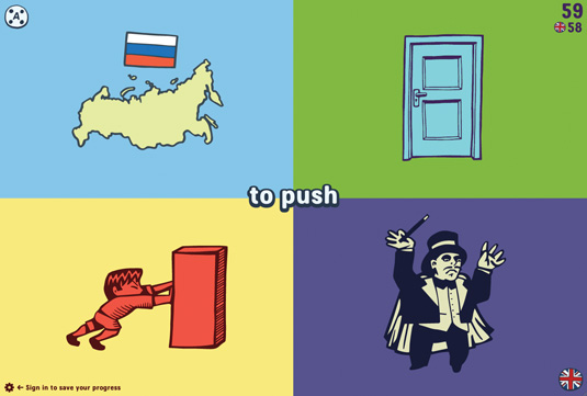
Ba Ba Dum, a 'play and learn' site featuring five games that work in nine languages, created by husband-and-wife team Hipopotam Studio. It's visually stunning, with beautiful graphic design, illustration and typography. It uses what look like simple hand-drawn illustrations that have been converted to vector illustrations: perfect for this word quiz.
The page layouts are simple and well balanced, and the colour palette – crazily multicoloured but also very considered – is amazing. The 'Mr Dum Dum' typeface designed for Ba Ba Dum perfectly complements the tone of the site. The UI is also easy to use, and the site's interactions and animations, and the games themselves, are fun and engaging.
"Me and my wife Aleksandra are authors of children's books," explains co-creator Daniel Mizieliński. "We're also programmers and wanted to create a fun, immersive experience which gives the opportunity to learn something."
13. The Rational Keyboard
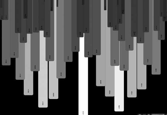
The Rational Keyboard is a musical instrument app that has a continually playing, 32-voice background accompaniment. Developer Fritz Obermeyer created it as an experiment.
Obermeyer explains that, "to keep the UI responsive the app does all of its synthesis in a background web worker and sends a data URI of a wave file back to the main window about five times per second. The main window then creates audio elements and plays these back, overlapping the sounds to accommodate timing jitter."
It also plays foreground audio on mouse click and motion, which are taken from samples generated on page load. The keyboard is rendered using canvas because of its better frame rate than SVG.
14. Sprite: The Hall of Zero Limits
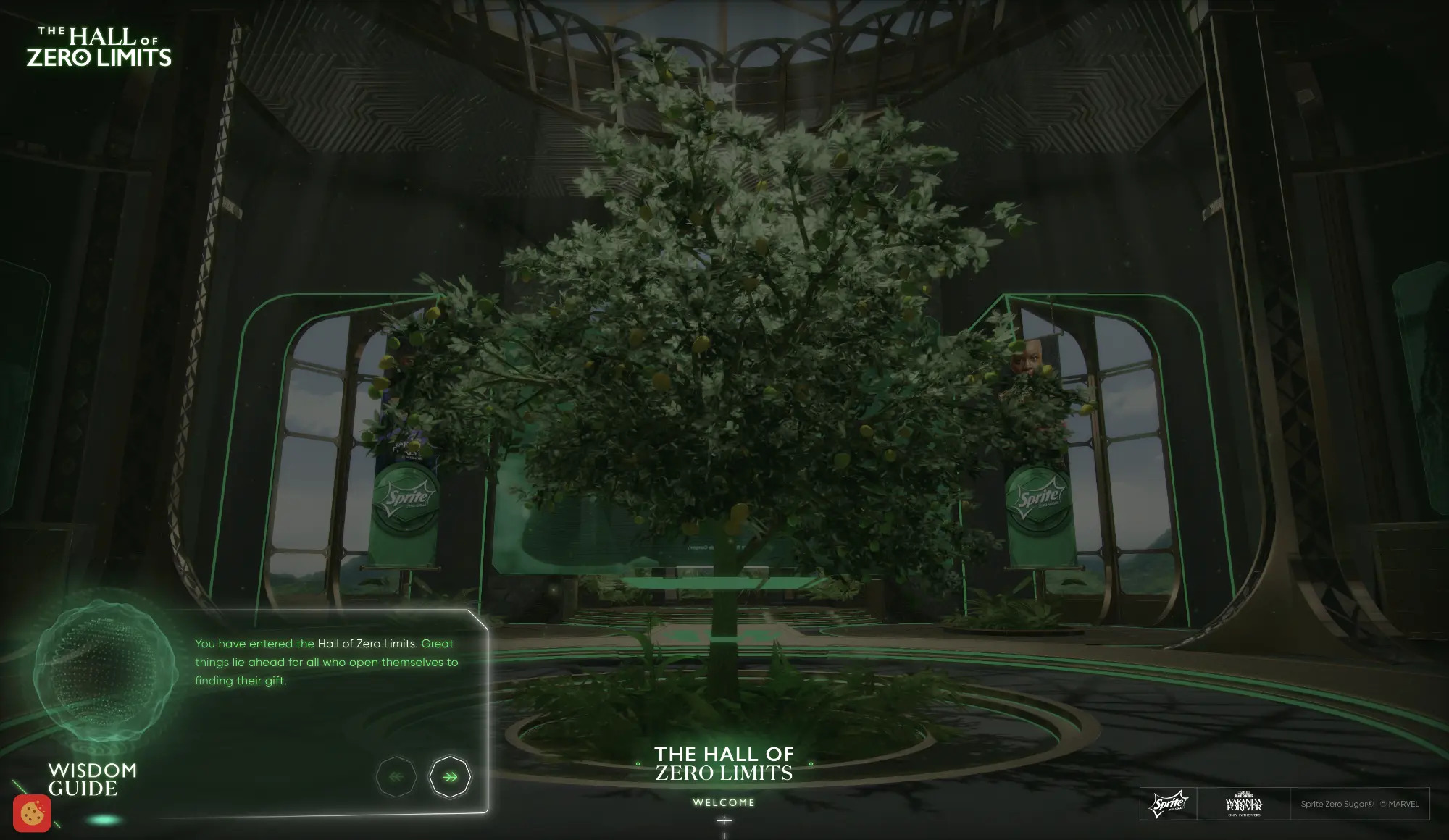
Sprite's Hall of Zero Limits site was designed to coincide with the launch of Black Panther: Wakanda Forever. It's an immersive, interactive webpage full of dynamic content from the outset. Click enter and the door swings open to invite you into a great hall featuring images of the film's cast and crew. You can click on each one to access content to learn more about their work on the film. The site was named Awwwards’ Site of the Month in January 2023.
For more on web design, see our guide to some of the best resources for learning HTML and CSS and how to use an HTML boilerplate.

The Creative Bloq team is made up of a group of art and design enthusiasts, and has changed and evolved since Creative Bloq began back in 2012. The current website team consists of eight full-time members of staff: Editor Georgia Coggan, Deputy Editor Rosie Hilder, Ecommerce Editor Beren Neale, Senior News Editor Daniel Piper, Editor, Digital Art and 3D Ian Dean, Tech Reviews Editor Erlingur Einarsson, Ecommerce Writer Beth Nicholls and Staff Writer Natalie Fear, as well as a roster of freelancers from around the world. The ImagineFX magazine team also pitch in, ensuring that content from leading digital art publication ImagineFX is represented on Creative Bloq.
