Master responsive web design
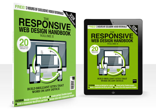
Learn how to adapt your sites for devices of all shapes and sizes in The Responsive Web Design Handbook: Vol 2.
Sign up to Creative Bloq's daily newsletter, which brings you the latest news and inspiration from the worlds of art, design and technology.
You are now subscribed
Your newsletter sign-up was successful
Want to add more newsletters?
In this special edition from the makers of net magazine, you'll find everything you need to know about the latest responsive web design and development techniques, from cutting-edge layout options and responsive images to emails and WordPress portfolios.
Buy The RWD Handbook: Vol 2 now
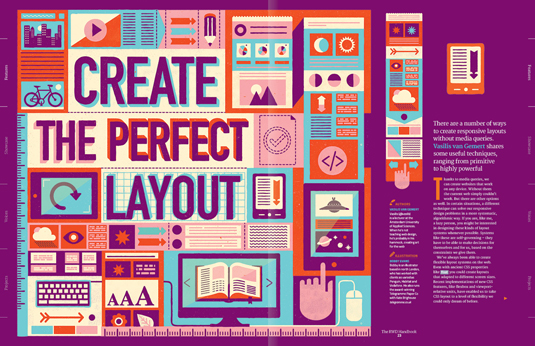
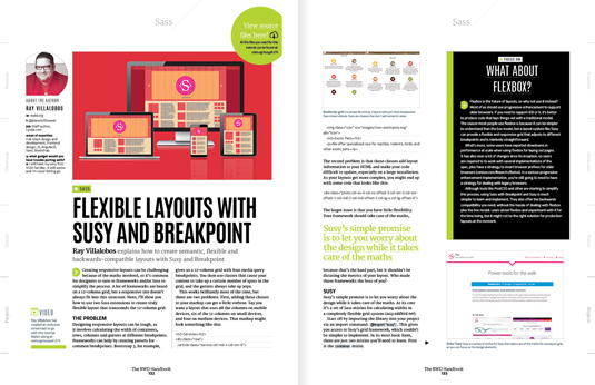
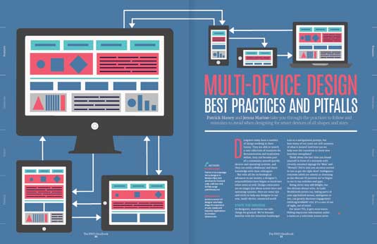
In our Features section, the team reveal the advanced techniques you need to boost your RWD to the next level, explore how to create responsive layouts without using media queries, and take a look at the best practices and pitfalls you should be aware of.
In the Showcase section, there's a gallery of inspiring new responsive sites out there. The team has also gone behind the scenes on the sites that have really pushed the envelope in terms of responsive design, with in-depth looks at sites from the Guardian, the RNIB and Amnesty International.
Article continues below 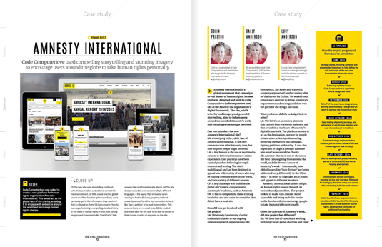
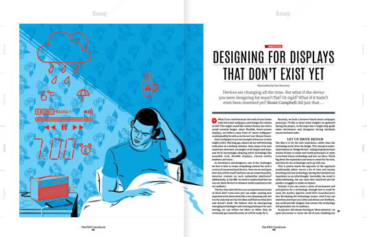
The Voices section gives web celebs a platform to share their views on issues related to RWD. In it, Noah Stokes argues responsive design is sucking the soul out of our sites, Tom Dougherty considers why brand guidelines are still so focused on print, and Rosie Campbell explores how we design for screens that haven't even been invented yet.
Plus we have exclusive interviews with Aaron Gustafson, Scott Jehl and Brad Frost.
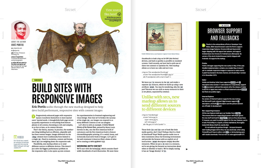
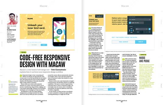
Finally, in our projects section, there are a whole load of practical projects to help you master every side of responsive design. There are tutorials exploring the latest RWD techniques (including flexbox, CSS Grid Layout and element queries); the platforms and tools that will help you (Webflow, Macaw, UXPin and Polymer, to name a few); closer looks at how to master tricky elements such as images, email, tables and charts; and finally guides to help you master responsive WordPress themes and portfolios.
Sign up to Creative Bloq's daily newsletter, which brings you the latest news and inspiration from the worlds of art, design and technology.

Ruth spent a couple of years as Deputy Editor of Creative Bloq, and has also either worked on or written for almost all of the site's former and current design print titles, from Computer Arts to ImagineFX. She now spends her days reviewing small appliances as the Homes Editor at TechRadar, but still occasionally writes about design on a freelance basis in her spare time.
