This parallax site is doing things differently
Distinguished magazine Scientific American gets the online experience it merits.
Sign up to Creative Bloq's daily newsletter, which brings you the latest news and inspiration from the worlds of art, design and technology.
You are now subscribed
Your newsletter sign-up was successful
Want to add more newsletters?

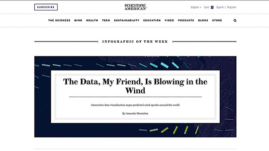
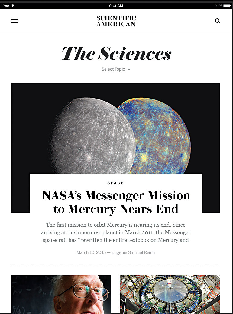
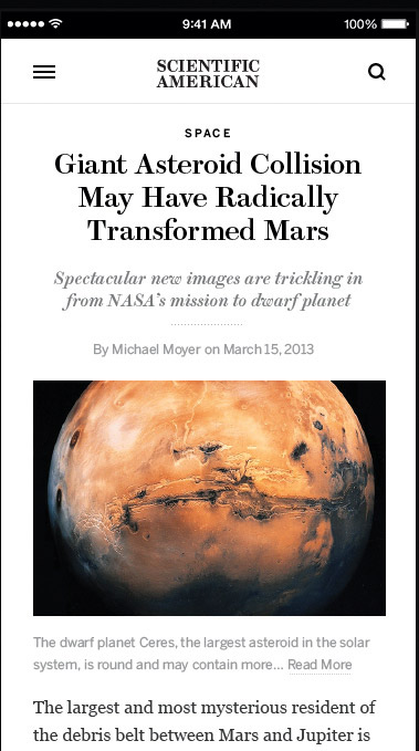
Science and technology magazine Scientific American was in need of a redesign to closer ally its print and digital touchpoints, and Brooklyn's Area 17 more than delivered with this parallax scrolling creation. Its design accentuates the respected 170-year old brand's content through careful treatment of design basics like typography, negative space, layout and photography.

"Aligning the brand online with the strong personality of the print magazine was a goal of the design and the project overall," says design director Miguel Buckenmeyer. "The print magazine's visual identity was based on an exquisite English modern revival typeface called Brunel, by Paul Barnes and Christian Schwartz of Commercial Type.
"So using Brunel and visual elements similar to those in the magazine were obvious choices. In the era of web fonts, there is really no excuse for an editorial brand not to be using the same basic palette of typefaces online as well as off."
Article continues below 
From a frontend layout perspective, I was happy to see the site using CSS flexbox effectively to support various layouts across screen sizes. The team has prioritised content to give a beautiful, elegant layout on different devices.
This article was originally published in net magazine issue 279. Buy it here.
Sign up to Creative Bloq's daily newsletter, which brings you the latest news and inspiration from the worlds of art, design and technology.
