Experimental design projects can be a great way to try something different. They're an excellent alternative to the usual everyday work that's more about about creating work that's familiar and reassuring.
They can provide the opportunity to break from the norm and pursue a creative path that's exciting, innovative and based on fresh ways of thinking. Not only that, they can supply some stand-out work for your design portfolio.
These are the kind of projects that most of us live for. But there's one problem. When you are asked to be brave and experimental, there's a chance that your no-holds-barred, imaginative muscles have atrophied through lack of use.
So if you're struggling to find your creative mojo, get inspired by these 11 amazing projects, which all harness experimental design to push boundaries like never before.
01. Jet packaging
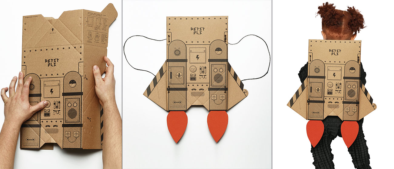
Petit Pli has developed a whole new way of making kids' clothes that grow along with children. Thanks to aerospace-inspired pleats, Petit Pli garments can grow up to seven sizes, saving parents the hassle and expense of buying new clothes for their little darlings every few months.
NB Studio handled Petit Pli's branding, and as part of the process developed some unique packaging design that reflected the company's four themes: sustainability, fashion, aerospace engineering and kids.
The NB Studio team came up with the idea of packaging that can be turned into a plaything, and the end result is a delivery box that can be folded into the shape of a jet pack once it's done its job. Developing the concept required plenty of experimentation as well as a crash course in origami, but the finished packaging has paid off in more ways than one.
Daily design news, reviews, how-tos and more, as picked by the editors.
Not only does NB's design give an extra lease of life to packaging that would otherwise have been discarded, it's also proved a lot cheaper to produce than Petit Pli's previous packaging.
02. Interactive dancing robots
Public art is often criticised and, perhaps worse, ignored by the public its meant to serve. So to celebrate the final month of Hull 2017 UK City of Culture, Jason Bruges Studio created four large-scale art installations that nobody could walk past and not notice.
The work entitled Where Do We Go From Here? featured 6m-tall robots that interacted with passers-by and performed a sound and light show. Off-the-shelf 3D software was adapted to make the robots do their own unique dance, explains 3D visualiser Adam Heslop.
"We regularly build plug-ins for Cinema 4D that allow us to directly control and manipulate real-world hardware," he says. "Normally, we build a real-time link so that we can scrub the slider and see how the hardware behaves. But these robots are a lot more complex and potentially hazardous so we decided to design choreographies in C4D.
"We built our own inverse kinematics plug-in so that we could apply all the motion graphics tools to design each robot’s choreography. We were then able to press a button, which would export a robot program from Cinema 4D, which we could then load into the robot’s system, press Go and watch it unfold."
03. Microscopic typography
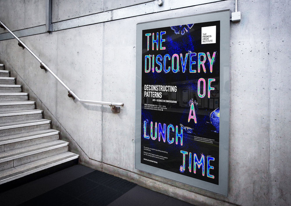
When The Beautiful Meme was asked to advertise a new exhibition held at London’s Francis Crick Institute, Europe's largest biomedical research facility under a single roof, the team wanted to do something in keeping with the institution's essence. So they worked with its scientists to create a microscopic headline, which was 3D printed with a 100 micron depth.
The headline template was flooded with fluorescent beads. The letterforms were then studied and photographed under a microscope before introducing the colours used to map patterns in cell dynamics.
"The processes that the Crick Institute used to create the microscopic type were all new to us as an agency," says creative director Tom Sharp. "So we had to be very adaptive to the results of the process, and allow them to define our approach to some extent.
"Our agency is as enraptured by science as much as we are by art – they are both quests to enrich life and deepen consciousness – and so this was a delicious project for us."
04. Branding with built-in asset generation
In 2017 Pentagram was asked to create the branding for Graphcore, a machine learning hardware start-up based in Bristol, England and Palo Alto, USA. Intriguingly, as part of the identity, Pentagram built a shape generator the internal team could use to create assets themselves.
This carefully balances a degree of randomness with some solid design principles. "There’s a lot of things that are very considered about it, like shapes and colour and how small the grid can get and how big the grid can get," says Pentagram partner Jody Hudson-Powell. "But within that very prescribed set of parameters there’s a nice texture that comes from random; there’s a kind of unconsidered consideredness. The other thing is when it doesn’t work the user just doesn’t save it. There’s still a human at the end of the process who’s gauging whether it feels right or wrong."
Handing over this degree of control of the identity to the client may seem unusual. But Hudson-Powell felt it fitted the project perfectly. "Graphcore didn't have any internal design resource – they’re a bunch of engineers trying to do something really fucking complicated," he explains. "So it's necessary to create useful things they can work with and they can generate themselves. If you don't do that, they end up not knowing how to use this expensive thing they've just bought from a design company, and finding Creative Commons imagery to use in its place."
05. Adaptive typeface
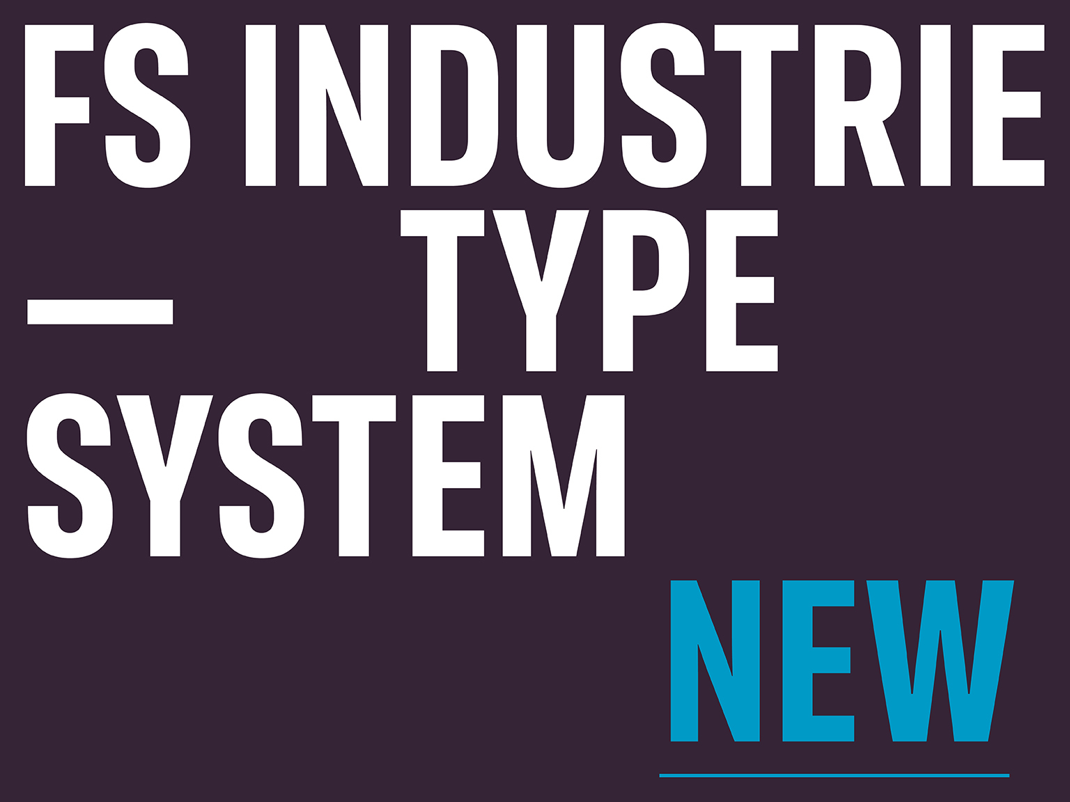
In the rapidly expanding digital space of 2018, fonts are having to do more and more things and more and more devices. With FS Industrie, Fontsmith set out to create a utilitarian typeface with its own unique character that works no matter your message or medium.
The adaptive font is basically a stop-gap until variable font technology has caught up with the needs of designers. "One of the key challenges we set ourselves was coming up with a type design that could adapt to a broad range of widths and weights without compromising its tone of voice," explains type design director Phil Garnham. "It had to be clear in all its guises, whether it was being used for interface menus or variable data advertising, and it needed to reflect the 'now' in every sense. What we set out to create was not just a typeface, but a type system with five widths and seven weights. With italics, that makes for 70 variants for each character."
"It is the spirit of variable design and flexibility that drove us to create FS Industrie," he adds. "A response to the changing nature of type, for brands that are responding to the changing nature of work."
06. Magazine with 8000 covers
Creative Bloq's sister magazine Computer Arts has made an artform out of the 'split-run', where an issue has four or more collectable covers. But that's nothing to the astonishing 8,000 variations Eye magazine produced for its 94th edition last year.
The graphic design and typography publication generated the thousands of individual covers using a variable data program called HP Mosaic. "To make ten seed files, Paul McNeil and Hamish Muir produced a file in which the letters of the word 'eye' are repeated in fixed increments and in three layers, each set in a different font of their TwoPoint or TwoPlus typefaces," explained editor John Walters in the magazine. "They are shifted laterally in distances proportionate to the letter spacing."
07. Indie publishing meets AR
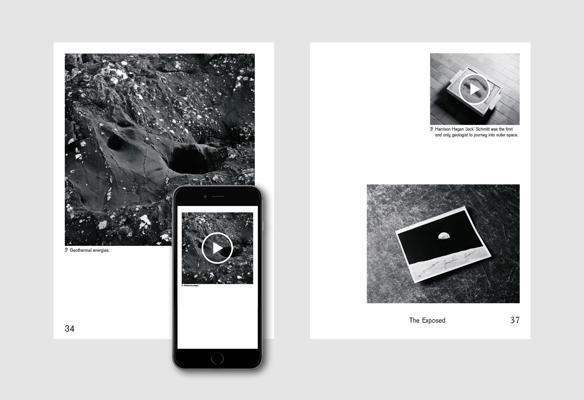
Another magazine taking advantage of new technology is indie magazine The Exposed. Well okay, augmented reality itself is not that new. But this Copenhagen-based contemporary arts publication pushes it forward by integrating AR into the storytelling itself.
The opening story of issue 2, for example, reported from Masdar City, the ambitious development in Abu Dhabi that is seeking to become the world’s most sustainable eco-city. Point your phone at the pages and an audio narration begins, giving more context and personal recollections on his trip and the strange world he found there.
The experience is something like listening to a podcast while also browsing through a collection of associated photographs, and draws the reader/listener deeper into the story. Elsewhere in the mag, video is used to similar effect. It's an innovative approach that we’d like to see more publications experiment with. See our post on top indie mags to see more magazines breaking boundaries.
08. Coding meets quilting
The fashion world has always been proudly elitist, but could new technologies make it more democratic? Based in Salford's Islington Mill studios, the artist collective known as > thread {}, aka Sally Gilford, Cheryl O’Meara and Vicky Clarke experimented with an innovative quilting processes that uses coding to digitise human data drawn from a group of local youngsters, and used them to create an immersive installation at the studios.
"It was like a love-hate relationship with fashion in liking the creativity but not liking the machine behind it," explains O’Meara. Adds Clarke: "I've been interested in the hack space and the maker movement, and the idea of creating one-off products that you're really involved in personally. So the idea of working with the code and the data, but also the analogue and digital processes, means you can create quite small runs and one-off works. So it's the anti-mass consumerism of the development of artworks, really."
You can learn the details of how the technical process in the video above.
09. Sustainable fashion
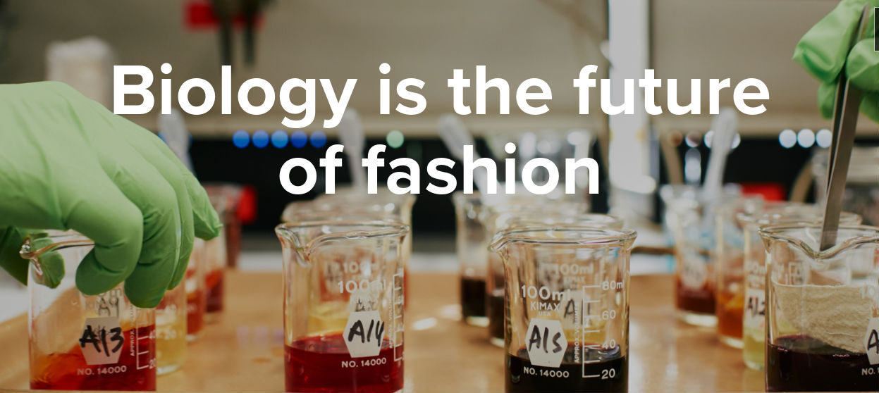
Another thing about fashion that many designers would like to change is that it’s one of the world’s most polluting industries. So there's been a big movement lately towards developing the use of more sustainable materials.
One company in the forefront is the wonderfully named AlgiKnit, which has prouduced a rapidly renewing biodegradable yarn made from kelp, as well as a biodegradable sneaker.
"If clothing is going to continue to be disposable, why not make it disposable in a way that makes sense – that actually benefits the earth, in a way that has a positive impact instead of a negative impact?" says Aleksandra Gosiewski. "It takes longer to create a mind shift, so why not first create an alternative that already fits into the same mindset? This is a first step to something else."
10. Animated graffiti
What do you get when you cross animation with AR with graffiti? GIF-iti, of course. That’s the phrase coined by London-based creative Insa, a member of our Illustrator Hotlist for 2018, when he started creating his unique animated paintings. Yes, that’s "street art" that paradoxically is only viewable online.
GIF-ITI is made via a laborious physical process involving numerous layers of painting and meticulous planning. Insa then photographs each hand-painted layer then uploads and overlays them to create the final piece, a looping GIF file. This comes to life when viewed through a mobile app.
11. Messy magazine design
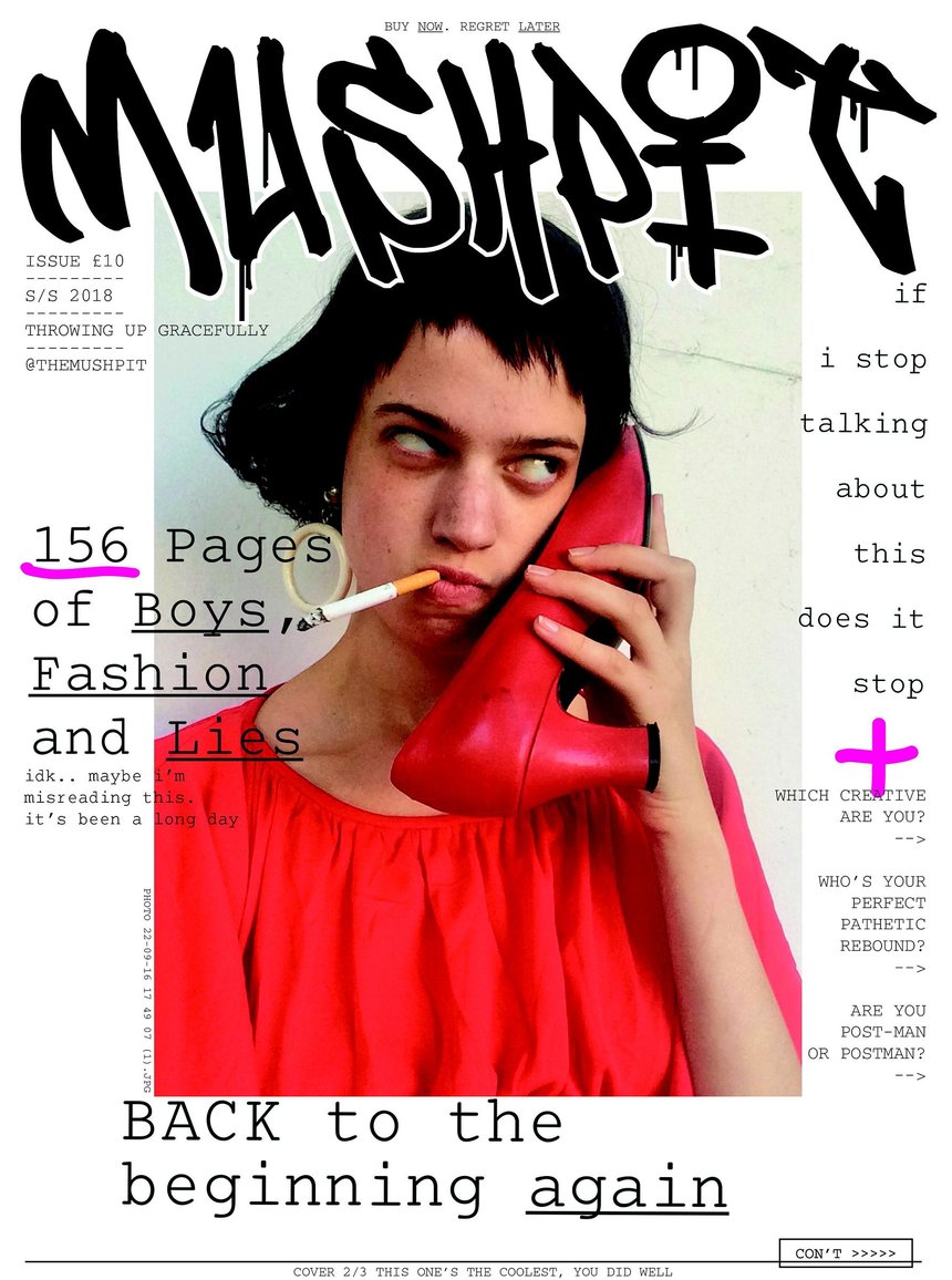
To round up our feature, we thought it important to note that experimental design doesn't have to involve technical innovation. You can just experiment with new approaches using nothing but your own imagination and a bit of gumption. And that's exactly what the makers of Mushpit, one of the most visual exciting print publications on the market right now, have done.
For the 10th edition of the satirical fashion, political and feminist magazine, co-founders Bertie Brandes and Charlotte Roberts brought designer Richard Turley on as art director. With the theme of 'courage', the issue's three-way split-run cover placed an ironic image centrally, with typewritten coverlines and handwritten details on a white background. Says Brandes: "We worked with Richard Turley to find a coherent aesthetic to match our tone of voice; messy, scattered and at times sort of brutal."
Related articles:

Thank you for reading 5 articles this month* Join now for unlimited access
Enjoy your first month for just £1 / $1 / €1
*Read 5 free articles per month without a subscription
Join now for unlimited access
Try first month for just £1 / $1 / €1

Tom May is an award-winning journalist and author specialising in design, photography and technology. His latest book, The 50th Greatest Designers, was released in June 2025. He's also author of the Amazon #1 bestseller Great TED Talks: Creativity, published by Pavilion Books, Tom was previously editor of Professional Photography magazine, associate editor at Creative Bloq, and deputy editor at net magazine.
