Here at Creative Bloq, we’re not against change: far from it. Every brand identity needs to evolve and change over time. So whenever a new version of a well-known logo is released, we like to give it the benefit of the doubt, especially if it follows a logo design tip from the experts.
Rather than join the inevitable knee-jerk reaction against any redesign (which is nowadays amplified beyond all proportion by social media), our attitude is to sit back and wait a while for the new design to bed in, before making a rush to judgement.
There are a small number of cases, though, where even in the fullness of time, a radical redesign of a much-loved logo seems like a mistake. In this post, we gather together seven such cases.
01. American Airlines
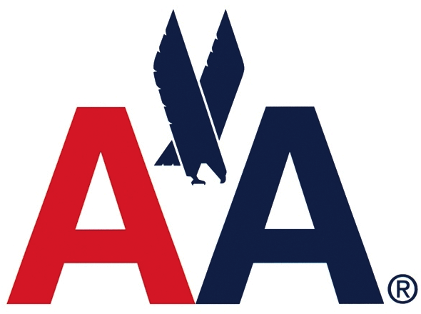
When your logo has been created by an iconic designer like Massimo Vignelli, you want to hang on to it as long as possible. And to be fair, American Airlines stuck faithfully with this beautiful 1967 design (shown above) for a whopping 46 years.
In 2013, though, they ordered a redesign. Of course, we don’t have a problem with that. Even our favourite classic logos, like the Coca-Cola logo, need updating now and again. But in this case, American Airlines weren’t looking for a few small tweaks, a light touch of modernisation, but a root-and-branch replacement (shown below).

Created by Futurebrand, this new logo did give a few nods to its predecessor, using the same colours and incorporating the eagle, and we don’t deny it’s a lovely design.
Yet call us sentimental nostalgists, but we miss the bold, majestic and distinctively American look of the original; while the current design feels like it could be a logo for any airline, anywhere on Earth.
02. Best Western

Best Western has had a number of distinctive logos since its founding in 1948. But it’s this 1993 creation, with its unusual colour scheme, weird typography and slightly crazy crown emblem, that we still hold dear in our hearts.
Admittedly this logo, which had received only very minor tweaks over the years, could have done with a touch of modernisation, along the lines of redesigns by TGI Friday or Hooters, for example. But sadly in our opinion, last year the hotel chain instead threw the baby out with the bathwater, commissioning this brand-new logo from San Diego agency MiresBall (shown below).

This streamlined look is a perfectly serviceable design, but we’re sad that it makes such a break with the past and loses all the brand equity built up by the previous logo. Even the distinctive blue-and-gold colour scheme has been ditched, making it far harder to spot a Best Western hotel in the distance from your car or train carriage.
Furthermore, by jettisoning the building-motif border, the new design fails to conveys ‘hotel’ in any meaningful way; it could easily be the logo for a software firm, a pharmaceutical company... anything, really.
03. Black & Decker

Here’s another beloved logo (above) that generations formed a deep emotional connection with. And sadly, it’s another design that’s fallen victim of the mania for uncontrolled minimalism.
This classic 1984 logo for the hardware company, with its distinctive nut icon and bold condensed font, was replaced in 2014 by a brand new logo designed by New York consultancy Lippincott (shown below).

All that remains from the original is the justified stacking of the name, the ® mark and a similar, if muted, colour scheme. The new font is a vanilla sans-serif, the beloved icon has been discarded, and the ampersand has been replaced by a more modern plus sign.
Don’t get us wrong: by itself this is a beautifully sleek and modern logo that would suit, say, a T-shirt brand, a sportswear company or an internet startup perfectly. But the sense of grunt and raw power conveyed by its predecessor is gone: and for a company known for its power tools that feels like a mis-step.
Disagree with our opinions so far? Well, now you can relax. Because for the remaining logos on our list, even the companies themselves agree they shouldn’t have been ditched...
04. Gap

The Gap redesign debacle of 2010 has now passed into legend as a cautionary tale for logo designers everywhere. The mid-range clothing retailer had been happily using this classic type-based logo (shown above) since 1984 when suddenly and unexpectedly it introduced a dramatic revamp designed by Laird & Partners (below).

A complete departure from the original, the new logo was claimed to represent an evolution of the company from “classic, American design to modern, sexy, cool,” according to a Gap spokesperson at the time.
But most people just thought it looked daft, and it kicked off one of the first design-related consumer backlashes of the social media stage. Gap withdrew the new logo after just one week of use and went straight back to the old design.
05. Tropicana

Here’s another design that even the company realised should never have been changed. In May 2009, PepsiCo juice brand Tropicana decided that its classic logo, with its cartoonish feel, pleasing curve and leaf icon, was old hat.
To bring it into the 21st century, they asked the agency Arnell (which has since closed its doors) to create new packaging. The redesign, shown below, was a radical one, featuring a new, minimalist wordmark and losing the iconic ‘orange speared by a straw’ emblem.

It was a complete disaster. Sales dropped 20 per cent because people didn’t recognise their favourite brand on the shelves. The company was bombarded with complaints, and it reverted to the previous design within two months.
06. Kraft

Okay, this one’s a bit confusing, but stay with us. This classic ‘racetrack’ logo for Kraft Foods shown above was in place from 1988-2012. But in 2009, Kraft Foods Inc the corporation (NOT Kraft the brand) released this totally new logo design, shown below, which had zero in common with it.

This bright and colourful logo is pleasant enough, but Kraft had sacrificed all its brand equity for no apparent reason; the ‘starburst’ emblem had zero connection to food and looked more like something you’d associate with an Olympic City bid.
Thankfully, it didn’t last long. In 2011, Kraft Foods Inc. announced it would split into two new companies: Mondelez, for the global snacks business, and Kraft Foods Group. The former got a brand new logo; the latter reverted to a modified version of the old red-and-blue Kraft logo, and the confusing starburst logo was gone forever. Phew.
07. Co-op

It’s rare for a retail brand to make a true emotional connection with the public. But the Co-op’s roots in the history of Britain run deep. Developing over 165 years from the merger of co-operative wholesale societies and independent retail societies, it remains today the largest consumer co-operative in the UK and is owned by more than 4.5 million active members.
The Co-op has had a few logos over the years, but it’s this classic 1968 ‘clover leaf’ design that is most fondly remembered by generations of Britons today. The new design that replaced it in 1993 (shown below) is in our opinion starker, less friendly and welcoming, as well as being a little less legible.

When North was asked to come up with a new identity for the Co-op for 2016, it pitched the idea of reinstating the 1968 logo... which is just what happened.
“It’s a symbol and a wordmark and that’s impossible to beat for a graphic designer. It’s never dated,” North’s Sean Perkins told Creative Review. We couldn’t agree more.
Related articles: