Hooters launches new logo
Sky Design updates the politically incorrect chain's 30-year-old logo - what do you think of it?
Sign up to Creative Bloq's daily newsletter, which brings you the latest news and inspiration from the worlds of art, design and technology.
You are now subscribed
Your newsletter sign-up was successful
Want to add more newsletters?

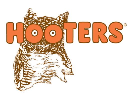
Hooters is one of the US's top brands and is a peculiarly American institution - a restaurant chain where a mainstream customer base, including families with children, are served buffalo wings and chilli dogs by female staff recruited largely on the basis of their vital statistics. Much like the concept itself, the company's logo design (below) served for 30 years as an example of a design that shouldn't work, but does. Now, though, Hooters has decided the time has come to update it.
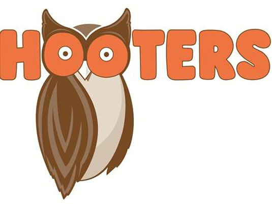
Atlanta design firm Sky Design has given the logo a more modern streamlined look (above), although the essential details remain, including the cartoon typography, the owl and the double-entendre use of the bird's eyes.
As part of the design process, different owl designs were presented to 300 consumers, and the one chosen was preferred roughly nine to one over the old design. Over the next few months the logo will be rolled out across the brand, appearing on waitress uniforms, menus and, eventually signage.
Article continues below 
[via USA Today]
Liked this? Read these!
- The ultimate guide to designing the best logos
- Our favourite web fonts - and they don't cost a penny
- Useful and inspiring flyer templates
- The best 3D movies of 2013
What do you think of the new logo? Let us know your views in the comments below!
Sign up to Creative Bloq's daily newsletter, which brings you the latest news and inspiration from the worlds of art, design and technology.

The Creative Bloq team is made up of a group of art and design enthusiasts, and has changed and evolved since Creative Bloq began back in 2012. The current website team consists of eight full-time members of staff: Editor Georgia Coggan, Deputy Editor Rosie Hilder, Ecommerce Editor Beren Neale, Senior News Editor Daniel Piper, Editor, Digital Art and 3D Ian Dean, Tech Reviews Editor Erlingur Einarsson, Ecommerce Writer Beth Nicholls and Staff Writer Natalie Fear, as well as a roster of freelancers from around the world. The ImagineFX magazine team also pitch in, ensuring that content from leading digital art publication ImagineFX is represented on Creative Bloq.
