TGI Fridays rolls out new logo
They've lost the apostrophe! Check out the modern makeover given to the long-running restaurant chain's branding.
Sign up to Creative Bloq's daily newsletter, which brings you the latest news and inspiration from the worlds of art, design and technology.
You are now subscribed
Your newsletter sign-up was successful
Want to add more newsletters?

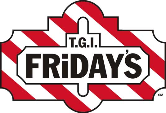
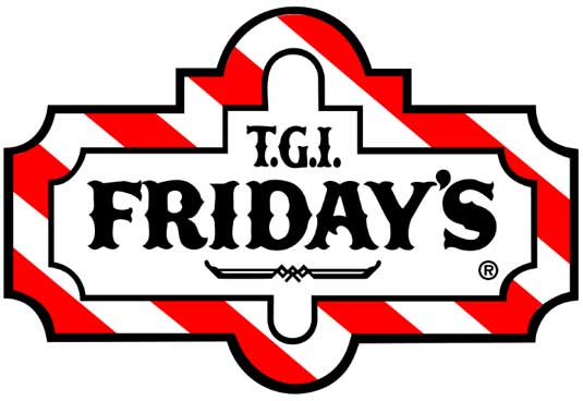
American restaurant chain TGI Fridays has carved out a name for itself across the world for its towering burgers, plentiful fries and alcoholic milkshakes. But since it was founded in 1965 by Alan Stillman, who opened the first one in East Manhattan in order to help him meet women, it's had pretty much the same logo, resembling an old-time bar sign (below).
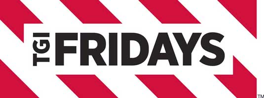
Now the company is rolling out this new, cleaner and more contemporary-looking logo design (above) to its restaurants across the globe. The trademark colour scheme and stripes of all remain, but the new design is now far more streamlined inside a simple rectangle. The letters are now all in capitals, rather than the mixture of sentence case and title case of the previous design, and, most notably, the punctuation has all gone - even the apostrophe in "Friday's".


The new logo is already being used on this website and in a new TV ad campaign:
Article continues below 
[Via Under Consideration]
Liked this? Read these!
- Hooters launches new logo
- Most iconic American logos
- Useful and inspiring flyer templates
- The best 3D movies of 2013
What do you think of the new logo design? Let us know about it in the comments!
Sign up to Creative Bloq's daily newsletter, which brings you the latest news and inspiration from the worlds of art, design and technology.

The Creative Bloq team is made up of a group of art and design enthusiasts, and has changed and evolved since Creative Bloq began back in 2012. The current website team consists of eight full-time members of staff: Editor Georgia Coggan, Deputy Editor Rosie Hilder, Ecommerce Editor Beren Neale, Senior News Editor Daniel Piper, Editor, Digital Art and 3D Ian Dean, Tech Reviews Editor Erlingur Einarsson, Ecommerce Writer Beth Nicholls and Staff Writer Natalie Fear, as well as a roster of freelancers from around the world. The ImagineFX magazine team also pitch in, ensuring that content from leading digital art publication ImagineFX is represented on Creative Bloq.
