7 examples of 2017's biggest logo design trend so far
It's only April but already there's an emerging trend in logo design.
April seems a little early for a logo design trends article, no? We’d usually agree, but when one trend is so in-your-face that you can’t ignore it, we felt it our duty to share. And we’re not predicting a trend – we’re providing evidence in the shape of seven logo redesigns that have all utilised one seemingly obvious trait.
So what is 2017’s biggest logo design trend so far? It’s what we’re going to call wordmark uppercasification*. Agencies are hitting the caps lock button in order to add emphasis and gravitas to the client’s logotype in the first quarter of 2017. This could end up being a bit SHOUTY, but the application of an agreeable typeface does the job of softening the aggression that uppercase usage can impart.
Here follows the examples of 2017’s most forceful branding trend so far. The question is, will caps lock continue to influence redesigns for the rest of the year, or will another trend usurp uppercase?
*We’re not going to call it this.
01. Fanta
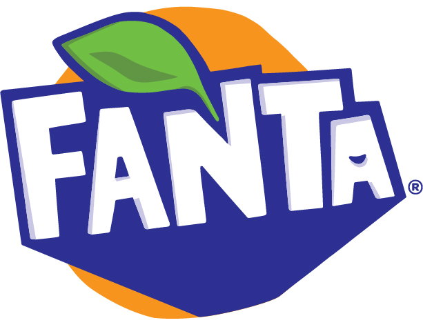
New Fanta logo
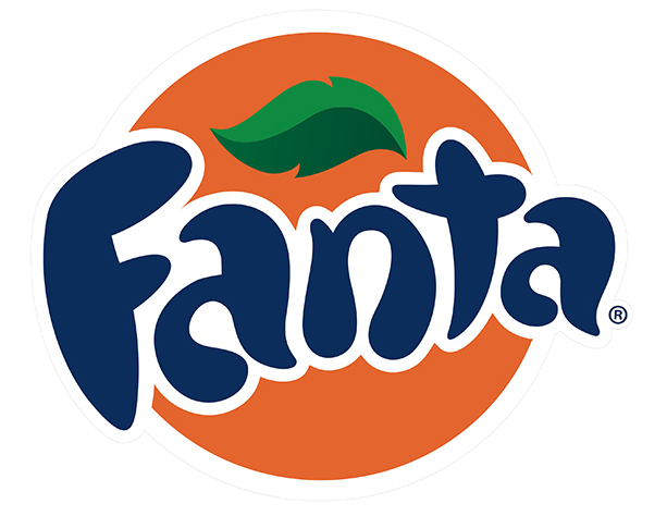
Previous Fanta logo
Heading up Fanta's rebrand is a logo created out of hand-cut paper, complete with a hidden smile worked into the design. This is accompanied by an updated colour palette on the labels and lids.
But most striking is how the logo has moved from soft and rounded to squared off and bold, emphasised by that shift to an uppercase typeface.
02. Calvin Klein
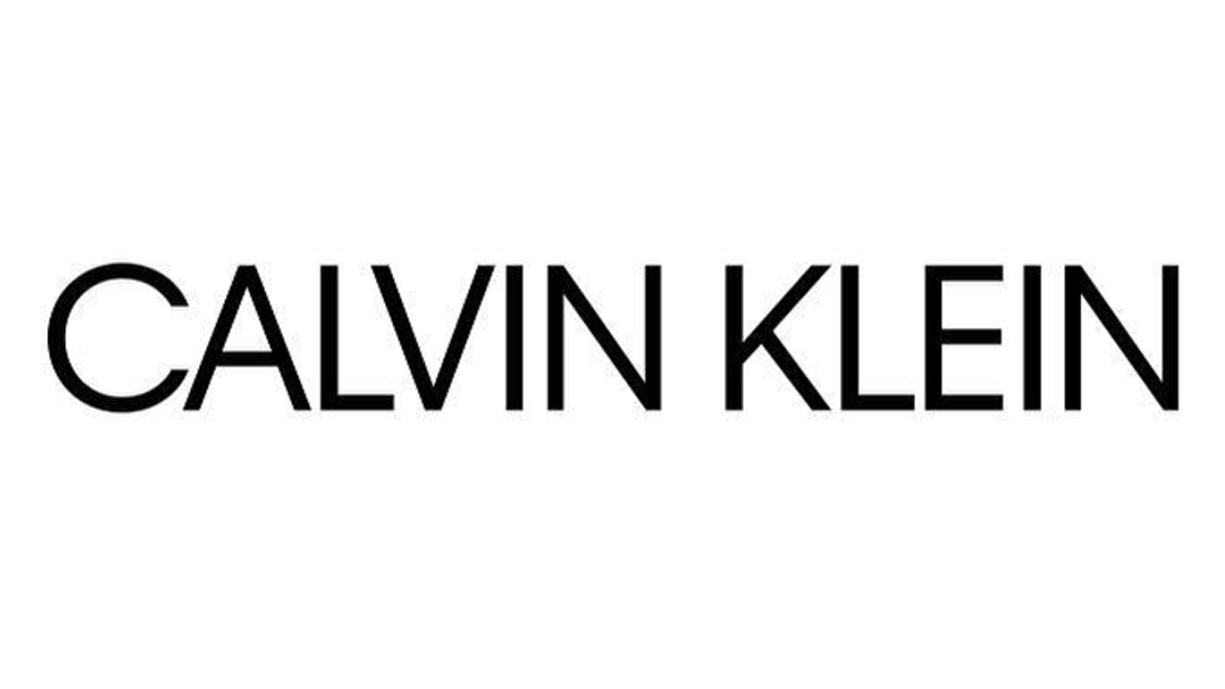
New Calvin Klein logo
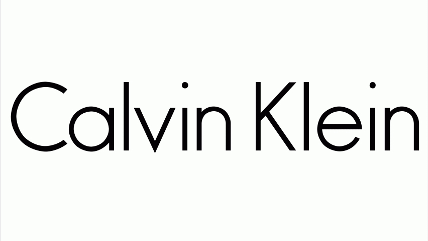
Previous Calvin Klein logo
US fashion label Calvin Klein gave its iconic logotype an uppercase update in February 2017. Created with the help of renowned British graphic designer Peter Saville, the new look logo has split opinions in the design industry.
Daily design news, reviews, how-tos and more, as picked by the editors.
The previous CK logo was instantly recognisable and an Americana classic, so the decision to change it had social media on high alert. However the company's creative director Raf Simons defends the decision, saying: "It's a celebration of Calvin Klein's iconic underwear and jeans; acknowledging their status as Pop and showing them in the world of art."
03. Lifetime
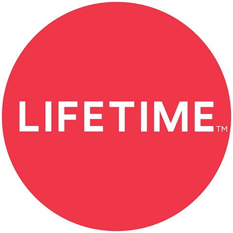
New Lifetime logo
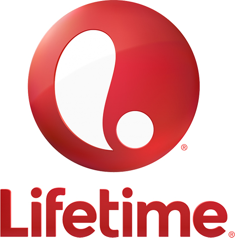
Previous Lifetime logo
Female-friendly US television network Lifestyle changes its logo more frequently than its underwear, so it should be no surprise to see its appearance in a logo redesign round-up. It's here, of course, because the dice have landed on an uppercase refresh this time around.
Not everyone is impressed, with Brand New commenting: "The new logo is bland type in a bland circle. It doesn't say anything, at all, about… anything. About TV, or life, or women and it's not full-on hipster or minimal or elegant. It's just caught somewhere in graphic limbo." Ouch.
04. Emily Carr University
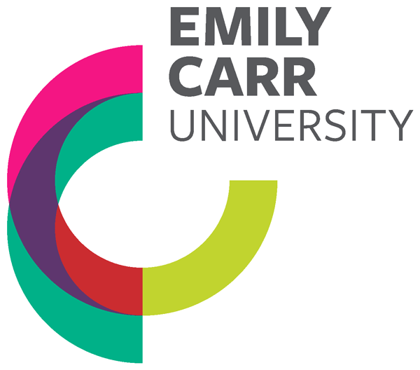
New Emily Carr University logo
Previous Emily Carr University logo
Emily Carr University's unusual circle doodles logo was replaced this year by a new circle-based visual identity, designed by Camp Pacific and inspired by the painting palette of the University's namesake, artist Emily Carr.
It also moved from the now very dated-looking all-lowercase typeface to an all-uppercase one, which is consistent with the bolder definition of the circular theme.
05. Saffron
New Saffron logo
Previous Saffron logo
Safrron – the global branding consultancy – describes its new logo thus: "The first key element is typography. Besides giving the company personality, a bespoke family has been developed to symbolise the combination of strategy and design – a fundamental in any brand definition process, according to Saffron." And in logotype form, it's uppercase.
06. Tom Kerridge
New Tom Kerridge logo
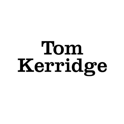
Previous Tom Kerridge logo
UK-based celebrity chef Tom Kerridge holds two Michelin stars and approached The Clearing to help build a brand that encapsulated his character and style – previously Kerridge had used a simple Clarendon logotype.
Creative director and founder of The Clearing, Andy Howell, said: "One of the things Tom said to us when we first met was that he wanted his products to be ‘Tom-proof’ – solid, reliable and unmistakably British. The brand mark we created reflected this – it’s Tom’s personal stamp of quality."
07. Guillebert
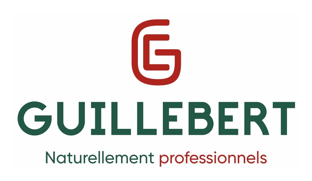
New Guillebert logo

Previous Guillebert logo
Guillebert's logo will be familiar to anyone who has even the most fleeting acquaintance with France's countryside. The French gardening and agricultural tools brand challenged Brand Brothers to update its long-standing brand mark, bold, italicised typeface and all, and went less bold and italicised and more uppercase.
"The new logo is composed of a bespoke wordmark and a monogram ‘EG’, as a reminder of its founder, Eugène Guillebert." says Brand Brothers' project page, but despite its voluminous style guide it remains to be seen whether the new branding will become as ingrained with la campagne as its predecessor.
Related articles:

Thank you for reading 5 articles this month* Join now for unlimited access
Enjoy your first month for just £1 / $1 / €1
*Read 5 free articles per month without a subscription

Join now for unlimited access
Try first month for just £1 / $1 / €1

Craig Stewart is a writer, SEO strategist and content marketer, and is a former editor of Creative Bloq. Craig has written about design, typography, tech and football for publications including Creative Bloq, T3, FourFourTwo and DSG, and he has written a book on motoring for Haynes. When he's not writing, you'll usually find Craig under his old car learning about DIY repairs the hard way.
