24 professional fonts for designers
Bring your designs to live with these professional fonts.
Sign up to Creative Bloq's daily newsletter, which brings you the latest news and inspiration from the worlds of art, design and technology.
You are now subscribed
Your newsletter sign-up was successful
Want to add more newsletters?
Typography isn't just important in design—it's fundamental. The right font establishes mood, improves readability, and elevates your work from ordinary to exceptional. So for designers serious about their craft, the best professional fonts often separate adequate designs from truly outstanding ones.
This guide showcases 20 essential typefaces every designer should consider for their collection. We've curated a diverse selection spanning classic standbys and contemporary options, each offering exceptional versatility and refinement for both print and digital applications.
Working with budget constraints? Explore our collection of the best free fonts. And don't miss our specialized guides to multilingual fonts and font pairing.
Article continues below01. Gilroy by Radomir Tinkov
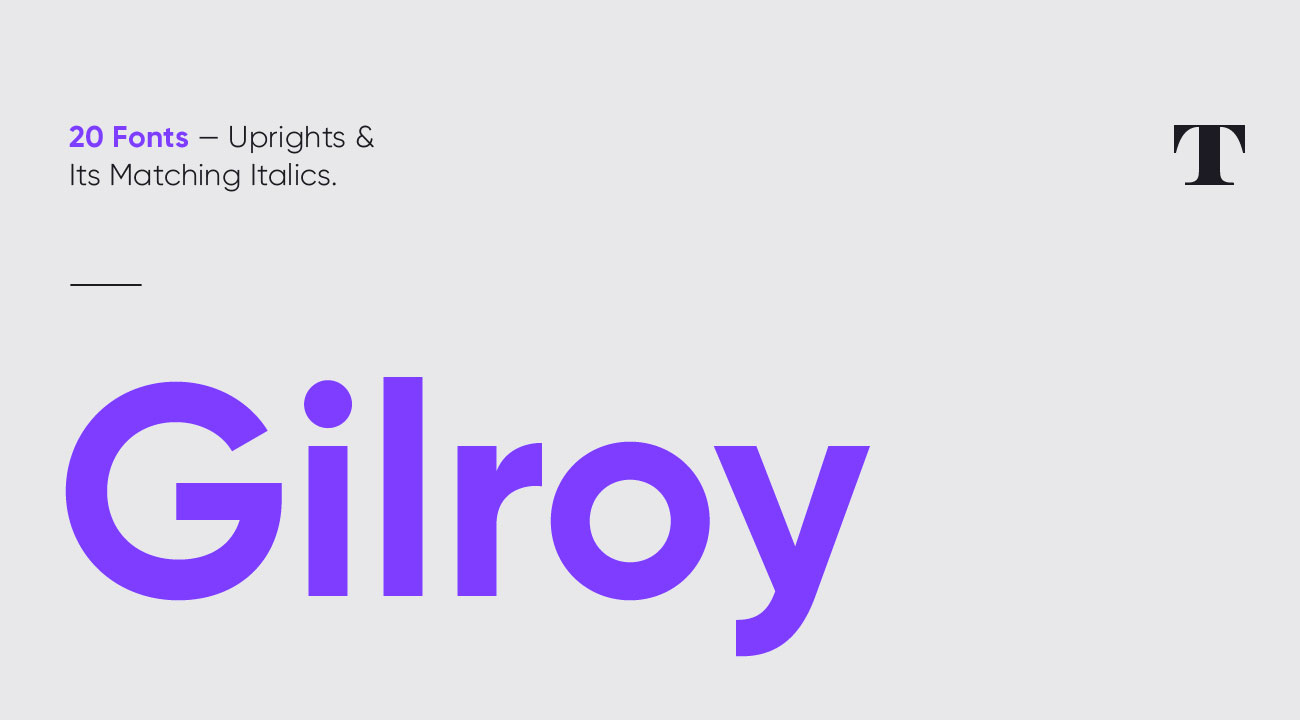
Gilroy is a modern sans serif with a geometric touch, designed by Radomir Tinkov. Designed as a younger brother to Tinkov's Qanelas font family, it comes in 20 styles, with 10 uprights and matching italics, and weights ranging from Thin to Heavy. Opentype features include extended language support and Cyrillics, fractions and ligatures, and Gilroy's designed for versatility. A good choice for everything from editorial and web design through to graphic design and signage. If you want to get a feel for it, two styles are available completely free.
02. Polymath by Vladimir Fedotov and Plamen Petrov
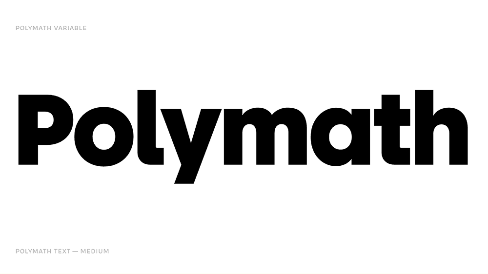
Designed by Vladimir Fedotov and Plamen Petrov, and published by VP Creative Shop, Polymath injects personality into the grotesque category, making it ideal for versatile branding applications. This geometric sans font offers exceptional versatility through three distinct optical sizes: a text version inspired by 1920s designs with longer ascenders, a display version echoing 1970s proportions with enormous x-height, and a standard size influenced by post-1980s geometric sans serifs. Polymath comes with comprehensive language support and extensive alternates.
03. Helvetica Now by Monotype
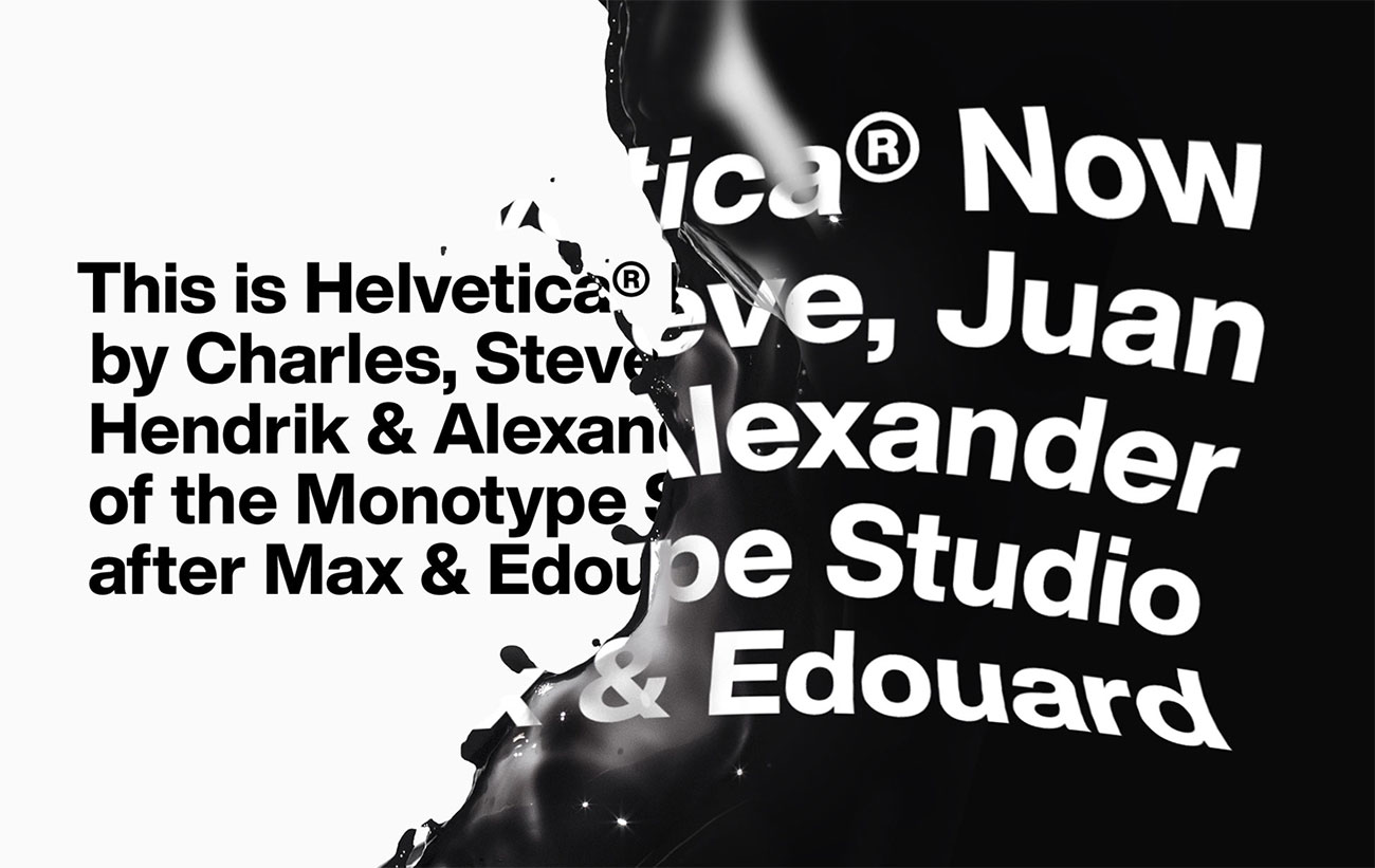
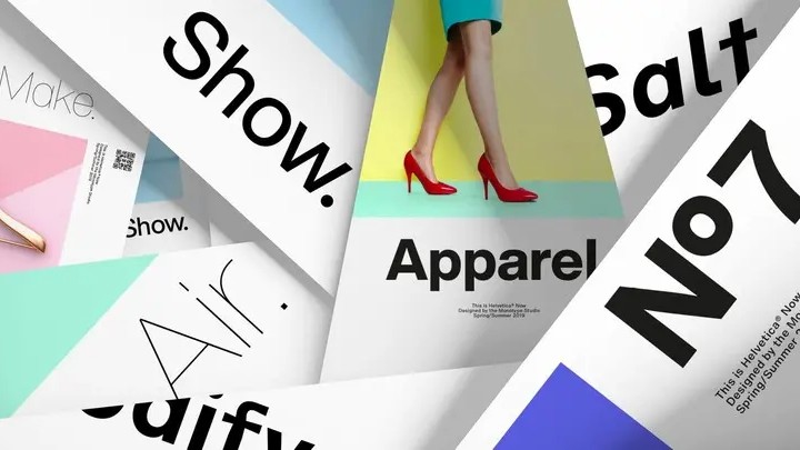
Essential though it is, Helvetica wasn't designed to cope with the heavy lifting that the digital age expects of it. That's why Monotype spent four years painstakingly redrawing every single character to create Helvetica Now, an updated version that's ready to work in across digital platforms and solve modern branding challenges that simply didn't exist when Helvetica was originally released. Helvetica Now comes in three optical sizes – Micro, Text and Display – in weights ranging from Thin to Extra Black, and every size, weight and style is designed to provide maximum legibility.
04. Aktiv Grotesk by Dalton Maag
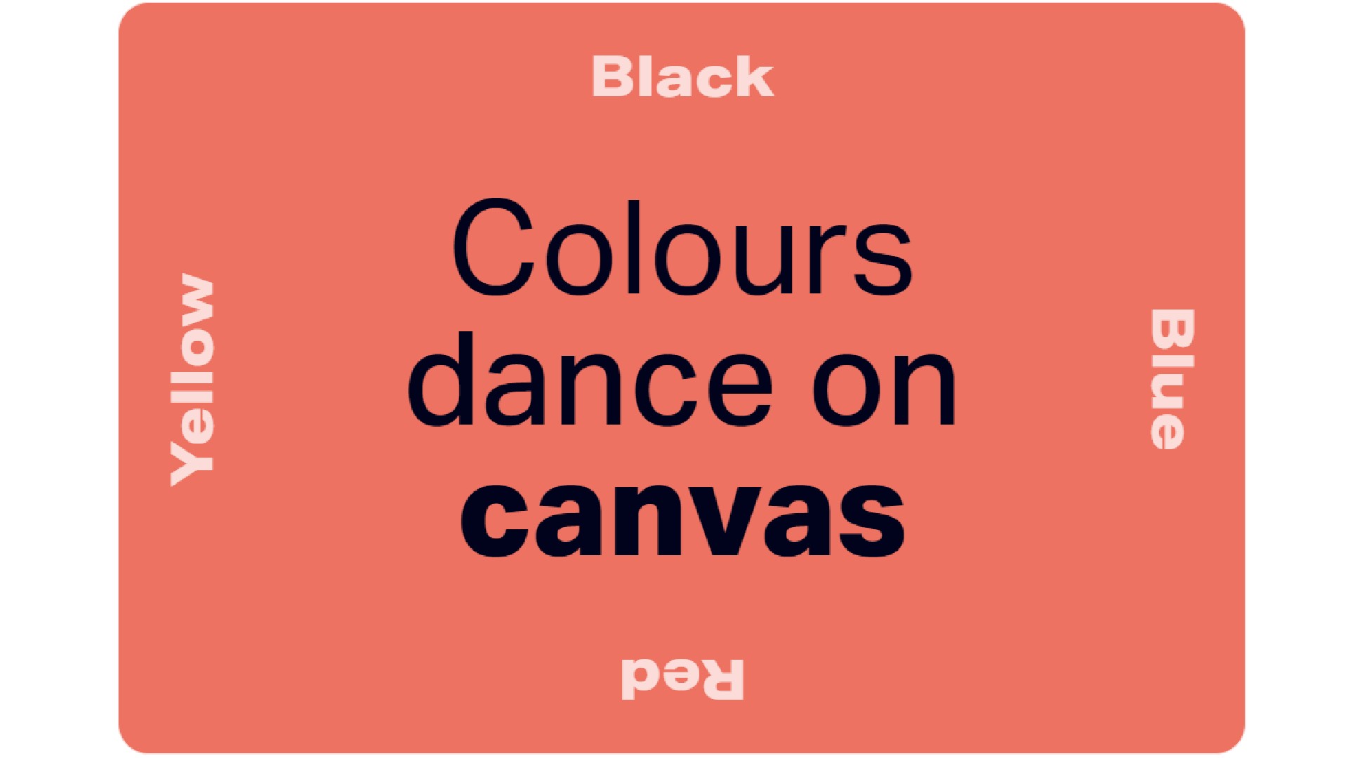
Designed by Bruno Maag and developed across the years 2010–2023 by multiple designers, Aktiv Grotesk is a grotesque sans typeface with weight, width, and italic variable font axes, support for 10 global writing systems, and an extensive icon set. Beautifully clean and minimalist, Aktiv Grotesk was intended to be warmer than Univers and without the quirks of Helvetica. It has slightly squarer edges than the former and a fractionally taller x-height than the latter. Overall, it offers an authoritative but neutral position.
Sign up to Creative Bloq's daily newsletter, which brings you the latest news and inspiration from the worlds of art, design and technology.
05. GT Flaire
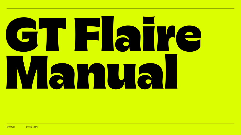
Characterised by pronounced curves inspired by calligraphic penmanship, GT Flaire is a versatile typeface that breaks corporate rigidity by combining seriousness with a sense of play. Designer Reto Moser drew inspiration from Frutiger's Gespannte Grotesk, creating a softer alternative that maintains professionalism while adding character. It's available in 28 styles including both serif and sans serif versions, and offers extensive customization options and language extensions.
06. Case 2.0 by Fontwerk
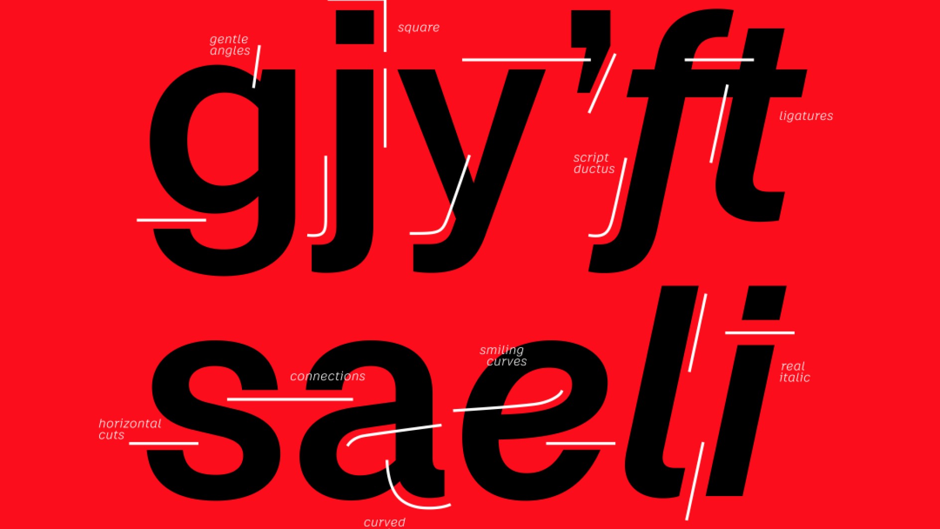
Case 2.0 is neo-grotesque font designed to meet the demands of complex branding projects while maintaining a familiar and reassuring neutrality. With a clear, neutral design, it offers a solid foundation for individual adaptations and custom designs. It was created in 2023 by renowned type designers Erik Spiekermann, Anja Meiners, and Ralph du Carrois, with the intention to combine the authority of classic fonts with a contemporary look. The font offers three optical sizes for versatility, a unicase feature, improved legibility, and real italics.
07. Financier by Klim Type Foundry
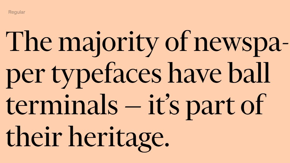
Drawn for the redesign of the Financial Times newspaper in 2014 under the direction of Kevin Wilson and Mark Leeds, Financier is an elegant and authoritative serif, with an aesthetic inspired by Eric Gill’s classic letterforms. Its versatility handles news and features well, both in print and online; even on small and narrow mobile screens. Financier is comprised of two complementary families: Financier Display and Financier Text. The latter draws pragmatic detailing from Solus and Joanna, while the former echoes Perpetua’s stately charm.
08. Nebulica
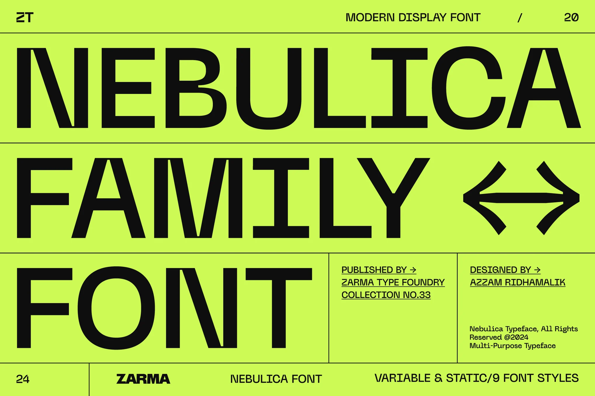
Nebulica is a display font that seamlessly combines geometric and monospace design elements for a distinctly modern aesthetic. This experimental typeface features unique details like inktraps and slanted stems that maintain visual consistency and legibility across diverse applications. Its variable font format and extensive OpenType features give designers remarkable flexibility, and there's support for over 88 languages, along with a comprehensive character set.
09. GT Sectra by Grilli Type
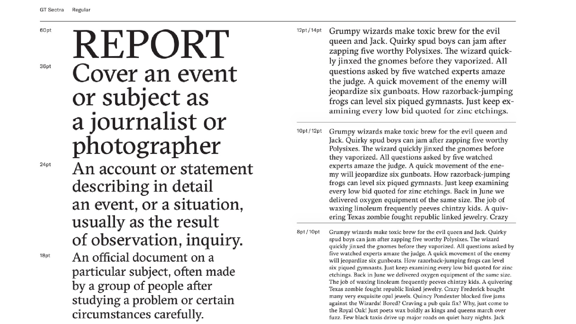
Serif font GT Sectra was designed in 2013 by Dominik Huber, Marc Kappeler and Noël Leu, for use in the long-form journalism magazine Reportagen. It was inspired by Blackletter, but the main idea was not to reproduce any historic typeface, but to translate those ideas in a more contemporary design. The font has since been expanded to three subfamilies: GT Sectra, GT Sectra Fine, and GT Sectra Display. In its creators' words, it combines "the calligraphy of the broad nib pen with the sharpness of the scalpel knife."
10. Chalet Comprimé
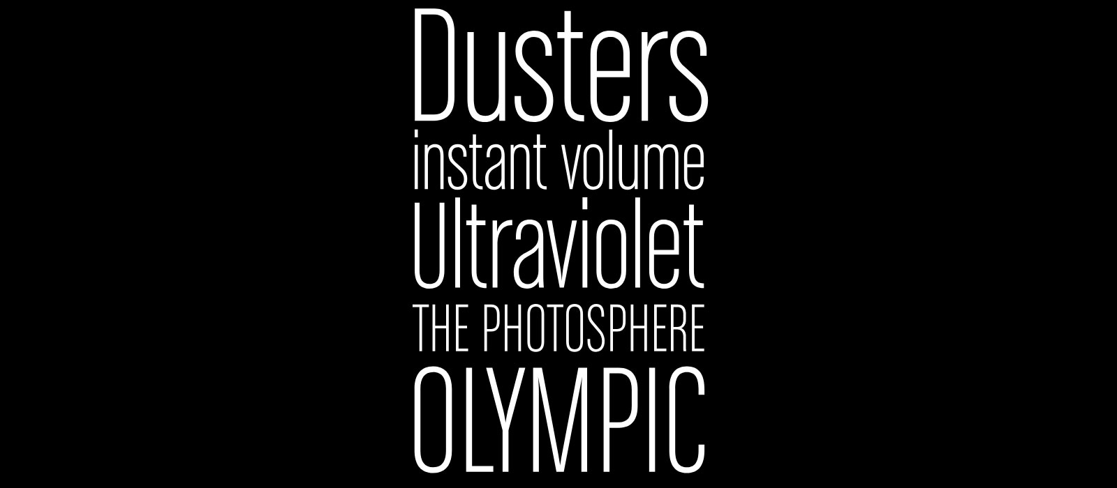
Chalet Compriméé was inspired by celebrated French fashion designer René Chalet, and extends the original Chalet font family. It's more stylised than many of the other professional fonts in this list, but its compact, clean letterforms make it idea for anyone looking for an elegant typographical solution. The family includes 10 fonts: three different weights in three styles, plus a titling face (above is the Chalet Milan 1980 variant). The web versions are free up to 12,500 page views per month.
11. Highmore
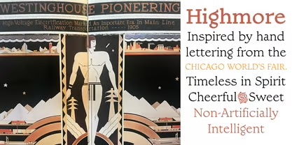
Inspired by 1930s lettering from the Chicago World's Fair, Highmore captures the timeless quality of brush lettering in commercial art. Designer Steve Matteson recreated the slight contrast and lively stroke endings evident in historic hand-painted signage. The typeface's warm character evokes vintage craftsmanship while maintaining contemporary usability. Particularly well-suited for friendly poster work, invitations, and packaging design, Highmore brings approachable elegance to professional projects requiring a balance of personality and refinement.
12. Sabon
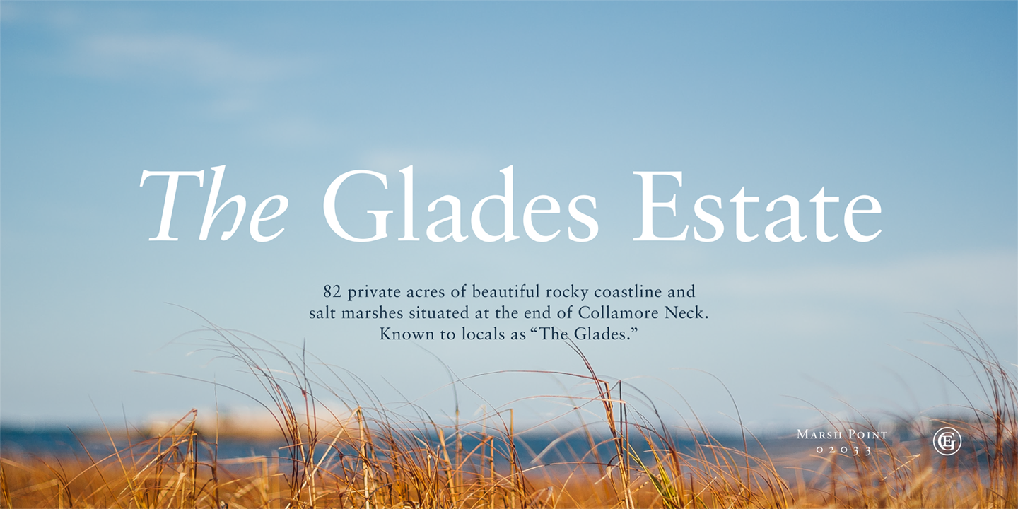
Sabon is Jan Tschichold's response to a request to design a new version of Claude Garamond classical Roman. It features a smooth texture and a highly distinctive 'f' in the italic variant. This professional font family has long been popular for typographers setting book text. The family is named after Jacques Sabon, who introduced Garamond’s Romans to Frankfurt.
13. FF Din
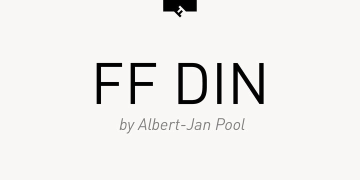
Created by Dutch type designer Albert-Jan Pool between 1995 and 2009, this sans serif is ideally suited to advertising and packaging, logos and branding. Added to MOMA's digital typefaces for its Architecture and Design collection back in 2011, FF Din is available in a range of styles and weights. You can pick up a single font or opt for a bundle that contains the versions you like best.
14. Oswald
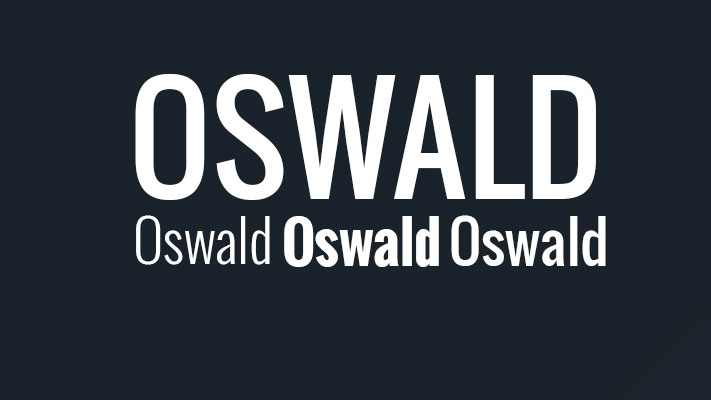
Oswald has become a popular professional font choice for designers, especially for those working in the world of of the web. A reworking of the classic style historically represented by the 'Alternate Gothic' sans-serif typefaces, this professional font has been re-drawn and reformed to better fit the pixel grid of standard digital screens.
15. Brandon Grotesque
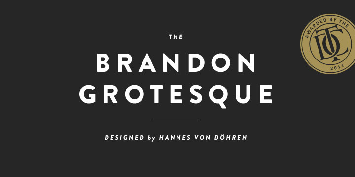
Designed by Hannes von Dohren in 2009, Brandon Grotesque was influenced by the popular geometric-style, sans serif typefaces of the 1920s and 30s. Equipped for complex, professional photography, Brandon Grotesque won the Type Directors Club Award in 2011.
16. Aviano
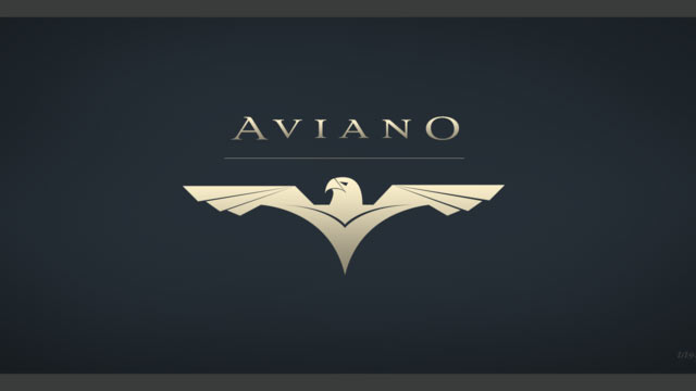
Named after a small town at the base of the Alps in Northern Italy, Aviano typeface is inspired by the power and timeless beauty of classic letterforms. A gorgeous design, Aviano was created by type designer Jeremy Dooley, owner of one-man foundry Insigne.
17. Proxima Nova
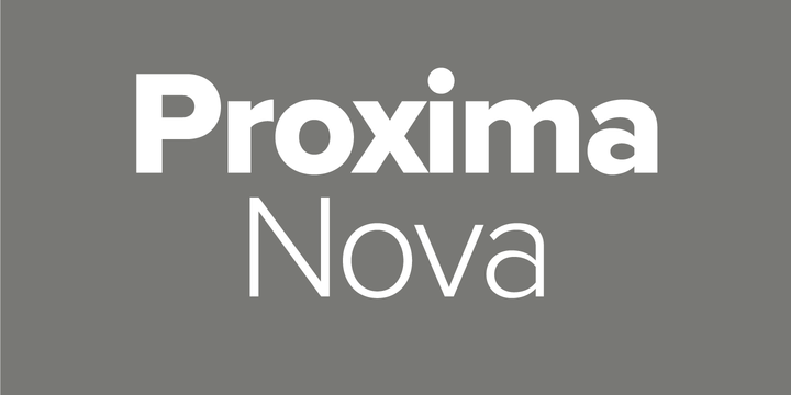
Used by over 25,000 websites, including Buzzfeed, Wired and Mashable, Mark Simonson's professional font Proxima Nova is a popular choice amongst designers. The extensive family is available in seven weights (thin, light, regular, semi-bold, bold, extra-bold and black), with matching italics, small caps and condensed and extra-condensed widths.
18. Rockwell
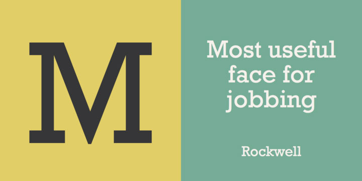
Geometric slab serif Rockwell was inspired by a 1910 font titled Litho Antique. Designer Morris Fuller Benton revived Rockwell in the 1920s before it was redesigned and published in 1934 by Monotype, in a project headed by Frank Hinman Pierpont.
19. Le Havre
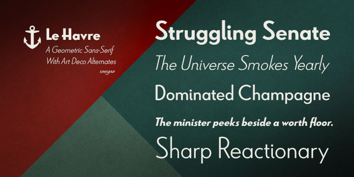
This art deco-inspired typeface was named after the port where many a famous luxury cruise liner was launched in the 1930s. Compressed capitals, a low x-height and geometric construction give Le Havre a retro look and feel, with the latest update in 2009 lending itself to all manner of creative projects.
20. Mallory
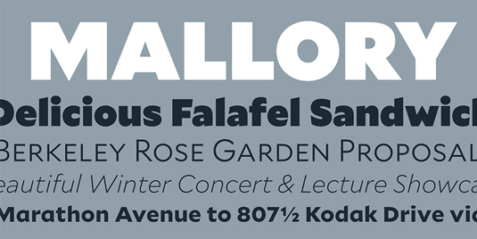
The creation of Tobias Frere-Jones, Mallory began life as an experiment in mixing typographic traditions, building a new design with British and American traits. "Mallory was built to be a reliable tool," says Tobias, "readily pairing with other typefaces to organise complex data and fine-tune visual identities. Each style contains over 1250 glyphs, to anticipate a wide range of content: small caps and old-style figures for running text, lining figures and uppercase punctuation for headlines, tabular figures and over a dozen currency symbols for financial data."
21. FF Meta
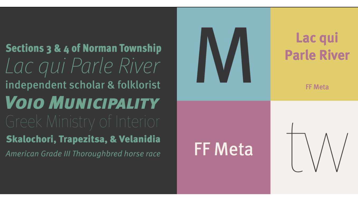
Created by famed type designer Erik Spiekermann, FF Meta began life as PT55, a typeface made for easy reading at small sizes for West Germany's Post Office in 1985. Erik continued work on it, including more weights and styles, and later released it as FF Meta. With a clean, cheery and distinctive aesthetic, it in the early 1990s and has been a firm favourite ever since. In 2011, the Museum of Modern Art in New York added FF Meta to its permanent collection.
22. Soho
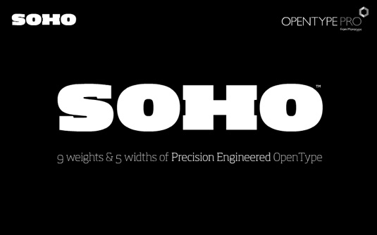
Beefy slab serif Soho is the product of renowned type designer Seb Lester. The super-family has over 40,000 glyphs and represents three years' worth of work. "As a type designer I'm preoccupied with finding ways in which I can address modern problems like good legibility in modern media, and create fonts that work precisely and efficiently in the most technically demanding of corporate and publishing environments," he comments on the Monotype website.
23. Davison Spencerian
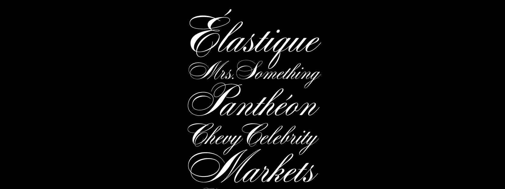
Davison Spencerian is a tribute to one of the most distinguished lettering artists of the 20th century, Meyer 'Dave' Davison. It made its first appearance in Photo-Lettering’s 1946 catalogue and remains a benchmark of the ornamental script genre Tireless hours have been spent by Mitja Miklavčič and House Industries designers Ben Barber and Ken Kiel to preserve the poise and precision of Davison’s masterwork in this faithfully-rendered digital incarnation.
24. Maelstrom Sans by Klim Type Foundry
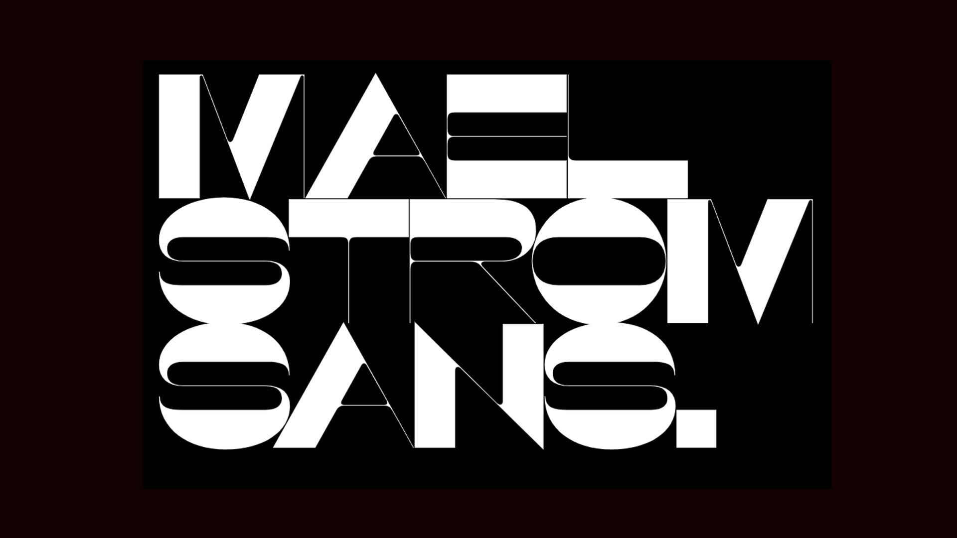
Maelstrom is a reversed-stress typeface specifically designed to be "perverse". Created by Kris Sowersby in 2019, its razor-thin spacing, heavy horizontals and spindly diagonals make for a typeface that feels fragile and off-kilter. Available in a single bold weight, this font is not for the faint-hearted.

The Creative Bloq team is made up of a group of art and design enthusiasts, and has changed and evolved since Creative Bloq began back in 2012. The current website team consists of eight full-time members of staff: Editor Georgia Coggan, Deputy Editor Rosie Hilder, Ecommerce Editor Beren Neale, Senior News Editor Daniel Piper, Editor, Digital Art and 3D Ian Dean, Tech Reviews Editor Erlingur Einarsson, Ecommerce Writer Beth Nicholls and Staff Writer Natalie Fear, as well as a roster of freelancers from around the world. The ImagineFX magazine team also pitch in, ensuring that content from leading digital art publication ImagineFX is represented on Creative Bloq.
You must confirm your public display name before commenting
Please logout and then login again, you will then be prompted to enter your display name.
