Industry insight: Creatives reveal their favourite logo redesigns
Following Twitter's update to its little blue bird, we asked our industry panel to name their favourite logo redesigns.
Daily design news, reviews, how-tos and more, as picked by the editors.
You are now subscribed
Your newsletter sign-up was successful
Want to add more newsletters?
Five times a week
CreativeBloq
Your daily dose of creative inspiration: unmissable art, design and tech news, reviews, expert commentary and buying advice.
Once a week
By Design
The design newsletter from Creative Bloq, bringing you the latest news and inspiration from the worlds of graphic design, branding, typography and more.
Once a week
State of the Art
Our digital art newsletter is your go-to source for the latest news, trends, and inspiration from the worlds of art, illustration, 3D modelling, game design, animation, and beyond.
Seasonal (around events)
Brand Impact Awards
Make an impression. Sign up to learn more about this prestigious award scheme, which celebrates the best of branding.
Twitter's creative director Doug Bowman recently commented,“Our new bird grows out of love for ornithology, design within creative constraints, and simple geometry. This bird is crafted purely from three sets of overlapping circles — similar to how your networks, interests and ideas connect and intersect with peers and friends.”
With so much thought going into a logo revamp, and in the light of Twitter's update, we asked the Creative Bloq design panel to name their favourite refreshed logos …
Jeffrey Zeldman says

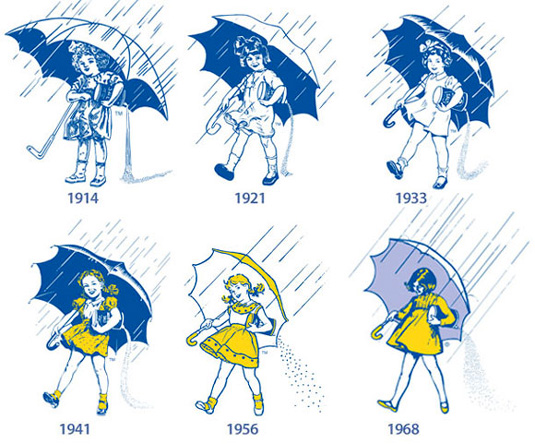
“Over the years, I’ve enjoyed watching the updating of the Morton Salt girl mark.
It’s an elementary mark — a “demo” mark, not that far removed, in its literalness, from a giant pair of eyeglasses hanging outside an optician’s shop.
“The mark has always shown a girl carrying Morton Salt in the rain. She holds the package carelessly, thus causing the contents to spill behind her. The point of this little embarrassment is to demonstrate that Morton Salt has been chemically treated so as not to crystallize and become unusable in conditions of high humidity, which was apparently a problem with table salt when the product came out in 1914. The tag line — “When it rains, it pours” — delivers the benefit and is often locked up with the mark.
The character ages and becomes more active over the decades.
“It’s interesting to see how the illustration style goes through periods of greater and lesser realism and detail over the decades. The character ages and becomes more active over the decades. The most recent version is more fashion-influenced, older, far less babyish, and far more abstract than the storybook-illustration-style girl who introduced the product in 1914. Her hair moves from curls to waves.
“The thing that’s always interested me is how the public accepts the new versions of the mark without thinking about them. There’s a very powerful (if also very primitive) advertising idea in there — and idea transcends the clothing, hair, and rendering style of its time. As a designer, you can only hope to create brands that will long outlive you … brands that can adapt to changing times without ever losing their identity.” - Jeffrey Zeldman is publisher and creative director of online magazine A List Apart and founder of design agency and consultancy Happy Cog
Daily design news, reviews, how-tos and more, as picked by the editors.
Chris Malbon says

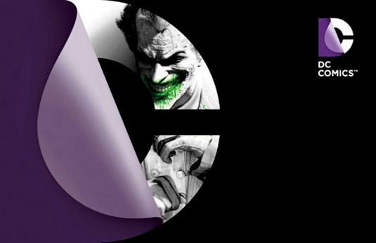
“My favourite redesign recently is the new DC Comics logo by Landor Associates.
“I don’t think there was anything wrong with Milton Glaser's original logo, but DC has changed; it’s more than a comic book publisher, it’s a business and needs to be branded like any other successful group would be. It also works on a corporate level as well as a entertainment one.
“I especially like how its treated for different comic book characters too, for example the green glow for Green Lantern, the gritty blue and bulk for Batman.
So it's clever, looks great, and works in all environments.
"The ‘page curl’ could be seen as a bit dated but it does the trick. It’s a nice idea – the big reveal, alter egos, comic book pages – and it works. If it works, why dismiss it!? And it works across all mediums too. So it's clever, looks great, and works in all environments – in my book that's a win.” - Chris Malbon is a freelance designer and illustrator.
Dan Mall says

"My favorite logo redesign was the new Bahamas identity by Duffy & Partners.
"I love the entire system that was created; it's beautiful, thorough, extensible, and a fantastic concept." - Dan Mall is founder and director at SuperFriendly. He is also technical editor at A List Apart, and - via his love/obsession for typography - he is also the co-founder of Typedia and swfIR.
Ben the illustrator says

"This was a toss-up between the last BBC logo rebrand (which simplified a fairly dated looking logo and created something more set to stand the test of time) and the branding of one of the world's greatest cities, Melbourne, Australia. Melbourne won. The City of Melbourne's previous logo was, to be frank, unexciting. They also had a fairly cluttered life with differing and completed unrelated logos for different elements of the city. The redesign brought all the city's branding together with one solid 'M', which exists in varied creative forms for different uses.
It's clean and creative, it can be colourful or monotone.
I just think it's so fresh on the eye; it's clean and creative, it can be colourful or monotone. Melbourne is such a diverse and exciting city and I feel that the logo redesign represents that." - Ben O'Brien is a freelance designer and illustrator
Elliot Jay Stocks says

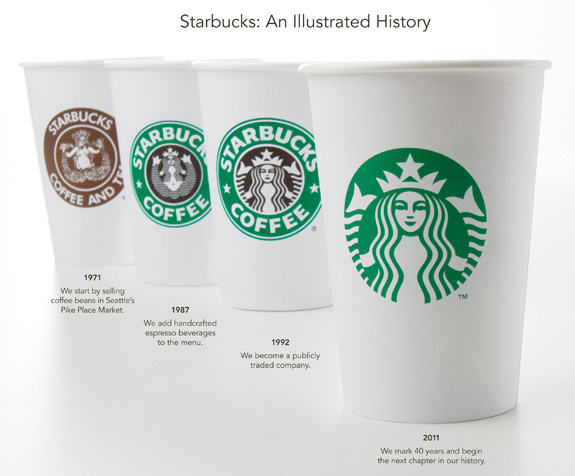
"My favourite logo redesign of recent years — especially if we're talking about redesigns that have dropped type to rely purely on symbols — is probably the Starbucks logo. It's obviously very true to the brand's roots, but it's wonderfully weird, especially now that it's no longer accompanied by type. In fact, it's a totally abstract image, like the tick/check of the Nike logo. I like that. It's nice to see big brands go for something that is, at its heart, rather odd." - Elliot Jay Stocks is a designer, speaker and author.
Shane Mielke says

"My favorite logo re-design is the Chevron logo that was enhanced a several years ago. They kept the traditional mark but added shading, highlights, depth & dimension giving it the appearance of twisted ribbons.
"I appreciate that they enhanced an already strong and memorable branding mark without going crazy exploring new fonts, shapes or colors like most rebranding efforts make the mistake of doing." - Shane Mielke is creative director at digital agency 2Advanced.
Nicholas Patten says:

“I like how the new AirTrain logo and the company name are aligned so that the referring word is opposite of what the logo is and vice versa.
“I also like how it’s a simple design and it portrays the naming of the brand well.” - Nicholas Patten is a video editor, graphic and web designer and product manager of DirectMarkets

So,that's what our designers think. But what's your favourite logo redesign? Let us know in the comments box below...

The Creative Bloq team is made up of a group of art and design enthusiasts, and has changed and evolved since Creative Bloq began back in 2012. The current website team consists of eight full-time members of staff: Editor Georgia Coggan, Deputy Editor Rosie Hilder, Ecommerce Editor Beren Neale, Senior News Editor Daniel Piper, Editor, Digital Art and 3D Ian Dean, Tech Reviews Editor Erlingur Einarsson, Ecommerce Writer Beth Nicholls and Staff Writer Natalie Fear, as well as a roster of freelancers from around the world. The ImagineFX magazine team also pitch in, ensuring that content from leading digital art publication ImagineFX is represented on Creative Bloq.
