How to approach colour matching with 3D printing
Tory Bryant explains how he 3D-prints puppet faces with consistent, predictable colour.
Sign up to Creative Bloq's daily newsletter, which brings you the latest news and inspiration from the worlds of art, design and technology.
You are now subscribed
Your newsletter sign-up was successful
Want to add more newsletters?
Tory Bryant had been working at Hasbro painting toys when Laika hired her to hand paint the faces for the stop-frame animated film Coraline (see more on that here).
"It was the first time anyone had used 3D printing for stop motion," she says. At the time, Laika had a PolyJet printer that printed only clear or white parts. Tory and the other painters painted the brows, lips, freckles, teeth, gums, back of the mouth and the overall colour."
Discover how to prepare a model for 3D printing
For ParaNorman, Laika's second stop-motion film, the studio bought colour printers that spray glue onto fine layers of powder. "We sent a green zombie to the manufacturing company as a test," Tory says. "It came back so beautiful, with beautiful gradients from green to yellow. We were all so excited about it."
When the printers arrived, modellers created a digital head to match a maquette, the artists painted a texture map that matched the maquette's face, and then they sent the file to the printer. "They came out with no detail," Tory says.
"It had a solid flesh tone. No freckles. No blush. Variation other than the printer shifted the colours from magenta to green. And half the face was white. The digital face didn't match the printed face. The manufacturer said, 'Oh, this printer works great with greens and blues. It doesn’t behave with flesh tones.'"
And thus began Tory's journey into colour matching with 3D printers. With Laika's most recent release, The Boxtrolls, she has taken colour in new dimensions. Here she explains how to match your screen and printed model's colours...
Sign up to Creative Bloq's daily newsletter, which brings you the latest news and inspiration from the worlds of art, design and technology.
01. Create a colour-matching book
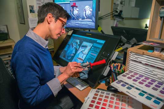
Tory printed every Pantone colour formula with the 3D printer. She painted the same formula on the computer screen. Then she compared the two and figured out the digital formula she needed to match the printer's colour.
"A blue on the screen might be green in the printed material," she says. "I needed to trust that if I followed the rule, in the end, I would get the result I was looking for. I have to be very methodical."
02. Use colours to enhance details
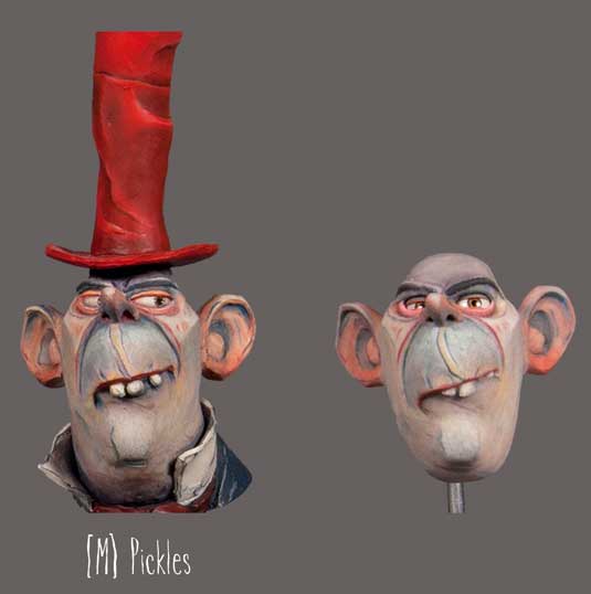
To enhance edges and pop details, Tory uses complementary colours. "Lips can go orangey-red," she says. "So, if I want bright red lips, I put green with a little blue on the edge of the lip line. Our eyes read the lips as brighter and more vibrant. Sometimes I put a bright yellow around a freckle. Having elements around the freckle keeps the print heads active, so I get sharper edges and cleaner colour."
03. Paint on the inside
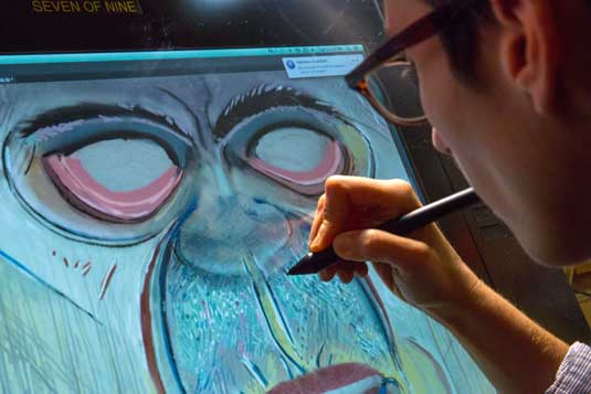
The printed face parts are shells. By painting on the inside with her multilayered technique, Tory gave the Boxtroll faces depth and detail. "The powder-based material is translucent," she says. "I could paint on the back and have it bleed through as the front bleeds into it. I created veining on Snatcher's face, blush in the cheeks, elements that come in and out of his face."
04. The impact of thick and thin
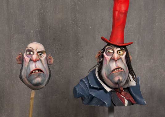
Tory realised dark colours are thicker – they go as much as 1/16 inches deep. The thinner the material, the less apparent the colour. Without enough depth, she couldn't create a dark blue. She turned it to her advantage. "I figured out the thinner the colour, the less it goes in depth, and it has to print the dark first, so I could cross light and dark," she says. "Also, I talk to the modellers to create thicker or thinner areas depending on what I need."
05. Check the file format
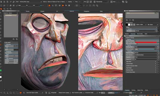
The original file format they used to send digital models and texture maps to the printer was lousy. "The files were so compressed, the detail was fragmented to a degree that we lost information," Tory says. "By changing the file format and making sure we used edge enhancements, we got sharper edges and cleaner colour."
Extra tip: Printing footprint

"Every printer has a distinct printing footprint. Some are sharper, some print more blue or red or yellow. If you hand me a face, I can tell you what printer it was on. We have some characters stay on specific printers. If I get a crazy detailed character, I choose the printer that's most beneficial."
To see more information and work by Laika visit the site here.
Words: Barbara Robertson
This article first appeared in 3D World magazine.
Like this? Read these!
- 5 new animation trends for 2015 that will change everything
- Illustrator tutorials: amazing ideas to try today!
- Free graphic design software available to you right now!

The Creative Bloq team is made up of a group of art and design enthusiasts, and has changed and evolved since Creative Bloq began back in 2012. The current website team consists of eight full-time members of staff: Editor Georgia Coggan, Deputy Editor Rosie Hilder, Ecommerce Editor Beren Neale, Senior News Editor Daniel Piper, Editor, Digital Art and 3D Ian Dean, Tech Reviews Editor Erlingur Einarsson, Ecommerce Writer Beth Nicholls and Staff Writer Natalie Fear, as well as a roster of freelancers from around the world. The ImagineFX magazine team also pitch in, ensuring that content from leading digital art publication ImagineFX is represented on Creative Bloq.
