Working with Adobe Muse's responsive tools
Lance Evans takes you though some tips for working with Adobe Muse's responsive tools.
Sign up to Creative Bloq's daily newsletter, which brings you the latest news and inspiration from the worlds of art, design and technology.
You are now subscribed
Your newsletter sign-up was successful
Want to add more newsletters?
Adobe's Creative Cloud-based Muse web design and website layout package, contains some exciting responsive web design tools. And while they're very useful, they can seem overwhelming at first. Here are some hints and tips for getting started.
Responsive tools
Let's take a quick look at some of the tools for responsive design. The first one is easily overlooked (see image below).

Found on the very bottom of the left side tool pallet, this setting determines whether the text editing you are doing will effect the text box just in the current breakpoint ('Format text on current breakpoint', the single 'T' icon), or if it will effect all Breakpoint instances of the text box being edited (Format text across breakpoints', the multiple 'T' icon).
Article continues belowKeep this option in mind before you touch a text box. In most cases it is a lot safer to leave it set to effect just a single breakpoint. Turn it on to effect all zones if the text box is set to act responsively, see next section.
Responsive text and text boxes
Much of all publishing work is about formatting text. Or 'massaging' it if we want to be artsy. The web has always made that harder than print, and responsiveness adds even more twists and turns. One might think that you should be able to click on all the 'responsive' settings for everything and – whoopee! – life would be great.
Well Muse does give us that option, we just have to learn to use it properly. Resize menus can be found both at the top of the screen, and by right-clicking on a page object. This option is available for both images and text boxes, though they are obviously treated differently.

Set a text box to 'Responsive Width' and Muse will change its width proportionally with that of the browser's width. This sounds like a good thing, and it can be for many situations.
Sign up to Creative Bloq's daily newsletter, which brings you the latest news and inspiration from the worlds of art, design and technology.
But for we control freaks, it adds yet another variable that might mess up our vision. The thing to keep in mind is that we now have other toolsets to address these issues as well – for example, breakpoints. So rather than setting a text box to be responsive, instead keep its width locked and modify it as needed in each of the various breakpoint zones you create.
Essentially, this is almost like treating each breakpoint as if it was a fixed page, like we have done with the desktop, tablet and mobile pages in previous versions of Muse. This just seems like a 'best of both worlds' way to work. Though it is more labour intensive than choosing the Responsive Width option and letting things go.
Generally speaking, we will always need more control over our headlines than over our body text. So while most body text can be set to Responsive Width, I'm less inclined to do that with the headlines without a lot of testing. Instead, the headlines are perhaps best handled by relying on breakpoints. But this all depends on the design. Remember: test, test, test.
Pinning vs responsive positioning
In addition to a responsive text block width, if not pinned in one way or another, Muse will also responsively shift the horizontal placement of an item on the page. This is a great thing, when it works.

I have noted that when changing the browser width, some items placed in the dead-centre go awry. My solution is to pin it to the centre, as seen here. Again, testing is your friend.
Variables per breakpoint
With all of Muse's responsive tools, the heavy hammer is of course the breakpoint controls. Each new breakpoint allows the designer to start with a fresh canvas, at least if needed. Granted, this is not the way you want to work. Ideally, you would flow as smoothly as possible from one browser width to another.
In fact, ideally you would rely mostly on the responsive controls listed above, and only use breakpoints as a last-ditch solution, when other solutions won't work. Theoretically you could create a responsive site with only one full-width breakpoint and have all the elements scale automatically. Granted, this would probably necessitate it being a rather simplistic site. In any case, you probably want to try and have as few breakpoints in a project as you can.
But as a fail-safe, breakpoints can be used gently, or with brute force. Gentle use involves waiting until page elements begin to break, then creating a new breakpoint width where you fix that element. Brute force techniques involve completely removing a page object that exists in one breakpoint zone (you can right-click to 'Hide in Breakpoint' or 'Hide in other Breakpoints'), and replacing it with a new item in another zone. Or perhaps just removing an item altogether as the browser width narrows.
For more granular tips and insights, visit this page on Adobe's site.
Page testing tips
Now let's take a look at some ways you can test your page to check your responsive designs are working as you intended.
Let's start with a tiny one. Preview doesn't let you test responsiveness; the only option is to use the Scrubber control, which is part of the breakpoint ensemble. Of course, this is in the layout window so you will not see a real preview of many functions. Instead, get used to using the keyboard commands for for page preview (cmd+shift+E), and for full site preview (cmd+alt+E).
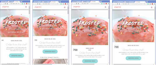
By placing an identifier on the page of each breakpoint zone, you can identify which zone you need to make changes to. I simply make a text box for each zone with the pixel width value of that zone.
Make sure each identifying text is only visible in its proper breakpoint. And also make sure to turn them all off before you publish. An easy setup would be to create a new layer for all labels. Then you can simply turn them all off with one button.
One other thing to note: keep the tag really, really small and away from other items whose positioning could accidentally be effected.

As can be seen in the image above, I have added a breakpoint tag to each zone. Now I can easily see which zones have issues I need to address. In this example we can see that the narrower version of '768' needs some tweaking.

If the text boxes can be fixed to work well across the entire zone, then great. If not then we might want to consider adding another breakpoint to deal with it independently. Another option: expanding the zone we call '550' to encompass the problem, might just solve it.
Related articles:
- Top Chrome extensions for designers and devs
- Choose a website builder with these top tools
- Behold the very best in website templates

Lance Evans is creative director of Graphlink Media (graphlink.com), a boutique creative marketing agency in NYC, with clients like Olive Garden, Miller Beer and AMEX. Lance recently launched "OPEN STUDIO | NY", a YouTube channel looking at production techniques for advertising and publishing shops. Visit it at youtube.com/@OpenStudioNY
