"We believed in the details": animating the world of The Imaginary
Studio Ponoc founder Yoshiaki Nishimura discusses the anime adaptation of a whimsical children’s book.
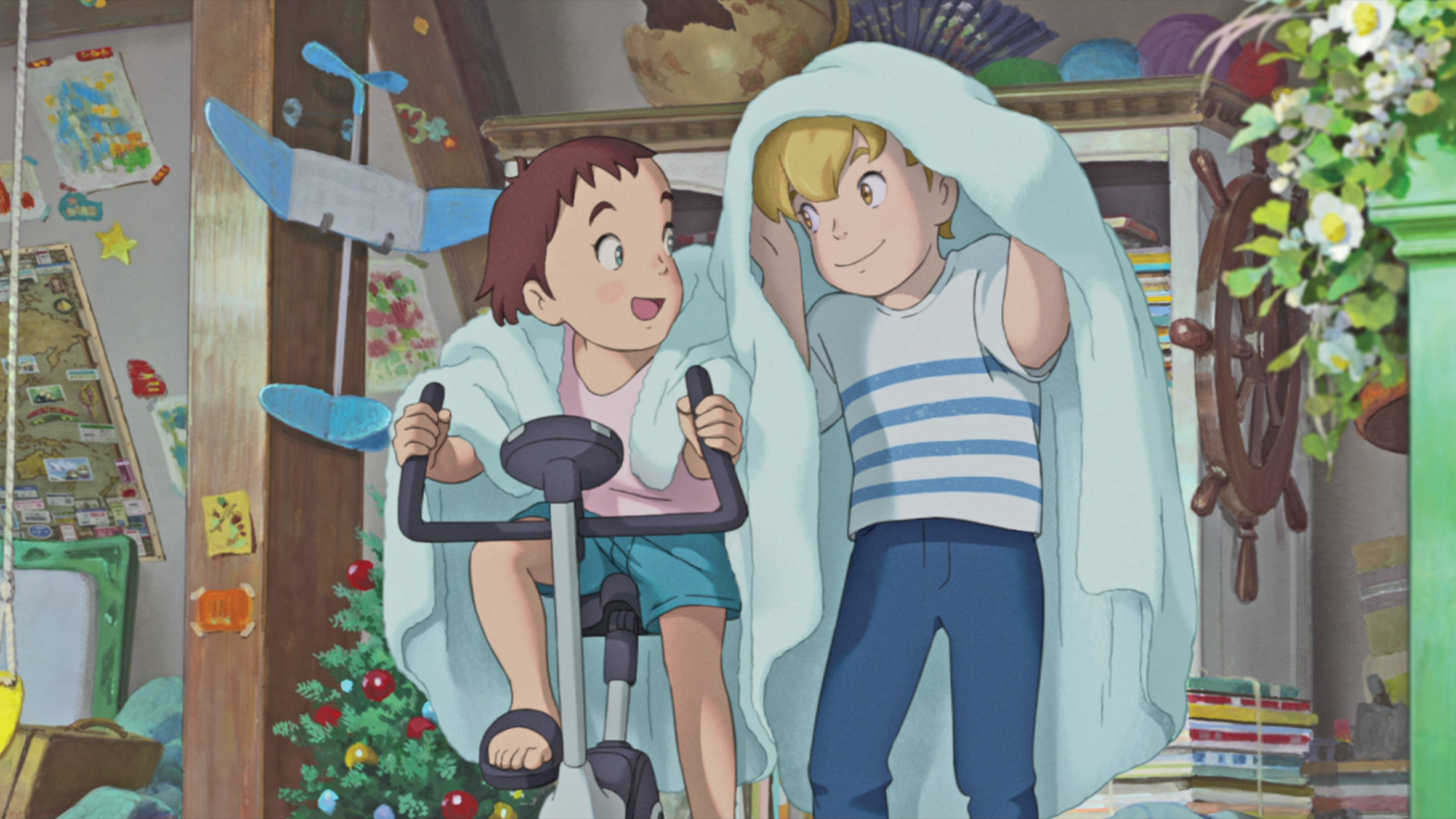
Anime has provided various fascinating instances of British children’s books being adapted for retelling on the screen. Among the most recent, Japanese animators Studio Ponoc looked to The Imaginary, written by A.F. Harrold and illustrated by Emily Gravett, as the starting point for a feature film that released last December. The animated adventure’s story moves back and forth between the real world and a dazzling range of fantasy environments, following the journey of a group of imaginary friends.
In bringing the known and unknown worlds together, a key point of the movie’s aesthetic resides in its integration of 2D and 3D elements. The production worked with France-based Les Films du Poisson Rouge, an animation studio that has developed lighting and shading softwares. Those toolsets have been applied to The Imaginary, bringing a distinctive visual detail in terms of digitally rendered shadow and texture elements that enhance the beautiful animation and artwork.
The integration of 3D elements with 2D animation – in total the movie comprises 140,000 animation drawings – has long been an ambition for producer Yoshiaki Nishimura, who previously worked at the legendary Studio Ghibli. We caught up with Nishimura to talk about the film, as he reflects on the relationship between character design, fantasy and believability.
Article continues below 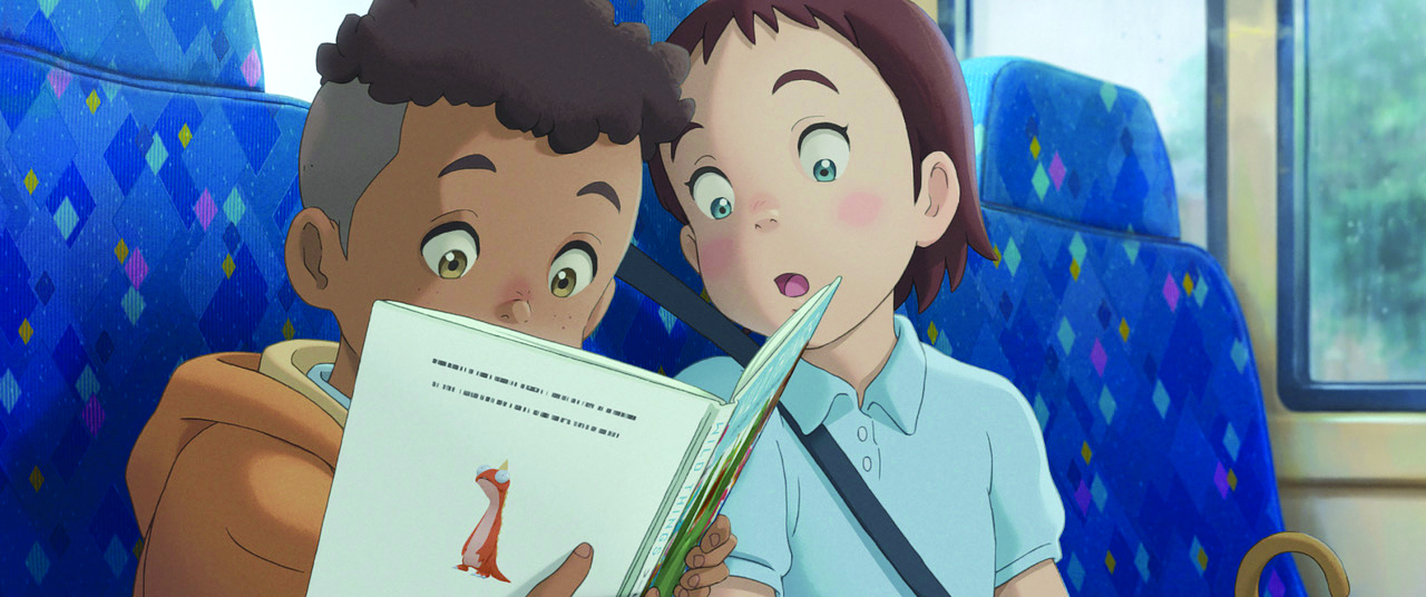
What was the creative challenge in adapting the book into a film?
When I work on adaptations, the first thing that I think about is how we can communicate a cool message from the original book, and if it’s possible to deepen that message as well. The second thing to think about is whether there are any visual and filmic images that could add into that original message, because if everything was complete in the original book, there’s no point in creating the film. But usually there are more things that we can enhance.
What did you want to achieve with the environment work?
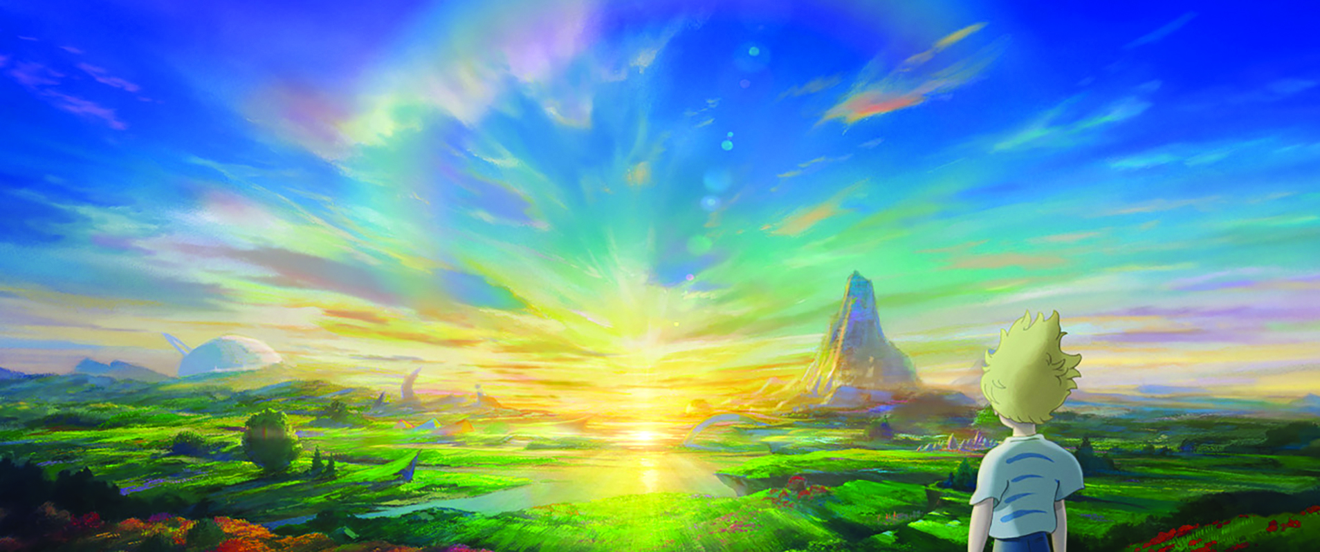
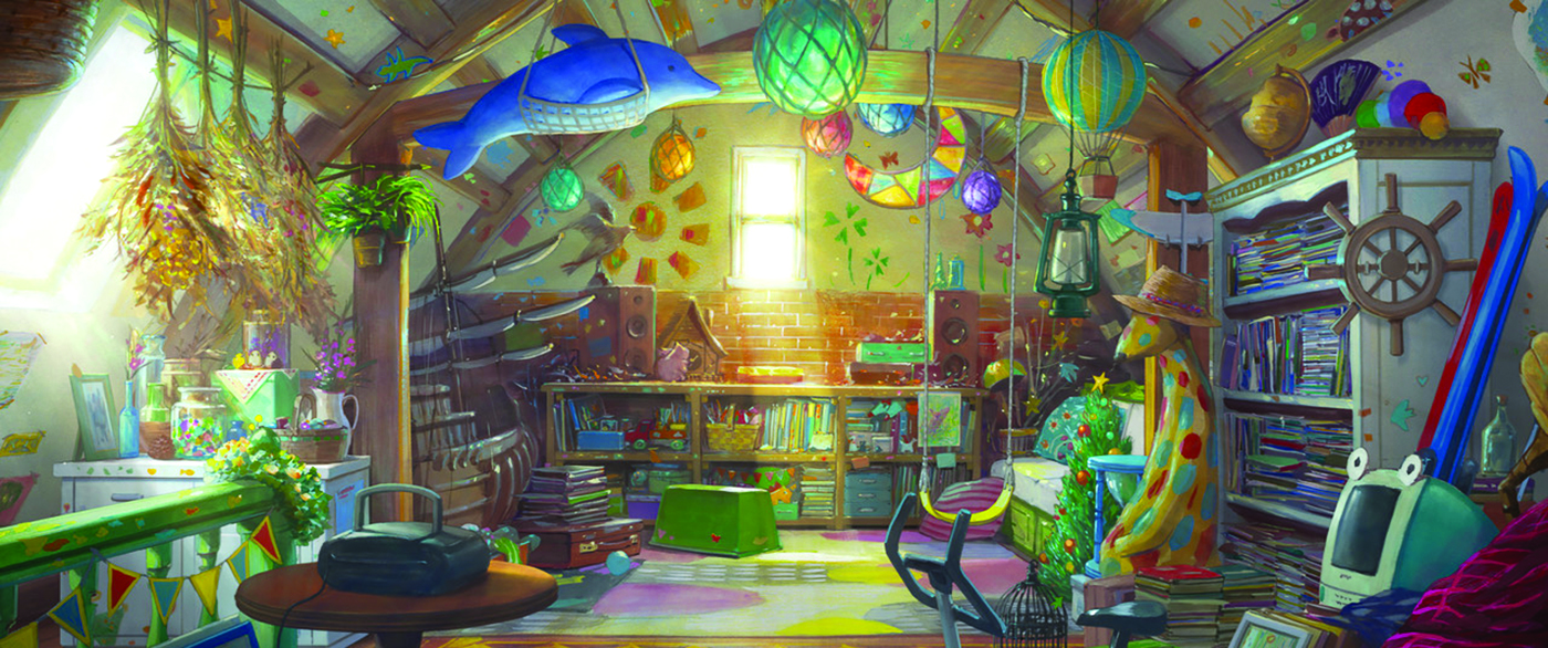
For our work on the backgrounds, we believed in the details; that was absolutely necessary. Normally we’d do thorough location hunting, but that wasn’t possible due to the pandemic. So we worked with a coordinator based in the UK, and they took a lot of videos and pictures all around the country. We just really wanted to make sure everything would look realistic and lifelike.
How does a depiction of nature and its beauty feature in the film?
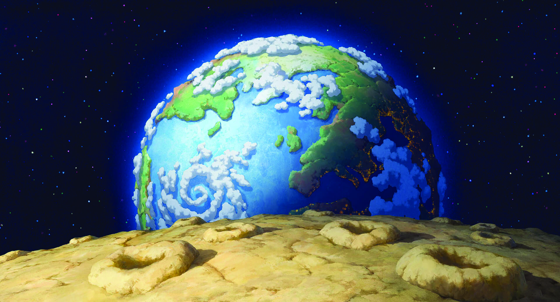
In terms of whether it was the flowers, the sky or the universe, one ethos we have at the studio is that we try to create something beautiful within animation – we think it’s very important. However, it can’t just be aesthetically beautiful, there needs to be a meaning behind it.
[When it comes to character designs…] I felt the responsibility for us not to just conjure up something out of thin air
Yoshiaki Nishimura, founder, Studio Ponoc
One of the things that posed a challenge within this film was the imaginative worlds created by different children’s characters. They can’t be something that’s seen as beautiful in this world. In terms of the artist references in the film, such as Vincent van Gogh and the impressionists, we’ve thought about that as well.
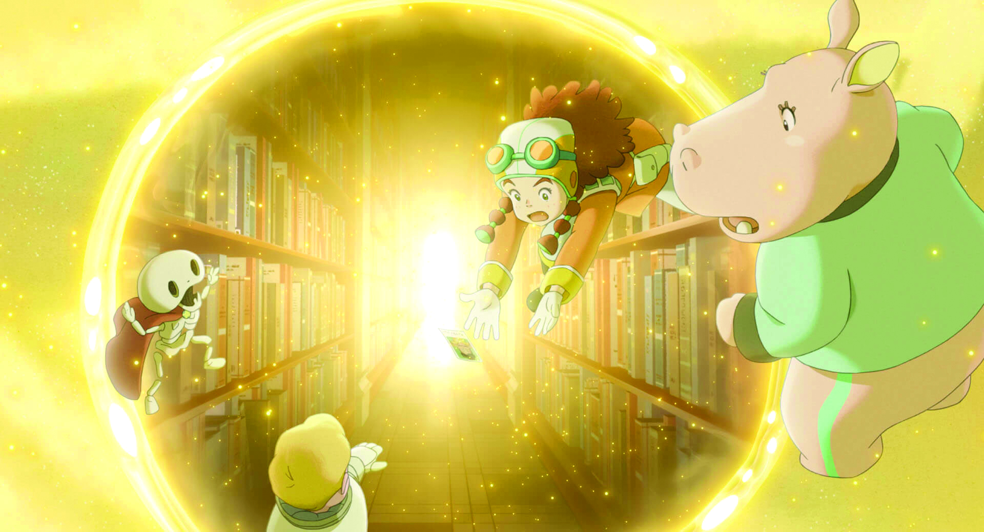
However, we can’t just use that in these imaginative worlds, as the imaginations of these characters have limits to what they’ve seen in their lives and what they can capture in their heads. The library scene is slightly different though, as all the memories have been conjured up from the book, so we could play around a little more.
Was it difficult to make a film that vividly combines playfulness with sadness and also features an element of horror?
The elements of sadness and scariness aren’t separate in my head. And I don’t think they should be separated. To make it clearer, in terms of scariness, it was a challenge for how to balance that out.
The original book definitely has that scary element. The book symbolised the scariness of this world, that children are faced by constantly; whether it be wars or climate change. That’s why I felt the need to retain the scarier elements, but also to include the message that every one of us has the power to overcome those challenges.
How did you approach the design of the animated characters?
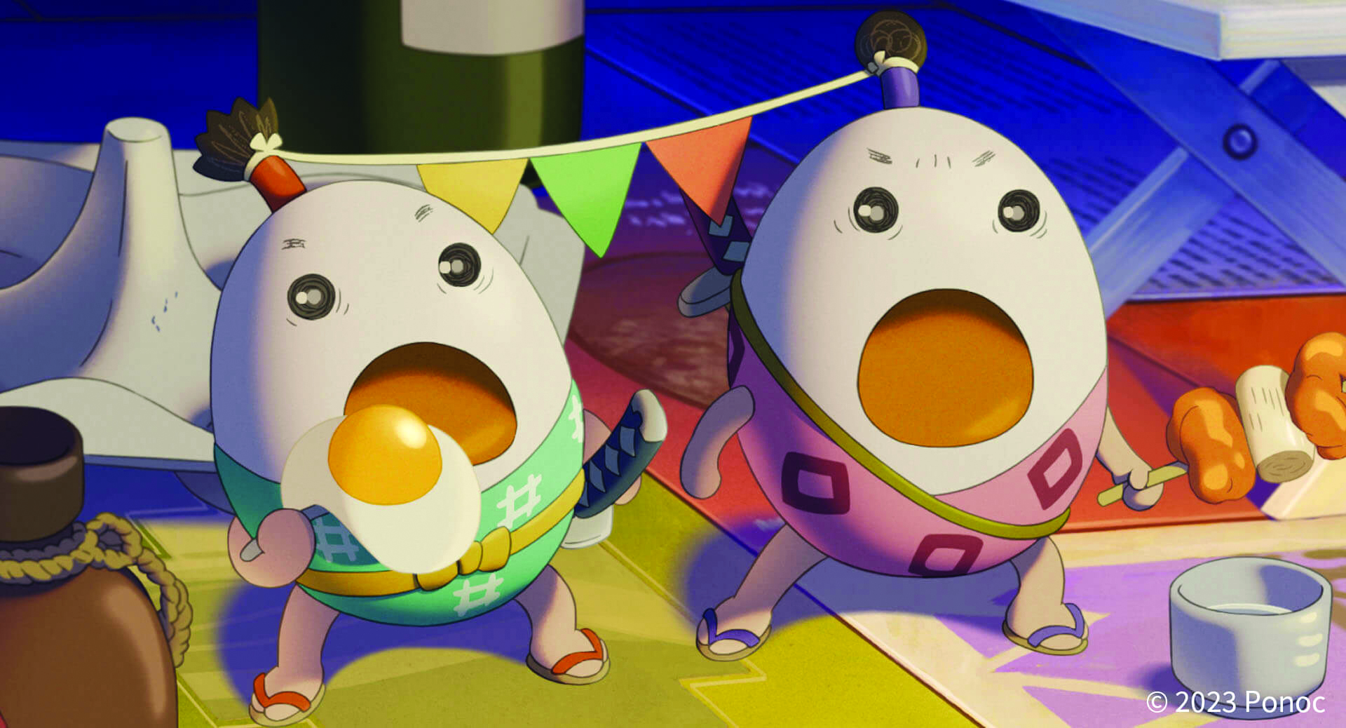
When it comes to character designs, we first started from the story. Usually the script for a film of this length would be around 60 pages under normal production, but mine spanned 200 pages. That’s because I included a lot of the detail from the images I saw in my head.
With all of the characters, and especially with the imaginary friend characters of Rudger, Emily and Jinzan, I felt the responsibility for us not to just conjure up something out of thin air. I felt like it was important for us to understand the human figures who have imagined those three characters. So first we worked on the backstories of those human characters who don’t appear in the film.
What was it like bringing the character of Mr Bunting to life?
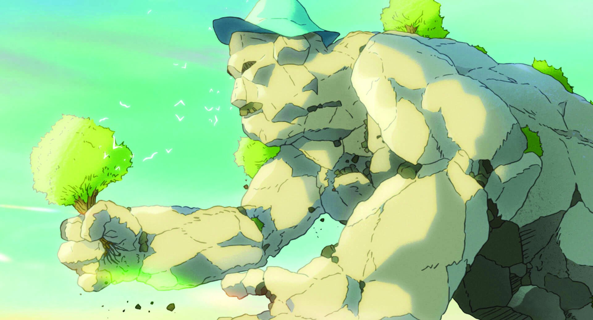
Mr Bunting was the most challenging character for us to design. Visually, there may be a link between the book and the film, but it’s not really clear within the book about why he’s feeding on the imaginations of others. I needed to think long and hard about the reasons why and then I came to my conclusion: it’s about reality. It’s something that you can’t ever escape.
It’s always there.
The reason I thought about that is because A.F. Harrold is a poet himself so there must be metaphor behind it, and it must be the metaphor of reality. It’s how Bunting behaves that creates the scariness. It’s not that obvious whether he’s a scary character or not from the beginning just by looking at him. And I wanted to really make that ambiguity. There’s a strong link between the visuals of the book and what ended up in the film.
This content originally appeared in 3D World magazine, the world's leading CG art magazine. 3D World is on sale in the UK, Europe, United States, Canada, Australia and more. Limited numbers of 3D World print editions are available for delivery from our online store (the shipping costs are included in all prices). Subscribe to 3D World at Magazines Direct.
Sign up to Creative Bloq's daily newsletter, which brings you the latest news and inspiration from the worlds of art, design and technology.

James has written about movies and popular culture since 2001. His books include Blue Eyed Cool: Paul Newman, Bodies in Heroic Motion: The Cinema of James Cameron, The Virgin Film Guide: Animated Films and The Year of the Geek. In addition to his books, James has written for magazines including 3D World and Imagine FX.
