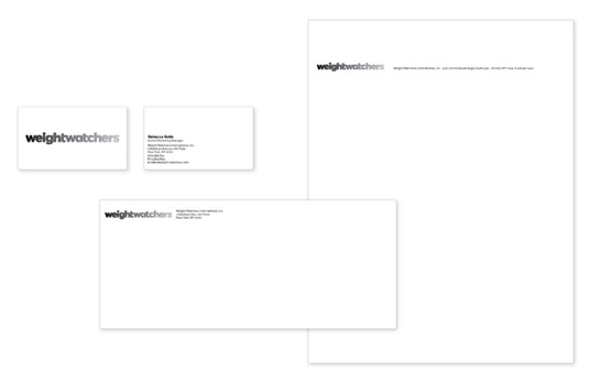
New Weight Watchers logo unveiled
Weight-loss specialists Weight Watchers have launched a graduated rebranding designed by Pentagram. What do you think of their new identity?
Weight-loss brand Weight Watchers has unveiled a new logo design that's a big departure from its previous identity.
Designed by Paula Scher of Pentagram, the logo uses a typeface based on a customized version of the font Fort, is all lower-case, and is graduated - presumably to represent the shedding of weight that the company is famous for.

Although the main logo is grayscale, as you can see in the short video at the top of this post, there are colour versions of the branding too.
Article continues belowThe new identity hasn't been without criticism, with some industry commentators describing it as looking like Microsoft Word Art.

The Microsoft comparison is apt, because Pentagram was also behind the similarly controversial rebranding of the software giant this year (click here to read designers' views on Microsoft's rebrand).
Pentagram is bullish about their design, as you would expect, saying on their website: "Modern, open and energetic, the identity brings to life the transformation that members experience when they adopt a new lifestyle that can lead to significant weight loss."
What do you think of Weight Watchers new logo? Tell us in the comments!
Sign up to Creative Bloq's daily newsletter, which brings you the latest news and inspiration from the worlds of art, design and technology.
Now read:
- How to brand a logo: 15 design trends for 2012
- What makes a brand iconic?
- Seven rules of successful branding - click here
- The ultimate guide to logo design - 25 expert tips

The Creative Bloq team is made up of a group of art and design enthusiasts, and has changed and evolved since Creative Bloq began back in 2012. The current website team consists of eight full-time members of staff: Editor Georgia Coggan, Deputy Editor Rosie Hilder, Ecommerce Editor Beren Neale, Senior News Editor Daniel Piper, Editor, Digital Art and 3D Ian Dean, Tech Reviews Editor Erlingur Einarsson, Ecommerce Writer Beth Nicholls and Staff Writer Natalie Fear, as well as a roster of freelancers from around the world. The ImagineFX magazine team also pitch in, ensuring that content from leading digital art publication ImagineFX is represented on Creative Bloq.
