Smooth almond milk branding might make you ditch dairy
This branding for London's first almond milk producer is so beautiful, you might never go back to dairy.
Sign up to Creative Bloq's daily newsletter, which brings you the latest news and inspiration from the worlds of art, design and technology.
You are now subscribed
Your newsletter sign-up was successful
Want to add more newsletters?
When launching a new company and product, it's imperative that you get the branding perfect. The Pressery is London's first producer of almond milk and designer Tim Jarvis has definitely ticked all the right boxes when it comes to their branding.
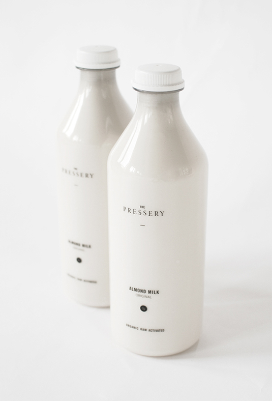
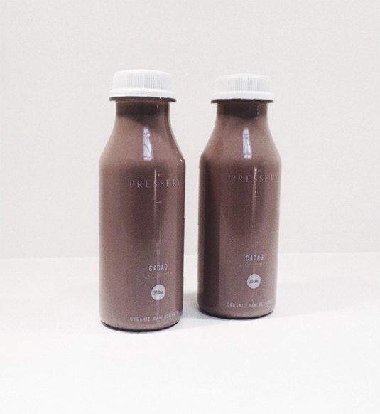
"One of the origins of the company is in creating a healthy alternative to dairy milk; a product that has suffered from decreasing quality through farming and methods of production," explains Jarvis. "The bottles suggest traditional dairy milk bottles, further confirming that a product of this quality is a perfect replacement for dairy milk that so many people accept as a part of their daily lives.
"The corporate identity features a logomark comprised of two parallel line; symbolic of the two founders. These lines are used as a visual style asset throughout the stationery and in some special circumstances are presented alone with no other elements."
Article continues below 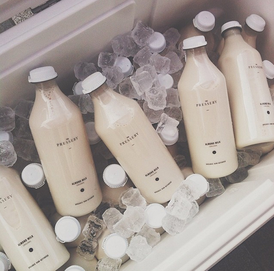
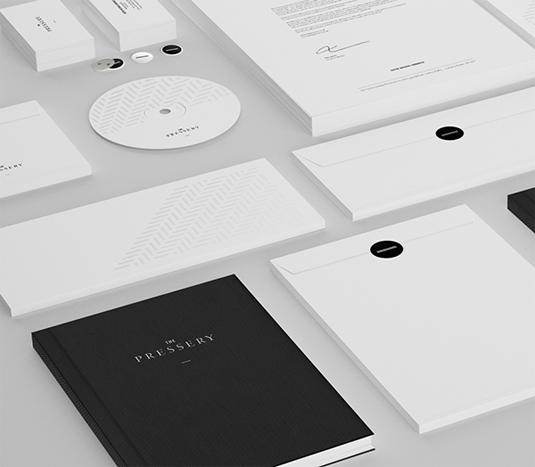
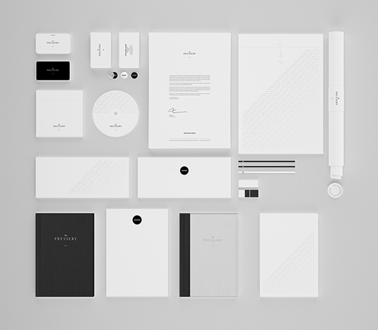
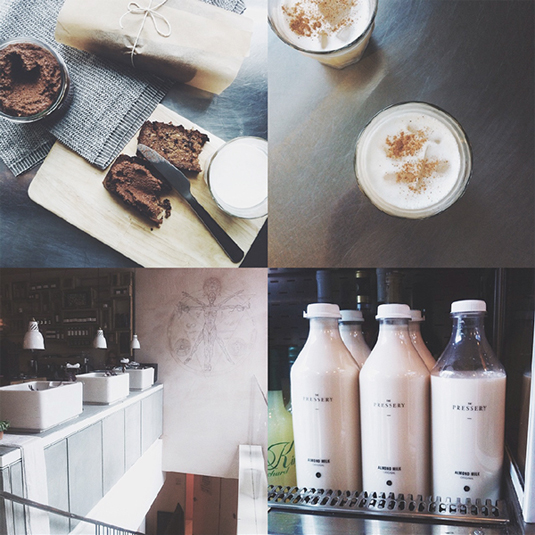
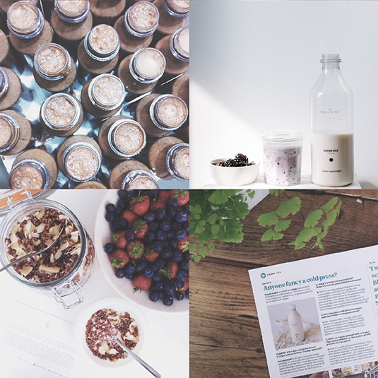
What do you make of this branding? Let us know in the comments box below!
Sign up to Creative Bloq's daily newsletter, which brings you the latest news and inspiration from the worlds of art, design and technology.

Sammy Maine was a founding member of the Creative Bloq team way back in the early 2010s, working as a Commissioning Editor. Her interests cover graphic design in music and film, illustration and animation. Since departing, Sammy has written for The Guardian, VICE, The Independent & Metro, and currently co-edits the quarterly music journal Gold Flake Paint.
