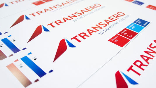
Pioneering airline gets future-facing new logo
StartJG and Dalton Maag have given Russia's Transaero Airlines a future-facing rebrand.
Sign up to Creative Bloq's daily newsletter, which brings you the latest news and inspiration from the worlds of art, design and technology.
You are now subscribed
Your newsletter sign-up was successful
Want to add more newsletters?
Russia's breakthrough air travel company, Transaero Airlines, turns 20 this year. To celebrate they've launched a forward thinking rebrand and personalised typeface.
Transaero flies to over 200 destinations worldwide and was the first private company approved to run scheduled passenger services in its space.
Back in 2014, design agency StartJG worked with independent font foundry Dalton Maag to create Transaero's new logo design, which will appear on its fleet of aircraft as well as both print and digital communications.

To bring Transaero's typeface up to date, the traditional Prometo font was dropped and replaced by uniquely customised lettering.
By combining Dalton Maag's Prometo and Soleto font families (in both Latin and Cyrillic), Transaero's fonts now reflect the brand's new proposition: 'To the future together.'
Standing out in such a competitive market was a concern for Transaero, but StartJG CEO Mike Curtis is confident that the rebrand sets them apart from the rest.

"This work lets it be seen as an invaluable business, now with typography that’s 's individual as Transaero is," Curtis explains.
Sign up to Creative Bloq's daily newsletter, which brings you the latest news and inspiration from the worlds of art, design and technology.
He goes on to add that now Transaero "looks and feels confident across all touch points." This is thanks to an enhanced red pallette and energetic typeface that builds on the equity of the original design.
Liked this? Read these!

The Creative Bloq team is made up of a group of art and design enthusiasts, and has changed and evolved since Creative Bloq began back in 2012. The current website team consists of eight full-time members of staff: Editor Georgia Coggan, Deputy Editor Rosie Hilder, Ecommerce Editor Beren Neale, Senior News Editor Daniel Piper, Editor, Digital Art and 3D Ian Dean, Tech Reviews Editor Erlingur Einarsson, Ecommerce Writer Beth Nicholls and Staff Writer Natalie Fear, as well as a roster of freelancers from around the world. The ImagineFX magazine team also pitch in, ensuring that content from leading digital art publication ImagineFX is represented on Creative Bloq.
