Build experiments into your workflow
Radim Malinic explains how to bring flexible working into play without adding extra hours to your project
Sign up to Creative Bloq's daily newsletter, which brings you the latest news and inspiration from the worlds of art, design and technology.
You are now subscribed
Your newsletter sign-up was successful
Want to add more newsletters?
- Time needed Four hours
- SkillsRetouch skin. Use the Pen tool, anchor points and smart filters. Learn quick masking techniques
When creating artwork for a client, you should always expect the unexpected. Not only can the creative brief alter halfway through a project, but the client can change their mind and add lots of amendments within your existing artwork. To avoid re-doing parts of your work from scratch, it’s imperative to ensure you plan ahead and learn how to work in a way that will stop you pulling your hair out when clients present you with changes.
In this tutorial, you’ll find out how to create artwork that is strong in its foundation, yet still enables you to experiment along the way. The process might even speed up your workflow. Our basketball-inspired illustration is bursting with intricate detail and an abundance of flowing energy, using basic smart filters. The final image might look difficult to produce, but you’ll soon find out it’s not rocket science.
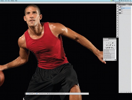
01 Draw around the main object of your image with the Pen tool in Photoshop – here, the basketball player – and save the path. Duplicate the path and, with the Direct Selection tool, choose points to delete and sections to make into new selections on top of each other, such as the vest and laces. Make a new layer for the player’s body.
Article continues below 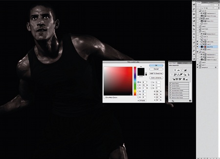
02 As the only highlight colour in this piece is red, we want our player to blend into the background while remaining visible. To remove the colour values but retain visibility, create a new layer and click Ctrl/Cmd+ Alt+G to add a clipping path from the object’s layer. Set the layer to Soft Light and fill with black. Duplicate the layer (Ctrl/Cmd+J). Below these two layers, add a Solid Color layer via the Adjustment Layer button (from the Layers palette), choose a colour and set the layer blending option to Color.
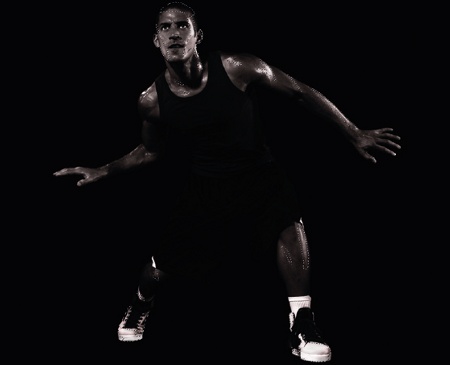
03 The overall figure now needs bringing out more, through highlights and contrast. This could be achieved by using the Dodge and Burn tools. However, let’s use a method that doesn’t damage the main layer, and which we can tweak later, if we wish. Create a new layer and set it to Overlay. Choose a soft round brush at 100px, set Flow to 20, and Opacity to 20. Brush in white around the light areas, and black to darken the opposite areas. You can see where I’ve painted in the image above.
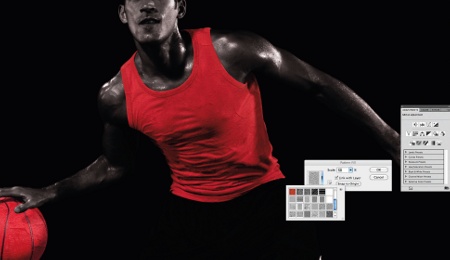
04 From the Paths palette menu, make a selection from the paths you made earlier – in this case around the player’s vest, laces and the ball. Select the bottom, original layer in the Layers palette and hit Ctrl/Cmd+J to make a copy of our selection from the main layer. Then, move both layers to the top of the stack. In Adjustment Layers, from the Layers palette, you can add a new pattern layer via a clipping mask. If you have some painted patterns already saved, they can make nice textures.
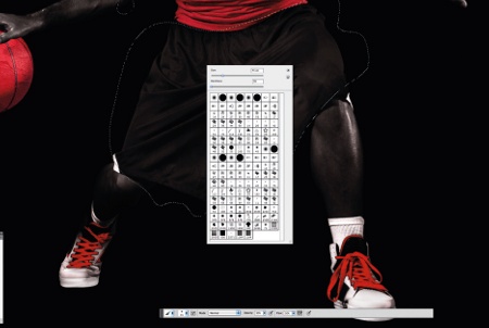
05 All in all, our player is almost done. However, during the retouch we lost some of the black and white contrast. Via Adjustment Layers (as per the previous step), add a Levels filter on top of the main object layer – our player’s body. Set the values to 0, 2.53 and 244, and fill the mask with black to hide the effect. The brush you used previously should still be saved. I selected white as my foreground colour and started painting over the shorts. We now see the detail coming back.
Sign up to Creative Bloq's daily newsletter, which brings you the latest news and inspiration from the worlds of art, design and technology.
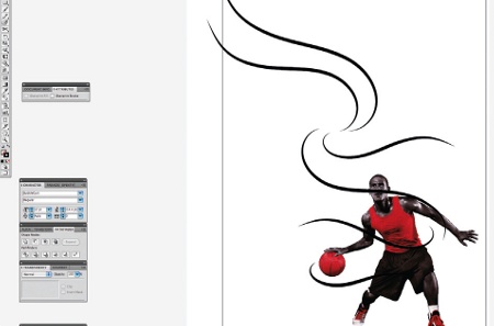
06 Save the image as a transparent PSD and place it in Illustrator. Now to build motion lines around the figure. Select the Brush tool and draw swooping lines. You only need to do a few main lines for what will become a cluster of swooshes. Once you’re happy with the shapes of the lines, select all and, in the Brushes palette, click Remove Brush Stroke.
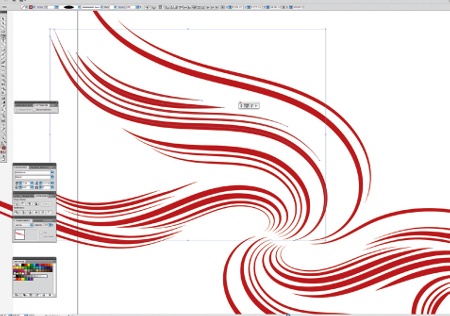
07 Make each line 4pt in thickness and apply a shape profile from the Stroke drop-down menu. This will give your lines pointed ends and thick middles, suggesting the movement of energy. To build up the clusters, copy each line by holding Alt/ Opt and moving the stroke line. You won’t be scaling any of these lines this way, though. To do this, hold and drag out the Pen icon from the Tools panel and select the Add/Remove Anchor Points tools. Add points about an inch from both ends of each swoosh (=), or shorten them by removing Anchor points (-) at the end. Repeat this a few times until you feel that the cluster is the right density and creates a good sense of perspective. Make some lines 10pt in thickness.
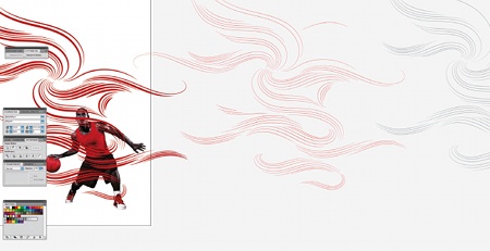
08 Once you’re happy with the flow of your vectors, make a few extra groups of these clusters in different stroke weights and colours. Group the main selection and copy it by holding Alt/Opt and dragging. Apply a 2pt stroke weight and make an extra copy in white. Once done, create a new canvas in Photoshop, set the background to black and place the player in as one layer. Then copy each vector group and paste into Photoshop as Smart Vector Objects. The layers should paste on top of each other.
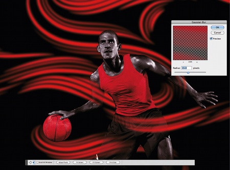
09 Starting with the group of thicker swooshes, go to Filter>Blur>Gaussian Blur and set to 15px. This will add an adjustable layer over the top of your vector shape. Copy this layer and move it below, then add a Quick Mask (via the bottom of the Layers palette, or set up your own shortcut preset). Fill the mask with a black colour (Alt/Opt+ Backspace) to hide the content of this layer. Brush into it to reclaim the content in some places, to build up a vibrant glow. Return to the layer above and set it to Vivid Light.
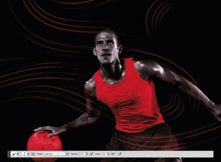
10 Quick Masks will be used on every new layer, so add them to your thinner lines. Hit Ctrl/Cmd+F to bring up the Smart Filter Gaussian Blur, and change the value to 4px. Hide the layer’s contents by filling the Quick Mask with black, then brush in where you want swooshes to appear. Take time to think where energy should travel and where it should be less opaque.
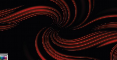
11 Although we brought all our previous vector lines in one group into the Photoshop document, for the next step we need to return to Illustrator and bring some of the cluster groups over in smaller bunches. Set to 1pt thickness, these clusters will be slightly offset from the main clusters already in Photoshop. When you’ve pasted them back into Photoshop as Vector Smart Objects, group the layers and add Quick Mask to the group. This will enable us to brush out some of the colours via the mask.
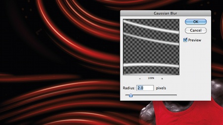
12 This step should be a breeze now you’ve completed the previous few, though it means more quick masking and brushing. We’re going to emphasise the flow of energy in the swooshes. Using the white set of vector lines, blur the layer by 2px (Ctrl/Cmd+F) and start reclaiming the layer by brushing in the places where you want to create highlights. You can also duplicate the group to create extra glows wherever you desire them, on top of the ones you’ve just done.
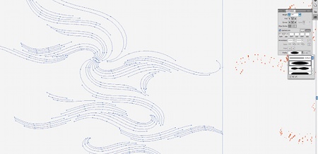
13 To add extra depth and texture, we can reuse vector lines. Return to the Illustrator file and select one of our cluster groups. In the Stroke panel, set a dashed line to 0.5pt thick with a 25pt gap. The existing shape profile will be brought through, showing the dots in ascending size. When done, copy and paste into Photoshop.
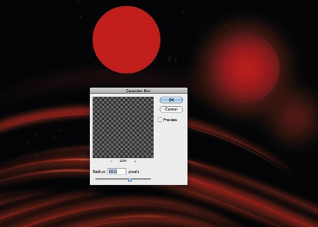
14 The use of smart filters and Gaussian Blur has taken the artwork quite far away from the simple vector look that we had at the beginning. Now that our overall image has the right amount of flowing energy lines, let’s just add a handful of last elements without cluttering the artwork. In the tone of this tutorial, add a vector circle and apply blur via the smart filter options. Use in various sizes with different amounts of blur, and then partially brush out the blur via the filter Quick Mask.
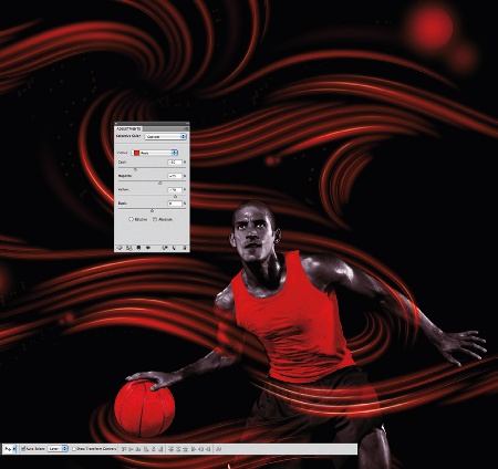
15 It always pays to consider tweaking your colour values to enhance the print output. The CMYK red colour consists of yellow and magenta, however we can add this through a Selective Colour Adjustment layer to bring more vibrancy to the image and the red colour. Input the following values: -50 for Cyan, +25 for Magenta and +70 for Yellow, and the red tone will become richer. Try the same approach with other colours in your work.

Radim Malinic
Radim has been labelled a ‘designer’s designer’ for his diverse portfolio of work across different media and platforms for clients including London Film Museum, Blistex, Cadbury and Goldman Sachs.
www.brandnu.co.uk

The Creative Bloq team is made up of a group of art and design enthusiasts, and has changed and evolved since Creative Bloq began back in 2012. The current website team consists of eight full-time members of staff: Editor Georgia Coggan, Deputy Editor Rosie Hilder, Ecommerce Editor Beren Neale, Senior News Editor Daniel Piper, Editor, Digital Art and 3D Ian Dean, Tech Reviews Editor Erlingur Einarsson, Ecommerce Writer Beth Nicholls and Staff Writer Natalie Fear, as well as a roster of freelancers from around the world. The ImagineFX magazine team also pitch in, ensuring that content from leading digital art publication ImagineFX is represented on Creative Bloq.
